

I think architectural competitions are awesome. A well run architectural competition generates debate, promotes architects and architecture and ensures that cronyism, fee cutting and so-called value management doesn’t diminish the public realm. When it comes to procurement it is usually the Project Management types who get it all wrong and not the architects. Yup, it is often the in-charge Project Managers who have little concern for, or knowledge of, architectural design. The killer thing is the Project Managers love to blame the architects for the problems they have created in the first place.
Greater Shepparton City Council. should be applauded for having the courage to run an architectural competition for the new Shepparton Art Museum. Architectural competitions are a excellent way to get the best outcomes, both in terms of time and cost and meeting the requirements of a complex program. Its great to see architecture supported in this fashion. In this case it is a complex cultural program and interestingly the business case for it is readily accessible if you are interested. It’s great to see and contrasts with the the usual behind closed doors machinations of Project Managers and bureaucrats enmeshed in established networks of patronage (and dare I say privilege).
The problems of criticism
Since starting this blog I have been hesitant to allow my harsher critical intelligence to run riot. Architectural criticism is fraught with hazards and pitfalls. The central problem is that some architects are notoriously thin-skinned and any vaguely or faintly critical discussion of their work can lead to bad voodoo. A lot of what passes as published criticism, and architectural discourse, on the web is really just about saying nice things about a particular architectural project. Or worse still stating the obvious with little interpretation. A lot of it is middle brow sop avoiding the hard questions and failing to pursue the contradictions and complexities of architecture in a wealthy nation like Australia.
I also fear that critical theory in relation to architecture is a little dangerous. Too much critical theory and you can get into trouble. I think this is because I witnessed the “Theory Wars” at my architecture school in the early 90s when the practicing architects took on the theory mavens. Theory is certainly dangerous of course, and unlike Italian, Dutch, or French Architecture, not valued particularly highly in Australian architectural culture. I can just hear those voices now saying: “cut the bullshit and who needs theory when we get stuff built.” I remember once when I was a chair of on a AIA awards jury I was told by an older and respected architect: “if you don’t give so and so the award you might as well pack your bags and leave town.” The privilege of practice doesn’t necessarily mandate the particular theoretical view of the practitioner. Why should it and why shouldn’t such views be contested and debated? I think we need critical theory more than ever now. In recent times I fear that the practice and development of theory in architecture schools has been, with a few exceptions, almost completely erased. Much easier to grab and robot and dance with a 3D printer. Who needs theory when you have technology. Who needs architecture for that matter?
As a much younger person I was also involved in a radio program on community radio. Every week we reviewed a building and gave it a score out of 10. A few buildings were so bad I used to call them dogs and I may even have made barking noises a few times on air. It is little wonder I always struggled to find work and why I never ended up crawling up the ladder to being an associate somewhere. Of course I was useless as well, as I was always spilling Rotring ink, or dropping things, or crashing the directors cars, or trying to gatecrash lunches at the Kelvin club with the AIA President or barfing up at the AIA awards. No wonder I was relegated to the back of the office under the dyeline machine.
These days I wonder if anyone cares whenever I write about anything about buildings at all. When I write stuff about Bjarke’s hair, or Alien Project Managers, or the problems with planners, the blog stats go through the roof. But nonetheless, despite these impediments, I still feel the need to try and here is my quick form guide to the Shepparton Art Gallery entries. In no particular order here is my, oh so gentle, take on the Shepparton shortlisted schemes.
DCM

This scheme has a pretty cool roof deck. The planning and circulation looks like it would easily cater to a range of different exhibition configurations. The volumes of the central galleria would be cool. Maybe its a bit too much like a gallery; but that is probably the point. But, the thing I like the most about this one is the northern “plate” façade and the hill or mound leading up to that. Working together these would be a pretty good articulation and expression of public space. I could just see myself lying on the hill drunk on Rose watching a few projections. If it is detailed and constructed well (and it think it would need to be to carry it off) the northern façade or plate could be fantastic.
Lyons
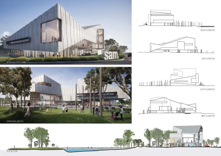
A lot of fun with some inverted wedge shapes (wedgies?), deftly playing up on contours of these volumes; in conjunction with the diamond shaped façade, this would give the Wyndham street view a great visual dynamic as you approach the gallery. Lyons really are great exponents of dynamic façade design and detailing. The volumetric shapes allow for the building to have a series of well articulated and diverse gallery spaces opening out to the lake. I like the ceiling of the Kaiela gallery. The galleries are generously and the central square would be great place for the kids of Shepparton to play up in.
KTA architects
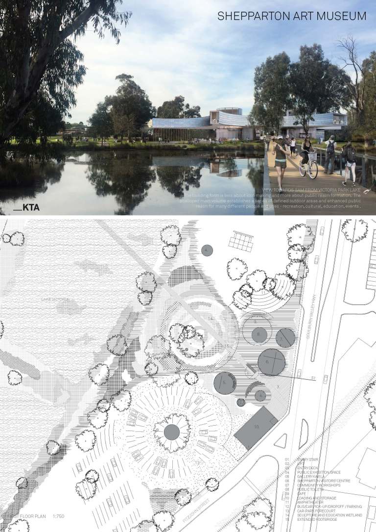
To be honest I actually like this one the best (is it ok if I say that?). I think this one pays more respect to the idea of country. I think it is because of the way that it attempts to drag the adjacent wetland and landscape into the building, and like the DCM scheme, I am a sucker for rooftops you can get onto. The space planning of the galleries look a bit constrained but I think the idea of a flowing circulation space and the sheltering canopy would be great backdrops for art. Being able to walk through it after hours is exactly what the punters need in Shepparton.
JWA
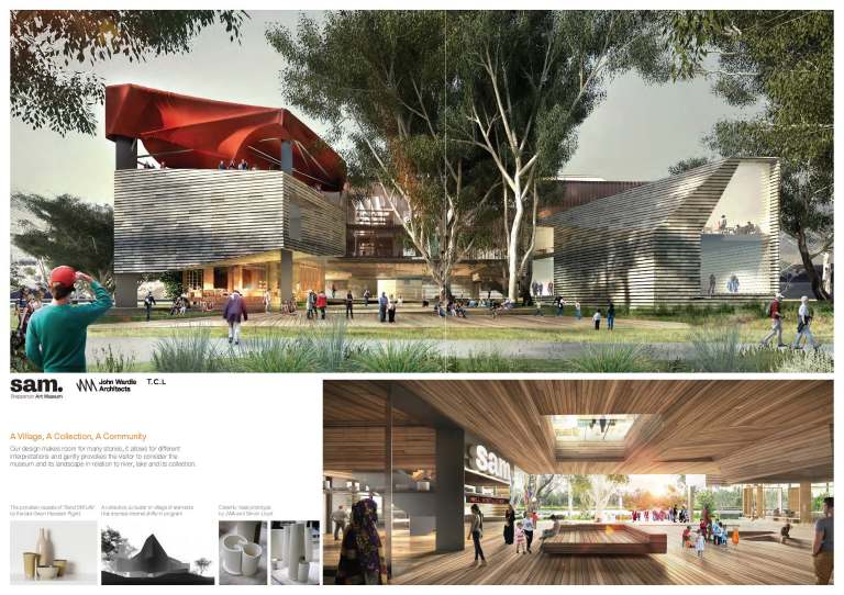
I work in a JWA building so maybe I am positively biased. In contrast to the materials in the Lyons scheme what distinguishes this design is the use of timber both inside and outside. The vertical circulation through the building and the arrangement of different rooms and spaces is functional and extremely well considered. There are some pretty cool bits that would work well: The circular aperture over the entrance gallery. The large outward facing window to the amenities area. As well as the surreal red canopy over the roof terrace (which presumably can be changed and is intended to change over time). There is a lot of architecture and architectural detail in this proposal.
MVS

Of all the schemes I think this one is probably the most subtle in terms of its concept.This is a more conceptually ambiguous proposal, than the other proposals, and perhaps that is a good thing. However, this ambiguity makes it harder to describe in a few words. At first glance it looks deceptively simple. A separate block and a courtyard block. There is no bluster or obvious kick in the head big idea. A distortion and break up of a traditional art gallery or museum typology. In the renders and the conceptual diagram it looks like the concept is structured around disruption and play between a forested landscape (country), a manicured landscape and the wetlands. A slightly different take on the themes in the KTA scheme. The kinda lumpy ceiling of the entry gallery looks like fun.The facade is also apparently ambiguous with hues of orange, yellow, pink and violet against a mesh-like pattern and material.
State of Play?
It’s a pretty good snapshot of the current state of play of Australian architecture. In light of the above I have tried to keep my remarks generous and resist the urge to let my critical faculties run wild. You can make up your own minds. My comments are based on the renders and plans to be found here. I would encourage all of you, especially students of architecture, to study and think about these submissions as these projects represent some of our best.
As with all good competitions you can vote on which one you like best. You can also do that here.
