The Zaha Grandparent Test: Turning your design into a great visual presentation.

A colleague told me her final year Masters design students asked her what the format requirements were for the final submission. What is the template they asked? She told them, as they were all doing individual projects, there were no right answers. There was no template. They were horrified and disturbed.

She suggested  that they each needed to design their own layout and graphics for their project. Of course, as all experienced architects know, by the end of architecture school students should know that there are no rights answers. Full stop.

Of course, such stories make me wonder about the power of computers to seduce young minds. Yes, I know this sounds cynical. But the computer is a highly controlled software environment ruled by algorithms producing another set of rules, graphical user interfaces and templates that are stable and static. Unfortunately, outside of this pleasant world of the rule regulated shimmering screen there are no rules. So here are a few ideas about making that design shine on the printed page or on some other digital platform. At the end of the day, or studio, your work needs to pass the Zaha Grandparent Test.

Drawings are read 

In the real world people “read” drawings. What do I mean? It is not like reading a book; nor, is it like watching  a television; or like looking at the screen of a mobile device.

The key to a great visual presentation is to understand that reading drawings or digital models is about getting inside the head of the person, or people who will look at our drawings and digital images. It is like a novelist who writes words in order to evoke images, sensations and thoughts in the person reading the book. Your drawings and visual images are “read” in this sense. If you do not prepare your presentation with this in mind you will fail to communicate your project ideas.

Approach it from the viewpoint of creating memorable images for your audience. What are the images that you need to produce that your audience of critics or clients will never forget? In other words create images they will think about even when they are fiddling around on their favourite app on their mobile phone.

RACHEL JONES FINAL LAYOUT_BLACK_Page_5

Layout is crucial 

When I look at architectural drawings or images on the wall. I don’t often read the text. I want to look at the images and get a sense of what the project is like. The layout of the drawings in the pdfs. or on the posters on the wall need to tell a story; in other words a narrative needs to be created that guides a “reader’s”, in other words a critic’s, “eye” through your architectural or urban design. In two dimensions either digital or physical you will need to describe and guide this “eye” through a three dimensional project.

What the project is like as a spatial entity, object or series of spaces is important. The spatiality of the design may need to be described and explained at different scales. At a urban scale in relation to a city or neighbourhood. How it is approached is important. At the scale of the street or its immediate neighbourhood. Entry conditions should be described. How do you enter the building and what are the spaces you first encounter when you are in it? What will a person see as they move through the building? What is it like at the scale of rooms? One way to do this is to organise your layout around these different scales or even the circulation routes around and through the building.

Layout is crucial to convey all this. It should not contain too much text as people want to see what the design is like. Too much text is confusing. Give your layout a heirarchy. Consider which information is more or less important. Structure it so that supporting diagrams, text and research information is adjunct to describe the spatiality of the building.

It is no good having one big aerial fly through or overall image if you then do not show the other spatial aspects of the project.

Always test your layouts with mock-ups and then refine them. Physically print them and pin them to a wall and then stand back and see what it is like. A bad layout has usually been done in one hit.

RACHEL JONES FINAL LAYOUT_BLACK_Page_4You don’t have to show everything. 

A good layout is a sequence of well organised images that convey a story and give an overall impression of the design. You do not have to draw everything. Tutors or critics who insist that you draw everything or you need to consider every detail are pedants. In the dark days of the 1970s I visited the architecture school up the road from my architecture school. I remember coming to the final year pinup and seeing sheets and sheets of plans, elevations, roof plans and sections. Every internal elevation, every external elevation and numerous sections. Line after line after black and white line of two dimensional drawings. There were even a few details. By the time the students had done all of these there was then no time to do any 3 dimensional drawings. The whole enterprise was as boring as batshit.

Drawing everything is a waste of time. Draw and translate into other media your digital models the  aspects and qualities about your design that are the most important. Architectural design communication is not about naive realism or trying to representing reality. You are not a failure if you haven’t drawn every elevation. In fact you can convey more about a design by just producing sections. After all plans are really sections anyway.

Only draw and present those images that convey the spatial, emotional or material narrative of your proposal.

RACHEL JONES FINAL LAYOUT_BLACK_Page_2

Design with the end image in mind 

Smart architects, at some point in the design process, plan their images, drawings and layouts ahead of time. They then put more design effort into those aspects of the building that will be presented and end up as images for others to view. In other words they start to design with the end visual product or presentation in mind.

Once you have a design up and running its always important to think that this will be presented and then work backwards from that. The worst presentations are those that desperately pop out at the end of the digital design process and get slapped around in Photoshop and slopped into InDesign.

RACHEL JONES FINAL LAYOUT_BLACK_Page_1Avoid excessive realism.

It’s not about copying reality. If your were going to represent your design as reality then you would build it at one to one scale. But, creating architectural images, particularly in the early stage of a project (sketch design),  and representing your design is not about making it real. It is not about filling in the dots with material likenesses, textures or colours of the real thing.

Yes, the sky is blue and bricks are red and concrete is a kind of grey. But that doesn’t mean we have to make everything look like its kind of real. Usually it just leads to really bad visual images that are oversaturated with colour and that reek of naivety. Drawings are not real, (look at Zaha Hadid’s early work for example), digital images are not real, 3d printed physical modes are not the real thing. So why try and pretend they are real? The best and most powerful architectural images are those that recognise this fact. Your images are representations and translations of your design. They are not the real thing and as such your images should represent the essential ideas of your design in the very manner in which it is presented.

Understand your media

We don’t all have Oculus VR set ups. So in the meantime we have to be able to translate our models from the computer to other formats. Sometimes these formats are actually physical. In the past we had a limited range of formats to translate or describe our projects in. Mostly just pens and pencils a and ink and limited range of reprographic techniques. I was an expert on reprographic techniques and using pantone for colour on drawings.

Today the techniques are different. Today with the proliferation of different platforms, software  and mobile computing your project may end up in a powerpoint, in a .pdf file, as a poster on a wall, on a web page or in the screen of an ipad or mobile phone. Its a good idea to remember which media you are translating or representing your design in.

Finally, the Zaha Grandparent test

Your images need to pass the Zaha Grandparent Test. Put your grandparents in front of your final Zaha like outputs and see what they say. They should both be able to understand what you have done and also be blown away as well. All of the above survival tips are another way of saying that to a large extent architecture is about image making. Of course how these images become a material reality is the topic of another blog. If not a few thousand blogs. Again, there are no right answers and after all isn’t that what architecture is all about.

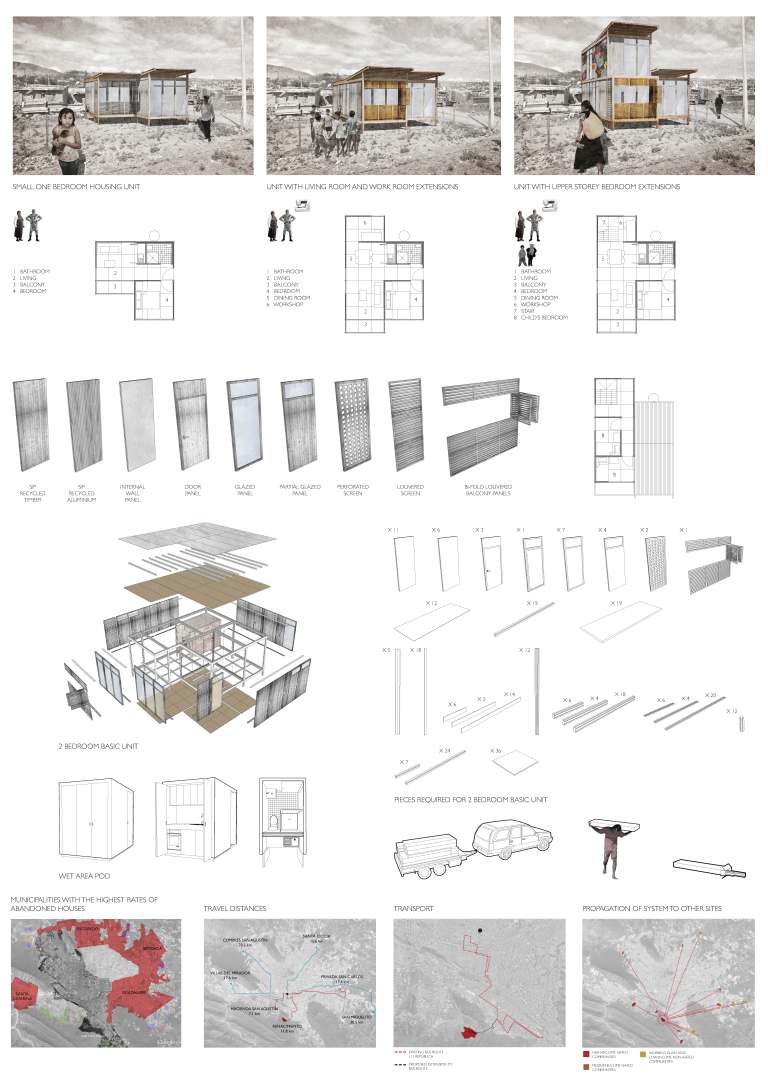
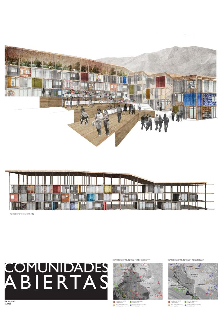
(The images are from Rachel Jones MSD MArch thesis from 2011.) 


Was Robin Boyd on Acid? The multimedia Space Tube at Expo 70.

Robin Boyd’s Space Tube, designed for the Australian pavilion at Expo 70, was a commission that came at a time when Boyd’s practice was struggling to make ends meet. From mid-1968 through to Boyd’s death in October 1971, his practice consisted of mainly residential houses and some more speculative projects. Amongst these projects, the Expo 70 commission was one of Boyd’s more significant commissions because of his use of multi media.

For todays architect’s multi-media technology is ubiquitous and Expos in the 21st century are mostly hyped up trade shows. Expo 70, the site of the Space Tube, in Osaka Japan, was the culmination of the 1960s neo avant-gardes dreams for architecture aligned with futuristic and universal values. Expo 70 crystallised the experiments of the 1960s neo Futurist avant-garde even more so than the previous Expo 67 in Montreal; this was perhaps because of the influence of the Metabolists who were directly involved with the planning of the many of the exhibits at Expo 70. (1)

DSC09059

Original sketch of the Space Tube from the Boyd Archive at the SLV

In general media coverage and most publicity photos, Boyd’s space tube is generally overlooked in preference to the “coathanger” structure of the Australian pavilion designed by the Government architect James McCormick. The Space Tube gained very little publicity from either the architectural press of the time or historians since. This is surprising given that it is one of Boyd’s most significant later commissions. The cost of the project, in 1970 Australian Dollars, was then estimated to be $700,000 and Boyd’s fee for the work was to be $75,000 (2 ). More importantly, it was a commission which was actually completed; of the 28 or so commissions that Boyd received from 1968 until his death, 7 were domestic commissions and 13 were speculative schemes. (3)

Slide1

As the Australian Expo 70 exhibits architect Boyd was responsible for the planning and circulation of the interior exhibition area, principally within the space tube. Boyd, in consultation with the Commonwealth Government committee overseeing the project, proposed that the exhibit would have four subject themes: “Man, Man and Nature, Man and the Man Made, Man and Man”. It was intended that these themes would divide the space tube or tunnel into four parts, which would then contain 19 exhibits (4). In notes for an early press release, Boyd makes note of these display boxes, which were to be built in Australia before being shipped to Japan, to be “simply bolted on and plugged into the power supply.”

The experience for the visitor within the tube itself was designed as a sequence of experiences controlled through movement. Boyd’s intention was that the motion should be barely noticeable. According to Boyd, “[t]he function of the moving platforms is not to excite or even to relieve the feet. Their main function is to give control.”(5). Through this use of multi-media technology, the architect was able to control the flow of visitors through the space, and hence “present a sequence of exhibits, knowing that the visitor can view them only in that sequence.” After leaving the first crush space and stepping onto the travelator, the visitor was presented with a view of the entire tube for the first time. As the opening of each display was inset from the tube surface and arranged at a right angle to the axis of movement, all that could be seen was a series of bright lights and colours shining onto the visitors ahead.

In the final scheme there were 20 displays or subject areas in all. Each display or subject area was comprised of up to four display boxes, arranged radially around the tube. The visitor was moved past the displays by means of twin moving travelators which positioned the visitor’s eye level roughly in the centre axis of the tube. The travelators were supported from below by a minimum of structure, to allow an unimpeded view in all directions from the moving platform. The tube itself was made from “Gunnite”, a form of shot concrete on mesh reinforcing which created a thin shell. Attention was paid to the finish of the tube, with construction drawings stipulating a smooth, uniform finish on the outside surface and a matt black “acoustic surface” on the inside. The tube’s status as a design object was as important for Boyd as its role in presenting a view of Australian society.

Slide1

Boyd was also responsible for the design of what was termed “technamation effects”. This was a multi-media technique achieved by projecting from two or more lights or projectors onto a polarised screen. As the viewer moved past the display, the screen would shimmer and ripple with colour and light. These effects were incorporated in a variety of ways into six of the display boxes. The best example is exhibit 17C, ‘Night City’. A model of a city block in exaggerated perspective was fitted on top of the polarised screen. Beneath the screen were six projectors mounted in opposing directions, creating the illusion of night traffic through moving red and white lights. What was otherwise a quite simple and almost dull model was in this way enlivened through animation. However, instead of a moving image or mechanical device, it was the viewer in motion which brought these displays to life. Visitors within the Space Tube were thus tangled in a complex set of visual relationships. The layout of the displays, in particular their height and angle in relation to the visitor, was one method used to control and organise these views. For example, the displays mounted horizontally (in the cardinal arrangement referred to above) made use of the level horizon line to suggest an equivalence between the visitor’s gaze and the subject matter. For instance, in exhibit 13C ‘Repco Brabham’, a cutaway model of a Formula 1 racing car is surrounded by a projection screen showing the car driving around a track. The view is arranged so that the visitor watches the track from just behind the car as Brabham makes his lap.

In contrast, the displays mounted at 45° to the horizontal present a more varied set of views. The displays below the walkway, such as 2C, 2D, 6C and 6D, present stylised views of the abyss – the mine, soil and what Boyd referred to as “the beasts in the pit”.(6) The circular frame of the display openings emphasise the detached and special view, appearing to be the viewfinder of an enormous microscope in exhibits 2C, ‘Some of the Body’s Microscopic Enemies’ and 2D, ‘Defence Cells Emerging from a Lymph Node’. The displays above the walkway more often include images of authority figures as part of their design. For instance, in exhibits 2A, ‘Immunology’ and 2B, ‘Organ Transplants’, circular screens were included which displayed projections of Gustav Nossal and Macfarlane Burnett, respectively. These images literally and figuratively look down on the visitor, countering the visitor’s gaze. These two displays include another recurring motif of Boyd’s design, the life-size transparent acrylic mannequin. A toy called “The Visible Man” and a teaching aid developed at the University of Michigan called “TAM” inspired Boyd (7). Both were human figures created with a transparent skin which revealed the organs inside. Boyd’s use of figures and bodies seems more scientific and anatomical than overtly erotic; however the experience for the visitor was doubtlessly voyeuristic (8).

Boyd was also central to the design and production of all the film, visual sequences and sound effects. He specified in detail the subject matter of each sequence, and personally chose the images used for each slide and film sequence. Though concentrated in the final displays, visual and multimedia effects were used throughout the tube as the central element of most displays. This was probably one of the largest and most extensive Australian multimedia projects of its time. In Boyd’s own words the purpose of the displays was to “capture the eye and the ear with light and colour and movement with music and sounds with 28 movie projectors and 46 synchronised slide projectors with hundreds of fluorescent tubes and 200 incandescent lamps.” (9). Circular screens were incorporated into most of the displays. Some of these screen arrangements were highly complex – for instance, exhibit 7B ‘Asian Aid’ was composed of six circular screens at the end of tubes housing a slide projector, each of which slid forward into the main space to reveal captions and subsidiary information printed on the side of each tube. Exhibit 3 ‘Tennis’ was made up of two projection screens facing one another across the tube, showing two players – Lesley Hunt and Yvonne Goolagong – playing a game above the visitor’s heads. Exhibit 17A ‘Ballet’ made use of moving screens, variable focal lengths and multiple projections to create a complex sequence of images (10). Sound effects were synchronised to visual cues for most of images, all of which were described and stipulated by Boyd. The Australian composer George Dreyfus was responsible for composing four variations of the pavilion theme, which were played at equal intervals along the tube.

The motion of the viewer through the tube constantly reinforced the logic of inevitability and progress within the subject matter of the exhibition material, and vice versa. For example, in Exhibit 20, the ‘abstract colour image’ designed in association with J.S. Ostoja-Kotkowski, was intended to literally be the “light at the end of the tunnel… visible all the time that the visitor is in the tube”(11). In effect, it was also a visual echo of the kaleidoscopic sun of first exhibit. From the very beginning, the Space Tube was thus a passage from a red/yellow stylised contemporary sun to a blue/green argon laser ray abstract future, toward “an absolutely explosive visual phantasmagoria in 3-D ” (12).

Of course this all makes me wonder if Boyd had at some stage taken LSD. Boyd’s thematic explorations certainly mark him as an architect of his time. But the design for the Space Tube does hint at the media driven technological future architects now find themselves immersed in (13). The degree to which contemporary architects have the same control over, or experiment with, new media technologies as Boyd did  is debatable. Boyd may not have actually taken acid. But it would be nice if we could direct such an accusation at contemporary Australian architects a bit more often.

This is an edited version of a conference paper co-authored with Simon Wollan.Peter Raisbeck And Simon Wollan Boyd As “Bower Bird”: Robin Boyd’s Space Tube And The Global Avant-Garde. SAHANZ 2003. 

NOTES.

1. For details of Expo 70 in architectural magazines see the entire issues of: Architectural Design June 1970 especially p 271 for comment on the Australian pavilion and Japan Architect 1970 Vol 45 N0. 5/6-164 see especially Koichi Sone, Sei Oyuki, and Yuji Morioka, “Moving Walkways and Urban Traffic” as well as p. 69 for a comment on Kikutake’s Expo tower.

2. Fee agreement for the project was signed on the 22nd of October 1968; to be paid in monthly instalments as the work proceeded. For this fee, Boyd’s brief was to design the Space Tube and its display cases in a way which would depict Australian life and industry to a primarily Japanese audience. The Commission also extended to producing and managing the construction of designs for the merchandising which was to be associated with the exhibit. Refer to Box 104, GRB Archive, State Library of Victoria.

3. His most significant civic architectural commissions during this time were Churchill House, exhibition designs for the Australian Chancery in Washington and the ”First 200 years exhibition” in the foyer of Harry Seidler’s Australia Square building.

4. In the original proposal the exhibits were numbered from 1 to 19 with the following subject titles and in the following order: origins of humanity, the battle against disease, science of the mind, enjoyment of life, Australian invention in agricultural technology, Soil and Water, Exploring and preserving resources, Exploring the Universe, utilization of Polar Regions, Transportation, Modern Living, Urbanisation, Automation, Language and Literature, Communications, Fine Arts, Lively Arts, Australia-Japan Relations, The Film. Refer to Box 104, GRB Archive, State Library of Victoria.

5. Robin Boyd, “Australia at Expo 70 for Walkabout” , undated text, Box 103 (c), GRB Archive, State Library of Victoria.

6. Letter from Boyd to Prof. G. Nossal, 11 July, 1968. Box 103 (a) GRB Archive, State Library of Victoria.

7. Letter from Boyd to J.P. Tyrer (Acrylic Industries), 7 October, 1968. Box 103 (a) GRB Archive, State Library of Victoria.

8. Further work, which is outside of the scope of this paper, is required to fully establish how Boyd fetishised these figures as objects, and the more general effects of the technological gaze within his designs.

9. Robin Boyd, “Australia at Expo 70 for Walkabout”, undated text, Box 103 (c), GRB Archive, State Library of Victoria.

10. First, a film loop showing dancer’s legs was projected onto the front screen, nearest the opening to the tube. Next, an image from a slide projector appears small and out of focus on a screen behind. As this screen moved forward the image enlarged and came into focus, before again going out of focus and diminishing in brightness. From the visitor’s point of view the slide image passes through the film image, literally deepening the visual field of the screen. Refer to Box 100/3, GRB Archive, State Library of Victoria.

11. Letter from Boyd to J.S. Ostoja-Kotkowski, 16 July, 1968. Box 103 (b) GRB Archive, State Library of Victoria.

12. Letter from Boyd to J.S. Ostoja-Kotkowski, 9 October, 1968. Box 103 (b) GRB Archive, State Library of Victoria.

13. This compression of time and consequent distortion of space also appeared in individual exhibits. For instance, exhibit 13D ‘Shipbuilding’, displayed a model of a ship growing from blueprints to steel structure to dry-dock construction to finished bow steaming steadily ahead through a technamation wave. However, instead of showing each ship in sequence, each stage occurs on a portion of a single hull, giving the sense that the ship is impatiently sailing through time into the future. That this exhibit is the only one mounted directly below the visitor, between the two travelators, ensured that this movement was aligned with that of the viewer.

Design Leadership & Architects: the myth of the SGDL (Singular Design Genius Leader).

In architecture the model of the Singular Genius Design Leader (SGDL) is hard to shift.  In theory, the SGDL has great ideas that are then pursued through force of will and strength of personality. Think Corb, Mies or FLW and then in more recent times Rem, Daniel L and maybe even Frank G. Here in the provinces, far from the East Coast and British breeding grounds of architectural pedigree, we have our own versions of the SGDL. What surprises me more than anything is that ticking all the right boxes as a SGDL doesn’t neccessarily mean a client gets a great designer or a better project design. SGDL’s, do not always come with good ideation or design skills. In Melbourne a city of four million people we have had a few spectacular architectural disasters as a result. That says a lot about the provincial conservatism, and dare I say it incompetence, of clients.

An SGDL who simply throws their minions a few sketches, after a few moments thought, and expects it to be great architecture doesn’t really hack it with me. A SGDL who micro-manages every detail is also a danger to clients; as is a SGDL whose ego is linked to having contrary opinions; cant abide having employees with diverse opinions; worse still a SGDL who doesn’t really get diversity.

Design leadership is more nuanced  than the SGDL archetype suggests. Simply exerting your will on acolytes or riding waves of celebrity across social media doesn’t make you a great architect. Thank god there are architects around who have completely rejected the SGDL model. Mostly these, by and large, younger architects continually generate ideas, have the insight to sift through ideas rather than latching onto one and have the skills to negotiate their way through the complex process of making architecture. They believe in diversity, collaboration and are comfortable with ambiguity. So for those of you brave souls who have abandoned the SGDL model here are a few of my own thoughts about design leadership.

Idea generation 

Idea generation is important. Design leadership is about both generating and then managing conceptual design ideas. This is not simply a matter of hurling out one or two idea’s from the ego. Most exploratory or generative design activities take place in the early stages of a design process and design leadership is about encouraging and fostering the development of these ideas once they begin to exist in various media.

An essential task of design leadership is to allow a team and other collaborators to explore, structure, critique and if necessary kill off ideas as they are generated. For example, design leadership is about encouraging their collaborative teams to use the conceptual and sketch design phases to  generate new subsidiary design solutions in order to advance the design to the next stage.

Design leadership is also, I think about collaborating in order to make the above process happen as quickly as possible.

Seeking paradox 

Design leadership is about deliberately seek to foster highly paradoxical processes within their firms in order to create new design knowledge. To achieve this great design leaders employ their team to continuing to simultaneously generate both radical and incremental design solutions throughout the design process.  In other words, design leadership is about continually questioning and reconsidering design knowledge at the point that it  is being created. More importantly good design leaders can pursue in parallel seeming paradoxical ideas at different scales. For example, whilst a detailed construction solution is being developed the conceptual structure of the project may be reconsidered. Even though a design concept might be settled, encouraging new design solutions or exploring the design itself, at different scales, in order to seek new concepts and solutions is important.

Hence, design leadership is about managing concurrently and in parallel. Architects can learn a lot from concurrent engineering.

Tolerating a culture of chaos 

Effective design leaders can generate mess and then tolerate the implications of this. Bad design leaders close down chaos and neaten everything up. Design leadership is about tolerating and being comfortable with a level of chaos. Design is not a linear sequence. Good design leadership means being able to cope with ambiguity. Being able to know where the design and its myriad lines of development are at any one point. Knowing who is exploring what in the design team. Perhaps the solution isn’t set in stone, perhaps some new lines of design research are running in parallel, perhaps some information is yet to be ascertained. In some ways good design leadership is about trying to destroy the very ideas that have emerged as a result of collaboration.

The problem with the SGDL model is that too often design ideas go untested and their limitations are not fully explored. Too often in the SGDL model the monolithic concept reigns supreme and it is never tested. Our cities are riddled with too many of these only line architectural concepts. Moreover, design innovation does not happen in a climate where the culture is focused on correcting deviations, minimising risk, imposing rules, ticking boxes and placating the clients or managers further up the food chain. Just ask Steve Jobs.

By deliberately fostering or generating messy ideas or seemingly chaotic expressions of those ideas a good design leader can quickly generate and then test a portfolio of ideas.

Designing with governance in mind. 

Despite the chaos and ambiguity in the design process design leadership is also about governance. Design leadership is about concerning itself with creating a decision support framework to guide design governance, workflows and the adoption of the design by others. This is one principal tasks of design leadership. To create and manage and mileux where design decisions can be made. The implementation and development of a conceptual idea means a team’s  IT tools, infrastructure, technical skills, workflows and even business processes must also be managed. But, all too often, it is unfortunately common that SGDL’s rarely care that much about such things.

Organisational project and team design processes should not be dictated via a top down strategic management approaches. The top down approach is the only mode of the SGDL. Alternatively, generative and exploratory design actions that emerge out of a well led design team are key drivers of design innovation. Good design leaders make the decision where the information is.

Sadly, the old ways still abound and this is to the detriment of the profession as a whole.

Surviving a design jury presentation: The essential guide. 

Design juries can be terrifying. It doesn’t really matter if you are an architect or a student the experience can be soul destroying. Get it wrong and you can lose the job or fail. Get it right and you live in order to fight another day. Standing in front of a group of critics can determine if you get the job; or the prize; or if you are at architecture school, a pass in  design studio. It’s much harder to present if you haven’t done enough work or you don’t really believe in the project. But speaking well in public and knowing the essential lessons of presenting a design can be the difference between passing or failing.

I have sat in on numerous design and award juries. The awards or the commissions don’t normally go to the architects who talk too long, speak in jargon, or bore the jury with an explanation of the stair and or toilet details. So here are a few essentials that will help calm the nerves and get you through if you are not used to public s peaking or always find presenting to a jury harrowing.

Timing 

When you are presenting to a jury. Get the timing right. Don’t run over time or drone on. Architects are notoriously bad at timing there talks. As a student I went to the old AIA International Lecture series. All I  remember is Hans Hollein talking for around 3 hours straight. Aldo Van Eyck was the same. Will Alsop did it to us as well. Each time it happens to me it is excruciating. It doesn’t really matter how good the work was an overly long talk will kill any audience interest or curiosity. But, at least Will Alsop was kinda interesting because he was long winded as well as being drunk. But I still would have given him an E for going over time.

A picture says a thousand words

If you are smart, or English is your second language you don’t have to say a lot. The more diagrams, images or other representations you have to present the less you have to say. The less visual material you have on the wall the more you have to explain what is not there. There is nothing worse for a jury than seeing an under designed scheme that is then talked up, explained and elaborated in words.

In presenting to a jury architects need to remember to right balance between about talking and what is on the wall or on the digital files. Architects are visual and jury members like to look at images. I tend to think it is better to have more visual material than text on your drawings or images. There is nothing worse than having a few thousand words of detailed and so called explanatory text on architectural presentation pdfs. A short summary of the concect is good. Like an abstarct it should be no more than 300 words or so. The rest should be diagrams including, charts, graphs, flow charts and conceptual diagrams explaining the concept. Minimal text is good. As well as two and three dimensional views that explain the design.

In short there should be enough visual material on the wall to make your life easy explaining it. You wont always be there to explain you work. This is particularly the case for competitions and when a jury member or critic reviews the project later. So the layout and the visual argument of the design with any supporting diagrams is very important. This is why clear and communicative graphic skills are important.

Just cutting and pasting the renders out of the virtual world into photoshop and then sending them straight to the printer doesn’t really work. Slapping together a layout doesn’t really work. Keeping it in the computer up until the last minute doesn’t really work. Over-talking or over-texting the project doesn’t work.Filling your drawings with slabs of text doesn’t really work.

As a presenter of a design the aim is to lead the juror’s and critic’s eyes to the drawings. The aim of what you say is to get them to understand the visual argument and, in the minds, to inhabit the space. What you say to a jury in words must be linked to the images.

Don’t avoid talking about the concept 

Some architects find it difficult to talk in conceptual or theoretical terms. This may be in apart training and it is usually because for some architects it is easier not to talk about history, aesthetics, compositional processes, form, critical theory or the politics of urbanism. But this is exactly the sort of thing a jury wants to hear.

Bad presenters or architects, or students, who have not got a great content on the wall talk a lot about the other stuff. Like, what they had for breakfast. How their semester shaped up in terms of blow by blow and sequential description of how the design happened. Usually the easiest way to do this is to talk about everything that doesn’t matter. There is nothing worse than hearing a long winded talk about the pragmatics of  project. Siting, briefing, sustainable technologies, construction and materiality, client and user preferences can all too easily dominate any presentation. A great design is not simply a response to these factors; nor should it sound like it.

Most jury members and critics are architects who know a lot about that kind of stuff. Good architects have mostly spent there life trying to escape from the contingencies of pragmatic design. Mostly they are there because they have an interest in the strategic issues, problems and broader views not the details. Jurors and critics want to hear and talk about the big ideas. For a jury member going to an awards presentation is a bit like going to one of those TED talk thingys. As a jury member you want and expect to hear about life the universe and everything in relation in a very focused way.  Design Jurors and critics like to debate ideas in relation to the design. Give them what they want and don’t avoid talking about the conceptual apparatus and how it has shaped the building.

Of course, if you just talk about life the universe and everything and not the project design then you should be doing philosophy.

Structure 

Guide the jurors eyes to the design. The way you structure the presentation should reflect this. Avoid the “this is what I had for dinner” or the “passage through life” syndromes. Get to the point. The first thing a jury wants to here is about are ideas. This will give them the context from which their eyes will begin to apprehend and understand the design and inhabit the building in their imaginations.

Do it as an elevator pitch. In three or four sentences you should be able to say what the project is about. What is it’s over riding concern or concept? The sooner the jury is familiar with this the more they will feel comfortable with looking at the design. Don’t leave the concept to the last minute. The best way to present to a jury is as follows. The improtant thing is to guide the jury to the design and the images which describe it.

You also need to lead the jurors thought the building. You can do this by describing how they enter the building, how they circulate thought it and what qualities of light or spatial qualities it has once they are inside or moving through it. The point is that you need to guide, not unlike a tour guide, the jury members or critics through your design.

  1. Introduce your self and the concept
  2. Quickly describe 3 or 4 ways that the concept has shaped the design of the building.
  3. Lead the jurors through the design quickly discuss: Siting, main entrances, circulation and spatial qualities of different spaces.
  4. Summarise what the design contributes to design knowledge and what you would do to evolve the design further.

And then you can be ready questions. Of course you in the above scenario there are whole lot of things you have not spoken about. Like materials or what or how its constructed or where the toilets or parking are. Some jurors like to ask these questions and by not mentioning them and yet being prepared for them. You will end up sounding knowledgable and thoughtful. Nevertheless, the main aim in the question period is to get a discussion going about the design, its associated concepts and what it says about the designers attitudes towards the particular type of architectural or urban problem the design encapsulates.

Public Speaking 

Don’t speak as if you are channeling a bad power point slide. A badly formatted template with crap images and too much detail on each slide. Keeping it simple is best.

I once saw the director of an architectural firm destroy his firm’s chances of getting  a $150M project by the ineptitude of his presentation. After 10 minutes everyone in the audience felt the same. After 10 more minutes I wanted to stab myself in the eye with a biro. The problem was that the presentation went on for another hour. It was scheduled to be only 35 minutes. The firm did not get the job and the primary topic of conversation in my email inbox, by other attendees, the next day was how bad it was. I just hope someone told him.

All the rules of public speaking apply. Don’t forget to wear your bow tie or best shoes. Get a good nights sleep before hand and rehearse, rehearse and rehearse. Practice in front of your grandmother or your non-architectural friend’s. See if they get it. After all it could mean the difference between getting the architectural commission or doing the Uber thing: Who wants to be an Uber driver after seven years of study?


Is BIM as good as it looks ? What Deleuze can teach us about BIM

In the Building Information Modelling (BIM) utopia representations of time are linear and easily progresses into a future where BIM enables seamless collaboration across the full gamut of design orientated disciplines. The viewpoint presented in the various BIM representations and advertising that litter the internet is often that of an eagle, or angel, freed of all earthly constraints and propelled towards a future BIM revolution. But unlike the critical theorist Walter Benjamin’s iconic image of an angel looking back on the wreckage of progress these images of BIM do not indicate a reflexivity that recognises that not every technical innovation succeeds or that technology has a social-technical dimension.

In theory, BIM project models paired with collaboration tools offer a number of significant improvements and benefits over traditional design, delivery and supply chain processes. Proponents of the BIM utopia claim that the BIM will change and be linked to augmented reality, enhance lean construction, scheduling, safety management, trade scheduling, progress measurement, design visualization and even architectural design studios.

But as some researchers have noted the BIM dream is not all it seems to be. For example the IFC’s, which are at the heart of BIM collaboration often “fails to provide complete interoperability.” 

BIM careerists, proponents and evangelicals claim that BIM is a new mode of visualization. Someone once said to me you can tell a BIM building because of the limitations of form that seem to be built into BIM software. Nonetheless, emerging from and circulating in BIM research discourse and the public domain the above claims are supported by a plethora of BIM representations. These often include strategic and operational diagrams, screenshot images and animations available in research papers, publications, reports, various how to do BIM manuals and numerous animations across the internet.

As the BIM industry has arisen as numerous, and in some ways glamorous, case studies and screenshot images are published and promoted as examples of successful BIM operation. The colours employed are seductive and colour is the key feature in numerous BIM screenshots. For example, a shimmering green is a often contrasted with yellows for services and purple. The viewpoint is often from a point looking above or below and is positioned to emphasise the layering of different systems and suggests a layered complexity constituted by the overlapping of many different small scale construction elements. With these highly seductive images it is argued that BIM can improve workflows through clash detection and management, better two dimensional drawing extraction, automated quantity take-offs, supply chain integration and facilities management integration.

bim-4

The French Philosopher Gille Deleuze’s encounter with cinema is a useful, although to some it might seem surprising, critical framework in the BIM context. Deleuze wrote two philosophical books about cinema. Deleuze saw cinema as a “new practice of images and signs, whose theory philosophy must produce as conceptual practice.” Deleuze’s concern is not a philosophical investigation of cinema’s essential nature. Unlike the proponents of BIM Deleuze did not simply proclaim cinema as a technological revolution. Rather, he was interested in interrogating the cinema for its possibilities about what it might become. Deleuze argues that cinema establishes the problems of traditional subject orientated epistemologies. Deleuze cites Henri Bergson as a philosopher who opposed a view of the world that is predicated on a static and centred viewpoint or subject. Deleuze sees in Bergson a philosophy that accounts for the early technological advances of cinema as well as anticipating its later developments. But, Deleuze also saw the cinema as constituting a language of images. Deleuze’s conception of image is something which is neither representation, secondary copy, imitation or mimesis.

These perspectives suggest that BIM research R&D should oppose a concept of BIM that privilidges linear sequences, singular perspectives and robotic notions of construction that ignore the randomness of craft.

The above considerations suggest that new methodological approaches are needed in the area of architecture and BIM R&D. If BIM is to reach it’s full potential as a tool which saves resources and allows better architectural design outcomes. Future BIM research needs recognise the power of different representational modes, stochatsic and random events, social milieu and avoid seeing a building as a simplistic digital-technical object or diagram linked to a database.

Stochastic processes which are random and are capable of using agents and swarms to predict what will happen within BIM models may reveal more than the static and mechanical models which seem to plague BIM research today. Notions of time should be seen as being multi-layered and interdependent of sequential BIM animations and screenshots. BIM models should be seen as entities which develop over time from the beginning of the design process where there is a iterative transfer of information between designers, teams, and 3D representations of buildings built in computers.

In BIM research critical theory should be employed to ensure that the architects of the future do not relinquish their canon of knowledge regarding the craft of building to mindless databases.