Rising and Falling Stars: Australian vs. Global architectural firms

This last week or so at my graduate school of architecture the students were lining up for selfies with Bjarke when he came as a part of the Beulah International competition. It was quite a commotion. Initially, I wanted to puke, there was a lot of black, and I mean a lot. Black tees, black jackets and black horn-rimmed glasses. Everyone looked liked gangsters on a Eurovision set. Most people who read this blog know how jealous I am of Bjarke’s hairstyle.

After my initial revulsion, I calmed down and realised that Bjarke was here for the Beulah International competition to design a mixed-use high rise complex on Southbank in my City of Melbourne. For Beulah quite a few of the local firms got together with the stars.

Beulah Competition: The Local-Star Match-Ups 

  • Bjarke Ingels Group with Fender Katsalidis Architects
  • Coop Himmelblau with Architectus
  • Mad Architects with Elenberg Fraser
  • MVRDV with Woods Bagot
  • Office for Metropolitan Architecture (OMA) with Conrad Gargett
  • UN Studio with Cox Architecture

In December the South Australian government announced the shortlist for the Adelaide Contemporary Art gallery. This list was as follows:

  • Adjaye Associates (UK) and BVN with Steensen Varming, McGregor Coxall, Barbara Flynn and Yvonne Koolmatrie
  • Bjarke Ingels Group (Denmark) and JPE Design Studio with United Natures, Arketype and BuildSurv
  • David Chipperfield Architects (UK) and SJB Architects with Jane Irwin Landscape Architecture and Arup
  • Diller Scofidio and Renfro (USA) and Woods Bagot with Oculus, Pentagram, Katnich Dodd, Rider Levett Bucknall, Arup, WSP, Deloitte, Kaldor Public Art Projects, Klynton Wanganeen, James Sanders, Dustin Yellin, Right Angle Studio and Garry Stewart
  • Hassell and SO-IL (USA) with Fabio Ongarato Design, Mosbach Paysagistes and Fiona Hall
  • Khai Liew, Office of Ryue Nishizawa (Japan) and Durbach Block Jaggers (Australia) with Masako Yamazaki, Mark Richardson, Arup and Irma Boom

Rant Free Zone

Firstly, I will try and avoid a rant about how much I hate the star system and the paucity of risk-taking on the part of our institutional decision makers. Yes, it was great to see some emerging practices and voices in the Adelaide lineups and a focus on indigenous narratives for some of these teams. As time goes on, I think this focus will increasingly have to be a consideration for public commissions. But what does the overall inclusion of so many stars say about architecture in Australia? Have we lost our nerve?

Local Grunt with Super Star Strategy

In strategic terms what do these collaborations say about global competition, competitive advantage and the branding of architects in Australia and Australian architecture as a brand across the globe.

What struck me was that there is no single stand-alone Australian architect in this bunch. In both of these competitions, the short-listed firms are Australian architects aligned with the so-called star architects. Now far be it for me to preach some kind of little Aussie battler nationalist bias. But it is nonetheless vital to ask a few more questions about this situation:

As a strategy is it wise for local architectural firms in Australia to collaborate with these so-called stars architects? The old aphorism is that the local partner brings along well needed local expertise and on the ground knowledge. In other words, the international star designs and the local, seemingly domestic, partner implements.

Are Australian architects the documentation drudges of the global system? In these competitions have the Australian firms, in these collaborations, become global lackeys. The so-called second rate “drafties” of the global system? But is it really as simple as this? And in an increasingly media driven international marketplace for architectural services perhaps this strategic rationale is only partially valid.

Outsourcing 

In this context, one could argue that the Australian firms might provide the local technical grunt. This is in line with the overall trend towards the global outsourcing of documentation services. Across the global system, privatisation policies, and shareholder value practices have led to a situation where there has been a rise in outsourcing for architectural and building documentation.

The rise of digital technologies and the labour rates in the so-called global south have led to an increase in digital outsourcing for documentation. The late Bharat Dave in his own work noted the rise of offshoring architectural services which began in the late 90. Outsourcing has coalesced in places where there is an ICT infrastructure aligned with skilled workforces and low labour costs. Dave noted in 2010 a situation, that is now commonplace, where designs in one country are modelled in another, documented in yet another and then fabricated in another. It is not hard to concur with his conclusion that this situation necessitates the need for the “reconfiguration of practice in the long term.” ⁠

This situation has only accelerated in recent years, and it is perhaps naïve to think that the reconfiguration of practice is solely about the outsourcing and subsequent commodification of the services, such as technical documentation that designers seem to loathe in the first place.

The problem with partial services 

In these matchups, local architectural firms ruled by economic survival might find some comfort in being more easily able to modify the range of services they provide; being able to provide the technical grunt. Yet this flexibility poses a dilemma: to be more profitable, these firms need to offer a complete range of services. But as a result of changes in technology, partial services are less profitable and also readily supplied by non-architectural competitors. Consequently, many middle-ranking and larger firms have no choice but to provide limited or partial services despite the fact that this only encourages, and leads to, further disintermediation, and commodification in their markets. Providing partial services may be unsustainable in the longer term. For the local collaborating firms it might be a vicious cycle.

Mapping Strategy 

There is another issue that these two competitions point to, and that is the role of the internet and media to shape perceptions and the branding of architects. The following strategy diagrams map media impacts of the collaborations in these two competitions. I charted media hits (as measured by Google) of the stars against the reach of the local firms (number of Australian plus Internationaloffices of the local partner). I will let you make your own analysis of what all this means. My take is that clearly for some offices the match-ups appear to be ad-hoc and without any strategic intent. For other practices, the diagram shows who might gain or lose from the collaboration.

Slide1

Clearly, it also suggests who might win these competitions if this was the only criteria. It also shows which local firms may be using the collaboration to either extend their range or extend their brand by being attached to a star architect.

Slide1

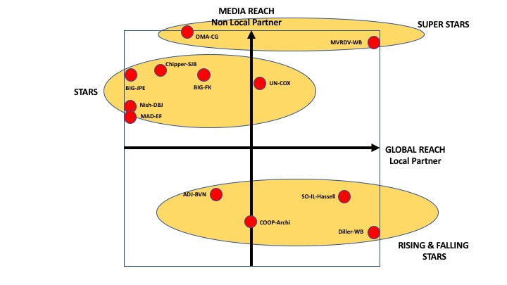
For many Australian architects or any firm on the periphery of the global media starchitect system, such collaborations are perhaps necessary.  Since the early 2000s if not before, architects are no longer grounded in a particular office or geographical location. Competition amongst architects is global in the intense global competition for architectural services, arguably Australian firms need to extract value from networks and systems of patronage no matter how distant they may be. The star architects are better able to do this because they operate from larger economic centres.

Commodification of Design 

In any case, this all points to the ongoing commodification of design services. Perhaps the local/star matchups, point to the dumbing down of design into seductively drawn products with market signals that scream out “star-designer.” This is regardless of the fact that these designer products, seem to retain a threadbare relationship to what might have formerly been regarded as a traditional design process. Many of these designer products, indicate no interest in the memory of city or any sense of freedom and politics to be found in local communities.

Taken together, Australian firms need a renewed emphasis on strategic thinking, better management, a recognition of the media landscape, and internal research to gain competitive advantage. Otherwise, Australian firms will be doomed to be secondary actors, and lackeys, swilling around in the global system of architecture.

The Zaha Grandparent Test: Turning your design into a great visual presentation.

A colleague told me her final year Masters design students asked her what the format requirements were for the final submission. What is the template they asked? She told them, as they were all doing individual projects, there were no right answers. There was no template. They were horrified and disturbed.

She suggested  that they each needed to design their own layout and graphics for their project. Of course, as all experienced architects know, by the end of architecture school students should know that there are no rights answers. Full stop.

Of course, such stories make me wonder about the power of computers to seduce young minds. Yes, I know this sounds cynical. But the computer is a highly controlled software environment ruled by algorithms producing another set of rules, graphical user interfaces and templates that are stable and static. Unfortunately, outside of this pleasant world of the rule regulated shimmering screen there are no rules. So here are a few ideas about making that design shine on the printed page or on some other digital platform. At the end of the day, or studio, your work needs to pass the Zaha Grandparent Test.

Drawings are read 

In the real world people “read” drawings. What do I mean? It is not like reading a book; nor, is it like watching  a television; or like looking at the screen of a mobile device.

The key to a great visual presentation is to understand that reading drawings or digital models is about getting inside the head of the person, or people who will look at our drawings and digital images. It is like a novelist who writes words in order to evoke images, sensations and thoughts in the person reading the book. Your drawings and visual images are “read” in this sense. If you do not prepare your presentation with this in mind you will fail to communicate your project ideas.

Approach it from the viewpoint of creating memorable images for your audience. What are the images that you need to produce that your audience of critics or clients will never forget? In other words create images they will think about even when they are fiddling around on their favourite app on their mobile phone.

RACHEL JONES FINAL LAYOUT_BLACK_Page_5

Layout is crucial 

When I look at architectural drawings or images on the wall. I don’t often read the text. I want to look at the images and get a sense of what the project is like. The layout of the drawings in the pdfs. or on the posters on the wall need to tell a story; in other words a narrative needs to be created that guides a “reader’s”, in other words a critic’s, “eye” through your architectural or urban design. In two dimensions either digital or physical you will need to describe and guide this “eye” through a three dimensional project.

What the project is like as a spatial entity, object or series of spaces is important. The spatiality of the design may need to be described and explained at different scales. At a urban scale in relation to a city or neighbourhood. How it is approached is important. At the scale of the street or its immediate neighbourhood. Entry conditions should be described. How do you enter the building and what are the spaces you first encounter when you are in it? What will a person see as they move through the building? What is it like at the scale of rooms? One way to do this is to organise your layout around these different scales or even the circulation routes around and through the building.

Layout is crucial to convey all this. It should not contain too much text as people want to see what the design is like. Too much text is confusing. Give your layout a heirarchy. Consider which information is more or less important. Structure it so that supporting diagrams, text and research information is adjunct to describe the spatiality of the building.

It is no good having one big aerial fly through or overall image if you then do not show the other spatial aspects of the project.

Always test your layouts with mock-ups and then refine them. Physically print them and pin them to a wall and then stand back and see what it is like. A bad layout has usually been done in one hit.

RACHEL JONES FINAL LAYOUT_BLACK_Page_4You don’t have to show everything. 

A good layout is a sequence of well organised images that convey a story and give an overall impression of the design. You do not have to draw everything. Tutors or critics who insist that you draw everything or you need to consider every detail are pedants. In the dark days of the 1970s I visited the architecture school up the road from my architecture school. I remember coming to the final year pinup and seeing sheets and sheets of plans, elevations, roof plans and sections. Every internal elevation, every external elevation and numerous sections. Line after line after black and white line of two dimensional drawings. There were even a few details. By the time the students had done all of these there was then no time to do any 3 dimensional drawings. The whole enterprise was as boring as batshit.

Drawing everything is a waste of time. Draw and translate into other media your digital models the  aspects and qualities about your design that are the most important. Architectural design communication is not about naive realism or trying to representing reality. You are not a failure if you haven’t drawn every elevation. In fact you can convey more about a design by just producing sections. After all plans are really sections anyway.

Only draw and present those images that convey the spatial, emotional or material narrative of your proposal.

RACHEL JONES FINAL LAYOUT_BLACK_Page_2

Design with the end image in mind 

Smart architects, at some point in the design process, plan their images, drawings and layouts ahead of time. They then put more design effort into those aspects of the building that will be presented and end up as images for others to view. In other words they start to design with the end visual product or presentation in mind.

Once you have a design up and running its always important to think that this will be presented and then work backwards from that. The worst presentations are those that desperately pop out at the end of the digital design process and get slapped around in Photoshop and slopped into InDesign.

RACHEL JONES FINAL LAYOUT_BLACK_Page_1Avoid excessive realism.

It’s not about copying reality. If your were going to represent your design as reality then you would build it at one to one scale. But, creating architectural images, particularly in the early stage of a project (sketch design),  and representing your design is not about making it real. It is not about filling in the dots with material likenesses, textures or colours of the real thing.

Yes, the sky is blue and bricks are red and concrete is a kind of grey. But that doesn’t mean we have to make everything look like its kind of real. Usually it just leads to really bad visual images that are oversaturated with colour and that reek of naivety. Drawings are not real, (look at Zaha Hadid’s early work for example), digital images are not real, 3d printed physical modes are not the real thing. So why try and pretend they are real? The best and most powerful architectural images are those that recognise this fact. Your images are representations and translations of your design. They are not the real thing and as such your images should represent the essential ideas of your design in the very manner in which it is presented.

Understand your media

We don’t all have Oculus VR set ups. So in the meantime we have to be able to translate our models from the computer to other formats. Sometimes these formats are actually physical. In the past we had a limited range of formats to translate or describe our projects in. Mostly just pens and pencils a and ink and limited range of reprographic techniques. I was an expert on reprographic techniques and using pantone for colour on drawings.

Today the techniques are different. Today with the proliferation of different platforms, software  and mobile computing your project may end up in a powerpoint, in a .pdf file, as a poster on a wall, on a web page or in the screen of an ipad or mobile phone. Its a good idea to remember which media you are translating or representing your design in.

Finally, the Zaha Grandparent test

Your images need to pass the Zaha Grandparent Test. Put your grandparents in front of your final Zaha like outputs and see what they say. They should both be able to understand what you have done and also be blown away as well. All of the above survival tips are another way of saying that to a large extent architecture is about image making. Of course how these images become a material reality is the topic of another blog. If not a few thousand blogs. Again, there are no right answers and after all isn’t that what architecture is all about.

(The images are from Rachel Jones MSD MArch thesis from 2011.) 


The Australia Day Hangover: Architecture, sovereignty, Hitler and Australian democracy

Driving around my city on Australia Day and watching all of the people picnicking in their green and gold outfits, Aussie flag eskies, stubby holders and other bits of Aussie slightly Springtime-for-Hitler kitsch, got me thinking about this year’s lamb ad with its militaristic overtones and last year’s lamb ad with Ritchie Benaud and Cookie in it. Any serious reflection regarding all of this Australia Day merchandising and marketing must lead to the notion of indigenous sovereignty and the transient nature of our so called democracy.

A few years ago I collaborated with my friend Alan Chan, a MSD graduate, on a competition for the Prime Ministers residence. The brief was to design a Prime Minister’s residence on the shores of Lake Burley Griffin. I would like to congratulate the University of Canberra and the judges for conducting this competition. It was entitled The Lodge on the Lake design competition and was sponsored by the University of Canberra. Thankfully the website is still up. The designs of the finalists, including our entry, was exhibited at the Gallery of Australian Design from 15 August to 19 October 2013. It was a great initiative. But like many architectural competitions and initiatives it seems to have got lost in the bottom drawers of the web.

Whilst the competition was held over 2 years ago in 2013 the 242 entries, including the judged winners, are worth briefly discussing as they point to a number of prevailing views about the notion of Australia, its histories, myths and architecture’s complicity in promoting these.

The location for the new Prime Ministers Lodge was Attunga Point, a peninsula with a northern outlook over Lake Burley Griffin (perhaps it should be Lake Marion Mahony Burley Griffin ) towards Black Mountain. The winning scheme, by Jack Davies and team members Nicholas Roberts and Henry Stephens, evoked a kind of up market holiday house you might find in a coastal suburb. The architects of this scheme draw on the well worn trope of the relationship between the architectural artefact and the so called Australian landscape. Claiming Griffin and Mahony’s plan for Canberra as an exemplar they argue that the scheme is both a “critique and a development of the relationship between Australian landscape and dwelling. An intersection of public assembly, intimate domesticity and ground plane.” There is no mention here of the Australian landscape as a violent frontier; although, the scheme does look a little defensive. It encircles a courtyard and is partially embedded in a slope and it is not without it’s predictable delights and nuances. But for the most part it depicts a relaxed and comfortable nation inhabited by citizens without fault-lines or class strata. A people who no longer need to expand outwards across the frontier. A people enjoying themselves, with a PM in a nice holiday house, with no self loathing bogan supremacists to be seen anywhere.

Some of the other schemes, are a little more cautious in resolving and recirculating the myths of the Australian landscape and its attendant histories. For example, Entry 6744 by  John de Manincor, Imogene Tudor, Christopher McDonald and Adam Russe produced a scheme overtly critical of Australia’s immigration detention policies. As they note, “Lake Burley-Griffin will offer our leader and their family security and beauty. However they will, at times, require some force for additional protection from intruders.” Another scheme of interest was the second prize winner by Alan Pert, NORD and Atelier 10 which evokes a kind of Athenian temple on the peninsula, I am not sure if this iconography is meant to be ironic or not; or to give some authentic nobility to the office of Prime Minister. The landscaped courtyard, with a single tree, is also conceptually akin to the winning scheme.

I liked the ugly schemes the best as these seemed to be more confident and in contrast to the mannered modernism of many entries. The Bird, Spooner and Fahey entry appears to epitomise a kind of suburban baroque. Suburban iconography is of course evident in the Edmond and Corrigan scheme. This is a rambunctious scheme and in some ways reminds me of extremely palatial footy oval toilet block. Entry 6920, Milbourne, Laura Martires and John Doyle, produced a scheme that dealt with the issues of landscape using abstract and rational process of generating geometry. The end result, evokes the work of Claude Parent, and seems to be a better approach to the Australian landscape problem than the winning scheme.

Our scheme also explored the dichotomy the planned city and the natural landscape. In much the same way that Walter Burley Griffin’s plan for Canberra was an extrinsic and extraneous intervention on the indigenous landscape, our scheme for the Lodge was based on a grid which has been laid onto the Attunga Point site. But this is done without pretension to the myths of uniting the landscape with architecture. We saw this as a departure point of conflict. We arranged chaotic and monumental rammed earth skylights and associated garden beds across a regular grid in order to contrast with the undulating topography of the site. We saw the Lodge as much as an extrinsic object to Attunga Point as the plan for Canberra is to the landscape; as the Australian Capital Territory entity is to the state of New South Wales in 1908; and as extrinsic as a population of migrants – colonial and recent – to Australia.

The primary rammed earth extrusions house the private rooms of the PM’s residence and function centre, with the visible external protrusion acting as skylights to allow natural daylighting. Underground, the rammed earth extrusions continue and demarcate the private rooms from the semi-public circulation spaces. The extrusions – the Lodge’s rooms – act metaphorically to anchor the building to the surface. The placement of the building’s functions underground allows the surface to be completely accessible by the public. The citizen can weave through the entire complex and its gardens, and down the terraces to Lake Burley Griffin, without compromising security. It is possible to approach the rammed earth extrusions, and up close one could observe and look into the glazed perforations in the rammed earth walls.

By being underground our scheme is a bit like Parliament House itself. Which, as we all know, is partially underground. Our scheme is more underground and more bunker like. We did this knowingly, and thought it would contrast with Parliament house: with its supposedly integrated landscape, seemingly, accessible to the public hilltop, a building open to the possibilities of democracy: yet, an artifice ignorant of country. In contrast we proposed that the Lodge would be open to the public as an art museum and gallery much like the Lyons House museum in Melbourne. The private lives of the Lodge’s occupants are safely secured inside their rammed-earth rooms when the main floor is opened to the public.

Our project was predicated on two underlying ideas. Firstly, the questionable nature of Australian sovereignty and the fragility of its democracy. An inspiration for the design was Sokurov’s cinematic masterpiece of 2000 about Hitler and Evan Braun called Moloch. This has always been a favourite movie of mine. The film’s setting is a kind of mirky bluestone and dark granite castle. It is shot on very grainy film stock. In the film, there are no open views from the castle to the external landscape over Obersalzberg. I wondered if we could design something with a similiar tone for our Australian politicians.

The project took considerable time to undertake. It involved considerable design research as we sifted through various options and discussed how we could try and dismantle, or at least contend with, the prevailing myths of the Australian landscape, democracy, and contemporary executive government. We made some study models and the project was exhibited along with the winners of the competition. No one rang us up, least of all the Prime Minister.

Our project was exhibited and published in the exhibition catalogue but I didn’t manage to get any RBP’s (Research Brownie Points for it) for it. Certainly, the work involved was equivalent to a journal article or a conference paper. The project indicates the dilemmas faced by both architects and academics in Architecture schools who collaborate on these types of projects and enter competitions. You get nothing for it (at least Alan got a job after he graduated). Most competition entries go to waste. It is not counted towards your research quantum and the research administrators don’t really get it if you tell them its a design for an architectural competition (Let alone telling them you are contesting notions of what underpins Australian nationhood). The category these things get lumped into is Creative Works or Non Traditional Research Outputs. I am not sure anyone really knows what that is. It would be better if there was simple, separate category, under the Australian Research Council’s publication system, for architectural works (built and unbuilt) that contribute to knowledge. A single specific category and one not muddled up with other creative works. Architects would then have more reasons to produce work that prompted the kind of public debates only architects can prompt. Such a category in the ARC system would really disrupt the status quo and set the cat amongst the pigeons. Now that would be disruptive innovation.