Surviving the Design Studio: 7 things to do to hit the ground running.

The first few weeks of any project or new graduate studio are critical to the success and delivery time of the project. Too often I have seen both architects and students waste valuable time by not quickly setting up the research, design research and design production process. Whilst, I am all for mulling ideas around in ones head this is not all one should focus on early in the project. Too often procrastination or a laissez faire approach in the early stages of a project can ensure problems with the design further down the track. Timing is critical and what follows are a few ideas about getting started in order to hit the ground running.

1.Curiosity

One of the key things any student or architect needs to do at the start of the project is to ask questions. These may be tacit questions one may ask oneself or questions you might ask a studio tutor or team leader. Critical questions about the site, the program, the brief, design approach or timing can all be asked at the project or studio’s outset. The purpose of these questions is to begin to set out the parameters and limits of the project. What can be done? What needs to be designed and what is possible? Are there special site conditions? What kind of density of building does the project parameters suggest? What are the critical things that need to be designed? What is ambiguous about the project; what new information needs to be ascertained prior to designing? What still needs to be researched?

Of course some architects or students never ask questions. There are often different motivations for this. But in my experience the student who has asked the most questions in the studio over the semester usually get’s the best design result. In design studio no one is going to tell you the answers. Unless you ask.

2.Traditional Research

I hate it when I hear about studios or teams that have spent weeks or months researching and not leaving enough room for design. Inevitably no time is left for actually designing and the results are usually mediocre. It’s great to be methodical. But, a good studio leader or team leader will recognise this and get the balance right between conducting traditional research activities, urban or precedent analysis and actually designing. I think it is a myth to not feel that you can’t design something until all of the parameters and research information (site topography, history, regulations, precedents, urban context and briefing notes) have been fully researched and documented. Given the internet this kind of research should not take that long. Of course it needs to be done. But it needs to be done quickly and efficiently and in tandem with early diagramming and conceptual design.

3.Design Research Parameters

A lot of architects these days talk about design research. As some of you may have guessed, it is not the same as traditional research although the two are linked. Good textural or theoretical research will underpin your design concerns. I worry that the activity of designing is too often conflated with this more recent notion of design research. Simply designing or thinking that because what you are doing is design doesn’t neccessarily make it design research. Design research is what it is you are trying to find out through the activity of designing. Are you trying to find out more, or ask something about, about a particular site, or brief or typology or cultural context? Is there a design research question underlying your design efforts? You also need to ask how your design process can contribute to knowledge. For example, in our recent proposal for the Pilbara we asked if Australia remote regions were a viable place for new settlements. We explored this via the design and strategic design of a autonomous settlement around an iron ore mine. Our contribution to knowledge was to establish how important notions of country are to new regional settlements. Moreover, the Planetary Urbanism brief was a good design research summary of the issues, the questions and the ground to be covered.

It may sound simplistic but design research should be structured around these questions and conclusions. The why, what, how and so what questions are important in generating design research solutions. To reiterate, design research parameters need to be clearly set out. What is the critical contribution to design knowledge that is being saught? What is unique about the project? What will be explored and how is this different to other similar or related projects.

4.Design

All I will say is why wait. Design is best explored by designing. It is not simply a matter of being creative or spinning that digital model around and around and around. In the early stages it is about exploring the parameters of the site, the brief, and any other things. In more conceptual projects it is about finding the right abstract structure or process that best represents and solves (in a sense) your design question. Procrastination only delays your ability to reiterate and explore different design options at a later point in time.

5.Avoid the delusions of technology

There is a lot I can write about in regards to design and design processes. Mostly, it is about the evils of computers and the need to respect traditional orthographics. I won’t bore you here as I am sure many of you know architects, or have tutors, who know more than I do about architectural computing and software. Needless to say, a computer model can easily lead you to believe you are designing when you are not. Just being technically adept at producing a digital model is not the same as designing.

6.Design production

The end result is important. It’s a good idea to think about it at the beginning of the process. What kinds of outputs in terms of drawings or models does the project suggest. It’s not good just making it up as you go along and lurching from graphic communication crisis to crisis. Having a vision of how you want to represent or draw your project at the end is actually really important. Considering this at the beginning will help you to design the most important parts of your project and help you to structure your time. Time is so important in the design process. Mismanage it and this will show up in the design. The last minute design effort, or the quickly found new concept a week before the hand in is usually obvious to every one. Client’s and jury critics can usually tell when they are looking at shit presentation.

7.Make space to design as much as you can

There are those who still think that design is all about being creative. Some innate force of ego or the will and innate talent is born into us at birth and the world is occupied by those who design and those who cannot. It is a view about stereotypes. It has helped to perpetuate the culture of star architects, gender and class stereotypes in the profession. It is a view that should not have any place in studios or graduate schools. This is one of the most damaging myths to prevail in architectural culture and discourse. Not unlike public speaking or politics or formula one or airline pilot’s designers are made and not simply born. Which is why we need to design as much as we can in our studios and graduate schools. Avoid being your own worse critic to the point where you can’t do anything. Everyone can design but like most things it requires a space to practice in. If you want to design, either in an office or at architecture school, then the above suggestions should help you to make that space.


A New Fortress for Art: Herzog and de Meuron’s Switch House at the Tate Modern

The new Switch House extension at the Tate Modern museum attests to Herzog and de Meuron’s ability to propose a public architecture that need not be a mish mash of white walls and fully glazed open vistas. As the Observer art critic Laura Cumming noted the Switch House seems to go against the “dominant piety of modern public buildings that democracy = transparency = glass.” This dominant and simplistic piety seems to have infected much of contemporary architecture. As I have written elsewhere the house seems to have suffered the most from this kind of architectural pornography. In the public realm this dominant piety is certainly the public and civic architectural language most beloved by the neoliberal state. Everything is Richard Meier like these days. In some ways it is the final triumph of the architecture of the New York Five.

The new Switch House as an addition to the Tate Modern adds more gallery spaces, education and events facilities, staff facilities, a restaurant, members rooms and best of all a viewing deck across London. All of this sounds like a lot of extra space and prior to visiting the building I naively expected to see it organised around clever vertical circulation with large open and flexible floor plans. I naively expected a similar regime to that evident in the existing Tate Modern previously refurbished by the Swiss pair. The new extension is more intricate than this and its public spaces, and circulation routes exhibit a finer grain of detail that is not common in contemporary architecture. The internal circulation and public spaces are generously scaled and inflected by strange warp and weft of the concrete frame that supports the exterior brickwork.

IMG_0359
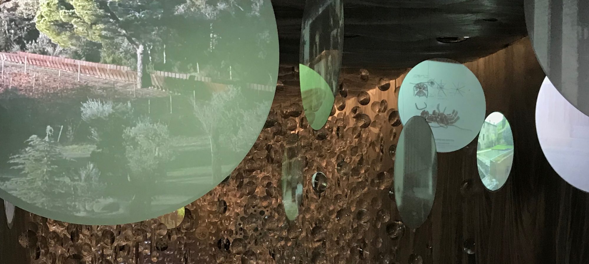
Stairs are always a place of apprehension and darkness; often the back stairs are where the budget ran out or where the fire services are fully revealed or where you may never encounter others. In the Switch House stair system this a generosity of space, attention to material detail, views to the exterior, as well as view lines along and across the vertical circulation spaces to other adjoining spaces. There are a series of different promenades within the building, through the undercrofted old tank spaces, the heroic helical stair, vertical stairs, and outside the lifts and along the perimeter walls with glimpses of the outside world. This is a hollowed out pyramid with a palimpsest of interior spaces. In this theatre of spaces the silhouettes of both individuals and small groups seem momentarily freeze framed before they move on.

IMG_0196In some ways the antithesis of the Tate Modern’s turbine hall and galleries. In these one is subsumed by the monumental spaces of a now archaic industrial technology of Giles Gilbert Scott’s power station desperately designed not to overshadow Wren’s dome at St Paul’s. Where the 2000 Tate Modern is vast and cavernous and the surreal glimpses and dissonances of conceptual art can be taken at distance. Walking up and down this building one becomes enveloped in its spaces as a flaneur both of the architecture but also of the other people one can see and may encounter within the building. In other words Herzog and De Meuron have created a city within a city. The complexity of the circulation spaces seem like a version of Loos’s raumplan; the building is certainly more raumplan than free plan. The Switch House circulation reminds me of the vertical stair circulation at the back of the Muller House. The grain of the concrete in the Switch House also seems strangely like the interior cladding stone of Muller.

IMG_0194The Switch House is certainly more claustrophobic than the spaces of the turbine hall and there is a dissonance in the architecture with its odd juxtaposition of concrete columns, brick lattice grill work, and seemingly adhoc spaces which come into much closer confines with ones body. This is not a public palace that one can walk through easily as a god-like citizen of Rome or Athens, ala Richard Meier at the LA Getty, with the ease of knowing that the space itself is open and rich and luxurious and supported by a network of philanthropy. Herzog and de Meuron have created a series of spaces that are variegated in their lighting effects, a bit dingy in some ways, and perhaps more like being in the underworld of the enslaved Nibelung dwarves in Wagner’s Das Rheingold than being on the mountaintop. The Switch House is an fortress that has, through its sparse material treatments, had a kind of melancholy folded into it.

IMG_0198 
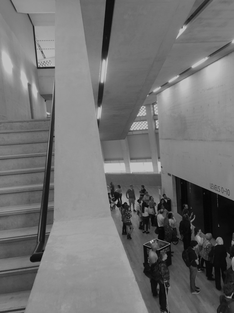
My own biases makes me think that the extension points to the architecture of Loos, the paintings of De Chirico or the subtle yet weird surrealism of Corbusier’s houses of the 1920s. Perhaps Herzog and De Meuron’s work is related to the Swiss artist Urs Fischer. In any case, this is an architecture that evokes notions of estrangement and the grotesque in minimalist forms. The geometric kink in the exterior of the building is both gargoyle and pyramid. After all, and despite its Renaissance pretensions, London is essentially a Gothic city.

IMG_0193There is a real treat on the viewing deck. The viewing deck is great because you get a 360 degree view of the City. The sense that you are in a public building is further emphasised by the fact that you can see directly into the neighbours houses in the unfortunate Neo Bankside development. It’s actually funny as these are the neighbours that happen to be part of Richistan, the nation where money is made, accumulated and distributed to the Caymans. It is this contrast that highlights the fact that the Switch House is to some degree a fortress of public space in a city where public and civic space, the space of encounter and possibility and freedom, has been largely destroyed by the bankers and more recently the celebrity politicians of the City.

IMG_0189

But by some miracle of circumstance and patronage Herzog and de Meuron have created a public building that is both fitting to the radical art that it might house and suggestive of a civic spatiality that is not the result of  a simplistic formula of the neoliberal palaces. There are no sunfilled spaces, open planned white minimalism with a bit of glazing desperately trying to frame or invent a serene view. Of course, the bankers and the celebrity politicians have no need for the poetics of the grotesque and estrangement which underpins so much radical art. The new extension is great because it suggests that for some at least, the techniques related to the grotesque and estrangement, and indeed architecture itself still matters.


Bjarke Ingels vs. Pokemon GO: the summer pavillion at the Serpentine gallery.

A regular pilgrimage for many architects in the Northern summer is to the Serpentine Gallery in Kensington gardens to see the summer pavilion. This year’s pavillion is Bjarke Ingels of BIG architecture fame. It goes without saying that the summer pavilion or Serpentine folly in the park is now a regular feature on the international architectural calendar.It is just another part of the global architecture road show. Of course we have our own version in my city. 

I have seen a few other pavillions, although not all, at the Serpentine over the last few years. In 2007 I saw Olafur Eliasson with Kjetil of Snohetta strange and totemic spiral volume, in 2009 it was SANAA’s smeared reflective mirrors and last time I was here in 2011 I saw the Peter Zumthor’s enclosed contemplative garden. Last year it was selgascano which looked colorful but probably crap to be inside; because, there is nothing like the smell of  being inside a plastic tent structure when its skin heats up. This year there are also four small summer houses nearby designed by Nigerian architect Kunlé Adeyemi, Barkow Leibinger, Paris-based architect Yona Friedman and British architect Asif Khan.

One of my friends is an architect in London who has seen more pavillions than me and suggested this years is the best yet. Being cynical by nature I wasn’t sure that this could have been at all correct. Living on the periphery far from the great architectural centre’s of the world one likes nothing more than tearing down a star god architect. Especially, one that has that look that is kind of the epitome of the hero architect image. As most of us know Bjarke himself is one of the gods in the current panoply of star brand architects. One of those big name architects full of self confidence and regard. One of Denmark’s more successful exports in the global competition for architectural services. These days his firm BIG or Bjarke Ingels Group is reported to be a huge going concern of 200 or so staff with 10 or so partners. The group is currently working on the new Google HQ in California.

20160710_162724

BIG’s pavillion is constructed from a series of rectangular boxes. The boxes are made from a kind of carbon or composite fibreglass. They are connected together with neat well detailed aluminium angles. Each box, or tube, is about 150 by 150 mm in cross-section and depending on there placement in the construction thyme vary in length. This year’s pavillion is cleverly sited, which is more than I can say about the other pavillions I have seen here. Mostly they have just been plonked in the garden with no regard to context. This one frames the lantern of the Serpentine gallery and it is has a deft relationship from the roadside entrance to the gardens.

Parametric design has been employed to good effect in this project. From one side it looks like a high wall and then from another view it appears to be a fallen down jumble of the fibreglass boxes. It appears to be both a monument or a folly in the park, as well as an object that has been deliberately and chaotically dismantled. In the interpretation notes Bjarke argues that the concept of this structure was that of a unzipped wall constructed from the bricks. As noted elsewhere it has been likened to a construction one might find in Minecraft.

20160710_162631

Inside the pavillion one is easily engaged, if not entertained by the different and variable permutations of the fibreglass boxes. There are numerous views from the boxes to the immediate confines of the outside garden.The height of the pavilion gives the impression that one is inside a kind of mini cathedral. Somewhat dubiously Ingel’s makes a connection to the work of Utzon (star-brand appropriating hero-brand) by saying that the pavilion was in fact inspired by work of Utzon:

“had this idea that you could create any imaginable form with carefully designed, mass-produced elements, almost like creating difference out of repetition, and it’s essentially that spirit we’ve tried to bring here” 

In any case, the pavillion seem’s to confirm to me how BIG’s architecture always seems to work with a kind of constructed tectonics often working with serial elements alongside direct and uncomplicated disparities and juxtapositions of scale and form. At the pavillion the elements of its making are not hidden and are evident both at the scale of the detail as well as at the scale of the pavillion itself. There is no deliberate fuzziness, or ambiguity, between its interior and exterior planning. What you see is what you get. Any ambiguity in the work is highly controlled, logical and the result of a generative parametric system. Whilst it fits in with the existing gallery this is not an architecture of memory and place.

20160710_162749

As with most things on the periphery there are the second order imitators. If any Australian firm comes close to the work of BIG it is probably Jackson Clement Burrows who have deservedly won a raft of awards of late. BIG’s work and the pavillion in general sits between the two dominant streams evident in Australian architecture. BIG’s (why do I keep thinking of this BIG persona?) facade of repetitive elements with their different permutations reminded me of the Design Hub at RMIT but unlike the design hub the Serpentine pavillion does more with its repeated elements. Who knows perhaps the discs on RMIT’s design hub will be replaced and live up to there initial and early promise. In general BIG’s work, and perhaps this is why Jackson Clement Burrows have been so successful, is positioned between the all singing all dancing kerraziness of ARM and Lyons and the assertive and odd agricultural minimalism (think moleskin pants and horse stables) of Sean Godsell with its overtones and nostalgia for the mannered modernism of the 1950s.

The pavillion is certainly a change from the dreary CNC plywood framing, reused milk cartons, laminated struts, and timber or laser cut timber held together with bolts and connecting fittings bought from the local hardware store. The BIG pavillion appears to establish that the tectonics of order as compared to creative disorder must count for something. This is minimalism with a tale to tell and the pavillion goes some way to drawing us back to architecture, to reminding us that tectonics, construction, siting, view lines and materiality still matter. It was as if the architect(s?) of the pavillion wanted us to be reminded of all the sane and logical things architecture can still do.

The last pavillion I went to we all sat around and contemplated the garden and the sky. In this pavillion there is nothing like that. On the afternoon I visited it was full of people looking at the boxes but mostly they were looking on their own little boxes. Their smartphones. They were taking pictures and doing whatever social media things the network would allow.

I think most of them were playing Pokemon GO in the pavillion and I wondered if BIG’s efforts to drag us back from our digital distractions were working. Somehow I doubt it until seriality and parametrics is able to engage with the memory of cities. At the moment Pokemon GO is winning against architecture.


Architecture Students as Customers: How not to measure the value of architectural education

Whilst we are waiting for the outcome of our federal election it is worth noting that The Abbott-Turnbull  government has increased funding to a new project that measures quality in tertiary education. This initiative is called QILT: Quality Indicators for Learning and Teaching. QILT is a ranking system that relies on independent data based on the 2015 different Student Experience Surveys. In September the survey will add in graduate employment data as well. On this basis your architecture school is a great architecture school if you graduate (in order to do the survey), love the experience (no matter how little you learn) and earn a buck. Yes, as a customer you will need to earn a buck to pay down your Higher Education student debt. But as we all know nowadays everyone pays to attend. Some more than others.

Architectural education is now well and truly a part of this increasingly global “business” of education. Although, architecture is not a large part of the “business”, or as large in revenue generation as law, commerce or biomedical sciences, it still seems to tick over nicely. For some university executives architecture is a commodified cash cow. You can thrash it like an old Holden via lot’s of short term contracts and  high staff-student ratios in the studios. It doesn’t really matter who you take in as students, or how you treat them, just as long as they pay.

QILT

Data measures such as QILT only seem to reinforce these “customer” orientated tendencies. The architecture student is now a customer; student’s get the branded degree they paid for; and they aren’t challenged too much or they might complain (tell me about it); and they learn a few technical skills (throw in a bit of of CNC, Rhino and Revit) that enables them to get a paying job (maybe).

The first flaw of QILT in relation to architectural education is is that it  aggregates data from across number of different disciplines.  This includes Architecture & Urban Environments, Building & Construction.It slums together Architecture, Urban Design and Regional Planning, Landscape Architecture and Interior and Environmental Design, Building Science and Technology, Building Construction Management, Building Surveying and Building Construction Economics. How any one could lump together architecture construction management and economics with urban planning is astounding. The built environment design disciplines should be in a separate dataset.

QILT uses data that is based on university Student Experience Survey (SES) which, as most committed tertiary teachers will tell you are notoriously flawed for reasons too long to discuss here (this is a good introductory paper on the issues). In architectural education a brief example might suffice: In architecture design students respond to the surveys prior to their final studio presentations. The administrators of the SES view these crits as an examination but do not realise that getting students to respond prior to the crit distorts the figures. Fewer architecture students respond, they are to busy preparing for the crit, and more importantly, the end of project design crit is one of the significant learning points in the semester.

QILT is also based on data gathered from the The Course Experience Questionnaire (CEQ). This is completed by graduates of Australian higher education institutions four months after completion of their courses measuring: Overall satisfaction, good teaching, generic skills. QILT also measures data gleaned from the Graduate Destination Survey. Which includes the median salary of graduates. This is one reason why the discipline data should not be mixed up together as every one is on different pay scales. The QILT data jockeys are also developing a “The Employer Satisfaction Survey (ESS)” which  is being developed as part of the Quality Indicators for Learning and Teaching

The QILT website allows you to compare between universities. Using the quick comparison I did it would seem that one architecture school in Australia appears to outshine all of the others in terms of graduate satisfaction, skills learnt and median salaries. There is not a lot I can say about this; except I don’t think much of the QILT methodology or its comparative results.

What makes a great architecture school

Of course, we all want to say that we went to a great architecture school. The one I went to is now argued to be, by some at least, one of the best in the world (it did not rank as well on QILT). The one I teach at is also ranked highly across global research measures. Of course when I went to Architecture school in the pre-digital dark ages there, some of us much longer than others, we thought it was a shambolic and chaotic mess. That was part of its charm and that’s probably what you get when you have architects running the whole show. Of course now that we have left architecture school and look back on it it doesn’t seem so bad. Compared to other schools in Australia at the time, or even elsewhere we had a pretty good deal.  In fact I would argue that because the architects were in positions of leadership in the faculty and the school this contributed to it’s burgeoning global reputation at the time. Sadly, one architecture school I know of is governed almost entirely by administrators.

Measuring architectural culture

QILT doesn’t really measure the value of an architectural culture or how students may be involved in current global debates. It is  a one size fits all approach to running the “business”. As a student I was actively involved and close to the architectural debates, controversies and conversations of the day. I had the opportunity to be taught by the best practitioners and academics of the day. As students we were challenged by our studio tutors and we did not mind this. As students we helped to create the culture that made the school better. Moreover, thanks to Whitlam I didn’t have to pay a cent and in fact I even got paid an allowance to escape my outer suburban bunker and go to architecture school.

Measures like QILT are easy tools for the administrators to bludgeon university academics with. Its a misleading tool to guide the potential customers. Fostering the link between teaching, research and industry in architecture schools is essential for the future of the architectural profession. This is not measured in QILT. Just giving graduates a technical skill set or measuring output by how good the graduate feels during the course or their employment and salary outcomes really misses the mark.

In the future most architectural graduates will have to cope with the firestorms of technological change, climate change, political volatility and perhaps worse. Being narrow technologists who cant think across disciplines, or graduates who have never been challenged by inspired teaching to think doesn’t really cut the mustard with me. Bad shit is coming down the pipeline and our architectural graduates really need to be able to think rather than consume.

 I am almost out of the country yet on annual leave. So watch out for next week’s blog which might even be written in road trip style.