Beyond the Australian Dream: Australia’s future housing and the failure of the political classes.

Last week I presented a paper at a great conference at Swinburne University in Melbourne. Future Housing Global Issues and Regional Problems Conference. Its was organised under the auspices of MPS. For me the conference reinforced the view that housing design, housing research and housing policy is a critical issue in the context of Australian policy debates. It reinforced for me that architects and urban designers are at the forefront of this issue and that it requires policy responses that are not left to the property markets.

Any approach to infrastructure policy, cities policy and urban sustainability must address housing design, housing policy and housing issues. Sadly, for numerous reasons policy makers, developers, contractors and the political classes housing policy has arguably been a casualty of neoliberal policy that in effect ignores the needs of different demographic strata and groups in Australian society. As the Grattan Institute pointed out in its 2013 report Renovating Housing Policy housing policy in Australia is in need of “renovating” (full marks for the pun) as well as a number of prior reports including The Housing We Choose, Getting The Housing We Want and a report called Productive Cities. 

Housing or cities have not really been a central feature of Australia’s current election campaign. The taxation arrangements around negative gearing have had a bit of a run. The real estate agents have squawked a bit. But generally the politically classes and the media don’t really see it. Its ok for the investment bankers, lawyers and union apparatchiks to talk about smart infrastructure, and so called smart cities, and city sustainability but it is housing that is the key policy element in all of these efforts. Yes, the Coalition will invest up to $100 million in a Smart Cities Policy renewable energy and energy efficient technologies in cities, if re-elected. But, the policy lacks real vision and looks like it is specifically targeted at Western Sydney with a whole lot of give aways like “better lighting, it could include better traffic management, it could include better water management,” I wonder why that is? So much for the rest of us. Why not devote the money to R&D in alternative housing financing, ownership, typologies and housing design. Why not fund ARC research that explores urban densification that isn’t simply about building apartments being developed developers who contribute to political parties. What about regional housing issues?

In contrast a recent Australian Senate Committee published a report on affordable housing in May 2015. The report containing over 200 submissions from different stakeholders in Australia’s housing sector.

The Senate report concluded that concluded that:housing affordability was also exacerbated by policy fragmentation. The report concluded that Australia’s housing system needed to be considered as a interlinked system which had both public private and the numerous local, state and federal jurisdictions. Policy was needed to give “coherence to the numerous local, state and national incentives and schemes intended to contribute to the provision of affordable housing.”

Organised by the Centre of Design Innovation at Swinburne University, and under the Auspices of MPS, the conference covered a number of diverse topics. A survey of the topics presented at the conference indicates the degree to which housing is a complex issue that requires more than property marketing, think-tanking and political spin. It is a policy area that requires alternative propositions through design research and experiment.

The conference covered the full gamut of this area of research and for me it underscored that housing policy cannot be boiled down to any singular catch cry. For example academics at the conference presented papers and research on affordable housing and issues in other cities and countries such as Iran, Sweden, the UK, South Korea, Mumbai and Vietnam. Researchers presented who examined alternative housing typologies in Australian cities as well as work regarding remote, rural and regional housing. Indigenous housing got a guernsey; as well as research into Australian social housing, rental affordability, housing finance and Australia’s urban poor; there were also papers on ageing, disability and housing design.

One intriguing paper investigated the notion of neighbour hoods and neighbouring patterns in Australian cities. Not a topic that is often discussed in the context of housing policy. Mostly, these days all the talk of neighbourhoods is in the glossy marketing materials. One of the more innovative papers, based on a MSD design studio explored proposals for the redevelopment of the Prahran housing estate. This paper reminded me that design research is an essential component in terms of housing policy and housing futures. Call me cynical, but the lawyer trained political apparatchiks and marketing minded developers really don’t care that much about design or design research.

Yet, architecture schools and architects themselves have been at the forefront, for the many years if not decades, by producing and proposing alternative typologies to the housing question. Architects are well placed to understand the interdependencies and intricacies of housing. Yet, as a profession and within the graduate studios of architecture school this work has had little impact on Australian policy debates. It has been largely for no avail and mostly ignored. If I had a dollar for every time I heard a politician  talk about the “Australian Dream” we would all be extremely wealthy. But for some reason Australia seems to be stuck in a limited number of market driven approaches to the housing question. The Australian dream of universal and egalitarian home ownership has gone now. It has slipped away. To keep talking about this dream only masks the stratified, and as I muse increasingly extreme, demographics that is the real nature of Australian society.

As many architects already know housing brings together interdisciplinary perspectives across economics, finance, planning, architecture and urban design. Creating new knowledge across this area requires a bottom up approach involving both community participation, nuanced data analytics and concerted design research. Meanwhile, the global marketing machine that spins a lifestyle of, minimalist danish modern designer homeware bright breakfast morning margarine advertisement living, just rolls along.

The Australian dream is of home ownership is now just another phantasm in the spectacle.

Planning Anarchy: Why architects hate urban planners in my city.

Architects are a contradictory profession. Prone to political activism and yet also deeply conservative. Seemingly agile, radical and innovative yet unable to move quickly in the face of gender inequality in the profession. Forward thinking and future driven yet bound by the traditions of the canon.

But if there is one thing I think many architects in my small global city of 4 million people can agree on it is this: Statutory Urban Planners are the lowest form of life.

I am not the only one in Australia to actually think this. A recent article by Elizabeth Farrelly in the SMH also points to the crisis in the planning profession in Sydney. However, I think many of Farrelly’s observations may also apply to Melbourne. The only problem is the planners themselves are not aware of the crisis. Architects, to their credit, on the other hand always seem conflicted by professional guilt and riven by internal debates of one kind or another.

Don’t get me wrong. I am a big fan of urban planning and its associated discourse. I was in partnership with a planner who also did architecture. But, many small architectural practitioners I know are angry. They are angry about the idiocy of a planning system that permits the wholesale destruction of our cities fabric and memory and yet binds up small projects in the most torturous regulations and processes.

From the perspective of many architects in Melbourne planning governance is broken and this impedes the governance and development of the city. It is an anarchic system.

Lesson 1: The built environment would be better if planners actually learnt about architectural and urban design

In 2011 we organised a protest against the unsanctimonious and ill considered renovation of a so-called brutalist building. One of the most important examples of this movement from the 70s.   You can read about it here. As a result of our protest, the council undertook to renovate an important element of that building. It is still yet to be refurbished. Despite a heritage assessment report and its significance the planners at the council in question said and did nothing.

Clearly in this instance the planners had no sense of responsibility to or appreciation of Australian modernist architecture.

Perhaps the study of Australian architectural history should be mandatory for statutory planners. The curriculum of most planning courses have a kind of pseudo legal aspect to them. This is matched with a altruistic, if not condescending, interest in community participation. Chuck a bit of sustainability into the syllabus and what more could you want? How about planners study architectural history, visual arts or urban design as a core component of their tertiary courses. How about planners learn about design, design research rather than exclusively focusing on social science research?

Lesson 2:  Planners will tie you up in processes that are disproportionate to the size of the project at hand

In the process of doing an internal renovation of a commercially zoned building in a middle ring suburb the building surveyor insisted an external facing shutter be removed and replaced with a gate in order to facilitate emergency egress. Makes sense doesn’t it ? Sure, it makes sense but not to the planners. They insisted that the new gate be subject to a planning permit including advertising. Maybe 3 months, maybe 6 months maybe a year to get through this process if you are lucky. Providing no one objects during the advertising period. But, maybe someone will object and you will go to VCAT. Of course if any one objects the planners will agree with them.

The architect friend of mine responsible for this project bemoans the fact that, a junior planner is employed at the council on the project and is just following the rules; that way they don’t have to think. She says, perhaps with the benefit of prior experience,  if you complain the planners put you at the bottom of the list and go slow.

Planners are not independent, mostly they are employees of councils, who will simply follow the dictates of their line managers in their organisation.

I am keen to document examples of situations where architects have been bogged down in planning red tape on small inner city projects. Send them to me and I will de-identify these cases and then discuss them in a later blog ! Email me if you are interested. 

Lesson 3: Planners have no control or interest in questioning large scale developments

One of of the last remaining buildings associated with the coach industry. Who cares ??? Not the planners. This facade is about to be completely demolished for a, perhaps tawdry, laneway and curtain wall. Maybe the laneway will have a barista outpost in it.

The upshot is almost nothing is actually governed by the planners. Small projects get locked up in red tape and as Elizabeth Farrelly points out the interests of big developers remain paramount.

Lesson 4: Planners love to meddle in architectural design 

So what’s worse than the planners not planning or not governing the planning system? It is when the planners actually start to see things in the urban environment; or think they actually know about design. Planners love to add design value. But they often get this wrong. Why is that? Urban Planners are not trained in visual or spatial thinking. Sure they can argue and talk about the politics of community participation and the rights to the city. But they by and large have no idea about urban aesthetics, architectural value, or design processes. Their understanding of the issues is extremely simplistic.  Consequently,  since the demise of high modernism and the birth of the building conservation and renovation movement in the 1970s our city is littered with the most simplistic and naive examples of facadism. Rohan Story has all done us a favour by documenting many of these as a part of Melbourne Heritage Action group (thanks to MHA for the images in this blog).

You can always tell when the stat planners have a had a go at a building in the planning process. They love to tweak a corner or add a bit of value to a streetscape. They are excellent mimics especially when it comes to imitating, the facades of Victorian and Edwardian housing stock. Their favourite delight is slapping on the heritage colours out of the paint bucket. Fragmented and “broken down” facades, setbacks on setbacks, screening in myriad materials, different materials and colours; beige, pink, rust and that beloved of all colours for the planner wanting to evoke Melbourne’s historic past: terracotta. Oh, and I forgot to mention that the planners love a balcony.

Future Melbourne Committee meeting 17 May 2016, Agenda item 6.2:

These pathetic efforts are usually touted as a win-win and as a result our city is full of the results of this kind of urban streetscape slop.

In reply to Farrelly’s article the PIA the Planning Institute of Australia responded by stating:

Planning policy provides the checks and balances to put the densities where they best fit and ensure infrastructure is appropriate. There will always be differing public, professional and political opinions and reactions to any rapidly changing city. 

Planning is inherently focused on facilitation and balance where both the public and many differing private interests are accommodated. This should occur without compromising good design, creation of place, amenity and liveability – this is known as the public interest.

As far as I can tell urban planners in Melbourne are powerless and do none of the above. The planners are always good at writing stuff to make it sound nice.  After all that is what they are trained to do. But they need to be visually and spatially literate.

Yes, some of my best friends are planners, many of my more admirably and politically orientated colleagues are planners, but I am sorry we really need to have this debate.

What rankles is how easily the punters find it in themselves to hate architects. In actual fact it is the urban planners the punters should be hating. Yes, architects are kinda guilty as well. Both professions are involved in and witness to the current and ongoing contemporary destruction of Melbourne.

But at least the architects as a profession will argue about it and lose sleep over it. Which is more than I can say for the urban planners.

24461081874_403e840d41_o


Was Robin Boyd on Acid? The multimedia Space Tube at Expo 70.

Robin Boyd’s Space Tube, designed for the Australian pavilion at Expo 70, was a commission that came at a time when Boyd’s practice was struggling to make ends meet. From mid-1968 through to Boyd’s death in October 1971, his practice consisted of mainly residential houses and some more speculative projects. Amongst these projects, the Expo 70 commission was one of Boyd’s more significant commissions because of his use of multi media.

For todays architect’s multi-media technology is ubiquitous and Expos in the 21st century are mostly hyped up trade shows. Expo 70, the site of the Space Tube, in Osaka Japan, was the culmination of the 1960s neo avant-gardes dreams for architecture aligned with futuristic and universal values. Expo 70 crystallised the experiments of the 1960s neo Futurist avant-garde even more so than the previous Expo 67 in Montreal; this was perhaps because of the influence of the Metabolists who were directly involved with the planning of the many of the exhibits at Expo 70. (1)

DSC09059

Original sketch of the Space Tube from the Boyd Archive at the SLV

In general media coverage and most publicity photos, Boyd’s space tube is generally overlooked in preference to the “coathanger” structure of the Australian pavilion designed by the Government architect James McCormick. The Space Tube gained very little publicity from either the architectural press of the time or historians since. This is surprising given that it is one of Boyd’s most significant later commissions. The cost of the project, in 1970 Australian Dollars, was then estimated to be $700,000 and Boyd’s fee for the work was to be $75,000 (2 ). More importantly, it was a commission which was actually completed; of the 28 or so commissions that Boyd received from 1968 until his death, 7 were domestic commissions and 13 were speculative schemes. (3)

Slide1

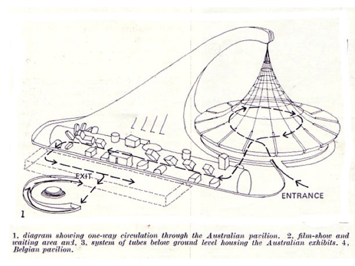
As the Australian Expo 70 exhibits architect Boyd was responsible for the planning and circulation of the interior exhibition area, principally within the space tube. Boyd, in consultation with the Commonwealth Government committee overseeing the project, proposed that the exhibit would have four subject themes: “Man, Man and Nature, Man and the Man Made, Man and Man”. It was intended that these themes would divide the space tube or tunnel into four parts, which would then contain 19 exhibits (4). In notes for an early press release, Boyd makes note of these display boxes, which were to be built in Australia before being shipped to Japan, to be “simply bolted on and plugged into the power supply.”

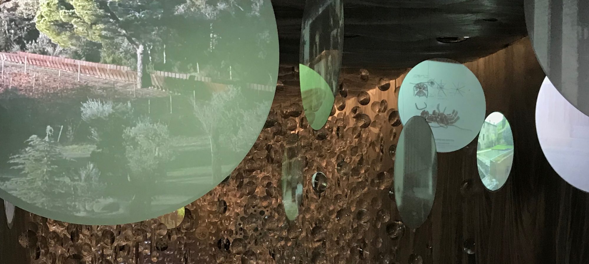
The experience for the visitor within the tube itself was designed as a sequence of experiences controlled through movement. Boyd’s intention was that the motion should be barely noticeable. According to Boyd, “[t]he function of the moving platforms is not to excite or even to relieve the feet. Their main function is to give control.”(5). Through this use of multi-media technology, the architect was able to control the flow of visitors through the space, and hence “present a sequence of exhibits, knowing that the visitor can view them only in that sequence.” After leaving the first crush space and stepping onto the travelator, the visitor was presented with a view of the entire tube for the first time. As the opening of each display was inset from the tube surface and arranged at a right angle to the axis of movement, all that could be seen was a series of bright lights and colours shining onto the visitors ahead.

In the final scheme there were 20 displays or subject areas in all. Each display or subject area was comprised of up to four display boxes, arranged radially around the tube. The visitor was moved past the displays by means of twin moving travelators which positioned the visitor’s eye level roughly in the centre axis of the tube. The travelators were supported from below by a minimum of structure, to allow an unimpeded view in all directions from the moving platform. The tube itself was made from “Gunnite”, a form of shot concrete on mesh reinforcing which created a thin shell. Attention was paid to the finish of the tube, with construction drawings stipulating a smooth, uniform finish on the outside surface and a matt black “acoustic surface” on the inside. The tube’s status as a design object was as important for Boyd as its role in presenting a view of Australian society.

Slide1

Boyd was also responsible for the design of what was termed “technamation effects”. This was a multi-media technique achieved by projecting from two or more lights or projectors onto a polarised screen. As the viewer moved past the display, the screen would shimmer and ripple with colour and light. These effects were incorporated in a variety of ways into six of the display boxes. The best example is exhibit 17C, ‘Night City’. A model of a city block in exaggerated perspective was fitted on top of the polarised screen. Beneath the screen were six projectors mounted in opposing directions, creating the illusion of night traffic through moving red and white lights. What was otherwise a quite simple and almost dull model was in this way enlivened through animation. However, instead of a moving image or mechanical device, it was the viewer in motion which brought these displays to life. Visitors within the Space Tube were thus tangled in a complex set of visual relationships. The layout of the displays, in particular their height and angle in relation to the visitor, was one method used to control and organise these views. For example, the displays mounted horizontally (in the cardinal arrangement referred to above) made use of the level horizon line to suggest an equivalence between the visitor’s gaze and the subject matter. For instance, in exhibit 13C ‘Repco Brabham’, a cutaway model of a Formula 1 racing car is surrounded by a projection screen showing the car driving around a track. The view is arranged so that the visitor watches the track from just behind the car as Brabham makes his lap.

In contrast, the displays mounted at 45° to the horizontal present a more varied set of views. The displays below the walkway, such as 2C, 2D, 6C and 6D, present stylised views of the abyss – the mine, soil and what Boyd referred to as “the beasts in the pit”.(6) The circular frame of the display openings emphasise the detached and special view, appearing to be the viewfinder of an enormous microscope in exhibits 2C, ‘Some of the Body’s Microscopic Enemies’ and 2D, ‘Defence Cells Emerging from a Lymph Node’. The displays above the walkway more often include images of authority figures as part of their design. For instance, in exhibits 2A, ‘Immunology’ and 2B, ‘Organ Transplants’, circular screens were included which displayed projections of Gustav Nossal and Macfarlane Burnett, respectively. These images literally and figuratively look down on the visitor, countering the visitor’s gaze. These two displays include another recurring motif of Boyd’s design, the life-size transparent acrylic mannequin. A toy called “The Visible Man” and a teaching aid developed at the University of Michigan called “TAM” inspired Boyd (7). Both were human figures created with a transparent skin which revealed the organs inside. Boyd’s use of figures and bodies seems more scientific and anatomical than overtly erotic; however the experience for the visitor was doubtlessly voyeuristic (8).

Boyd was also central to the design and production of all the film, visual sequences and sound effects. He specified in detail the subject matter of each sequence, and personally chose the images used for each slide and film sequence. Though concentrated in the final displays, visual and multimedia effects were used throughout the tube as the central element of most displays. This was probably one of the largest and most extensive Australian multimedia projects of its time. In Boyd’s own words the purpose of the displays was to “capture the eye and the ear with light and colour and movement with music and sounds with 28 movie projectors and 46 synchronised slide projectors with hundreds of fluorescent tubes and 200 incandescent lamps.” (9). Circular screens were incorporated into most of the displays. Some of these screen arrangements were highly complex – for instance, exhibit 7B ‘Asian Aid’ was composed of six circular screens at the end of tubes housing a slide projector, each of which slid forward into the main space to reveal captions and subsidiary information printed on the side of each tube. Exhibit 3 ‘Tennis’ was made up of two projection screens facing one another across the tube, showing two players – Lesley Hunt and Yvonne Goolagong – playing a game above the visitor’s heads. Exhibit 17A ‘Ballet’ made use of moving screens, variable focal lengths and multiple projections to create a complex sequence of images (10). Sound effects were synchronised to visual cues for most of images, all of which were described and stipulated by Boyd. The Australian composer George Dreyfus was responsible for composing four variations of the pavilion theme, which were played at equal intervals along the tube.

The motion of the viewer through the tube constantly reinforced the logic of inevitability and progress within the subject matter of the exhibition material, and vice versa. For example, in Exhibit 20, the ‘abstract colour image’ designed in association with J.S. Ostoja-Kotkowski, was intended to literally be the “light at the end of the tunnel… visible all the time that the visitor is in the tube”(11). In effect, it was also a visual echo of the kaleidoscopic sun of first exhibit. From the very beginning, the Space Tube was thus a passage from a red/yellow stylised contemporary sun to a blue/green argon laser ray abstract future, toward “an absolutely explosive visual phantasmagoria in 3-D ” (12).

Of course this all makes me wonder if Boyd had at some stage taken LSD. Boyd’s thematic explorations certainly mark him as an architect of his time. But the design for the Space Tube does hint at the media driven technological future architects now find themselves immersed in (13). The degree to which contemporary architects have the same control over, or experiment with, new media technologies as Boyd did  is debatable. Boyd may not have actually taken acid. But it would be nice if we could direct such an accusation at contemporary Australian architects a bit more often.

This is an edited version of a conference paper co-authored with Simon Wollan.Peter Raisbeck And Simon Wollan Boyd As “Bower Bird”: Robin Boyd’s Space Tube And The Global Avant-Garde. SAHANZ 2003. 

NOTES.

1. For details of Expo 70 in architectural magazines see the entire issues of: Architectural Design June 1970 especially p 271 for comment on the Australian pavilion and Japan Architect 1970 Vol 45 N0. 5/6-164 see especially Koichi Sone, Sei Oyuki, and Yuji Morioka, “Moving Walkways and Urban Traffic” as well as p. 69 for a comment on Kikutake’s Expo tower.

2. Fee agreement for the project was signed on the 22nd of October 1968; to be paid in monthly instalments as the work proceeded. For this fee, Boyd’s brief was to design the Space Tube and its display cases in a way which would depict Australian life and industry to a primarily Japanese audience. The Commission also extended to producing and managing the construction of designs for the merchandising which was to be associated with the exhibit. Refer to Box 104, GRB Archive, State Library of Victoria.

3. His most significant civic architectural commissions during this time were Churchill House, exhibition designs for the Australian Chancery in Washington and the ”First 200 years exhibition” in the foyer of Harry Seidler’s Australia Square building.

4. In the original proposal the exhibits were numbered from 1 to 19 with the following subject titles and in the following order: origins of humanity, the battle against disease, science of the mind, enjoyment of life, Australian invention in agricultural technology, Soil and Water, Exploring and preserving resources, Exploring the Universe, utilization of Polar Regions, Transportation, Modern Living, Urbanisation, Automation, Language and Literature, Communications, Fine Arts, Lively Arts, Australia-Japan Relations, The Film. Refer to Box 104, GRB Archive, State Library of Victoria.

5. Robin Boyd, “Australia at Expo 70 for Walkabout” , undated text, Box 103 (c), GRB Archive, State Library of Victoria.

6. Letter from Boyd to Prof. G. Nossal, 11 July, 1968. Box 103 (a) GRB Archive, State Library of Victoria.

7. Letter from Boyd to J.P. Tyrer (Acrylic Industries), 7 October, 1968. Box 103 (a) GRB Archive, State Library of Victoria.

8. Further work, which is outside of the scope of this paper, is required to fully establish how Boyd fetishised these figures as objects, and the more general effects of the technological gaze within his designs.

9. Robin Boyd, “Australia at Expo 70 for Walkabout”, undated text, Box 103 (c), GRB Archive, State Library of Victoria.

10. First, a film loop showing dancer’s legs was projected onto the front screen, nearest the opening to the tube. Next, an image from a slide projector appears small and out of focus on a screen behind. As this screen moved forward the image enlarged and came into focus, before again going out of focus and diminishing in brightness. From the visitor’s point of view the slide image passes through the film image, literally deepening the visual field of the screen. Refer to Box 100/3, GRB Archive, State Library of Victoria.

11. Letter from Boyd to J.S. Ostoja-Kotkowski, 16 July, 1968. Box 103 (b) GRB Archive, State Library of Victoria.

12. Letter from Boyd to J.S. Ostoja-Kotkowski, 9 October, 1968. Box 103 (b) GRB Archive, State Library of Victoria.

13. This compression of time and consequent distortion of space also appeared in individual exhibits. For instance, exhibit 13D ‘Shipbuilding’, displayed a model of a ship growing from blueprints to steel structure to dry-dock construction to finished bow steaming steadily ahead through a technamation wave. However, instead of showing each ship in sequence, each stage occurs on a portion of a single hull, giving the sense that the ship is impatiently sailing through time into the future. That this exhibit is the only one mounted directly below the visitor, between the two travelators, ensured that this movement was aligned with that of the viewer.