Surviving the Design Studio: 10 ways to fix the plans before the final deadline. 

Ok so it’s the end of semester or the project and you have spent your life deep in the Rhino, or the other R model, and it’s time to do your layout. But hey you forget about the plan. The what? Oh yeah, the PLAN !!!

The problem is the plan is the first thing any critic or competition judge will look at. Sure they might glance at the crappy 3D render you have done; so hastily crafted the night before. But it’s the plan they will use as the co-ordinating point of reference for the rest of the drawings. Its probably the thing they will look the most at. In fact an excellent plan will mean that the design jurors or critic (or perhaps even a client) will more easily forgive how bad the rest of the project might be.

The demise of the plan

In this digital word it is easy to forget about the plan. You may have sketched something early on; quickly outlined it in the computer and then constructed a model from that plan. By the end of the project you have actually forgotten about the plan.

We no longer read plans because we are too busy watching the future stuff. This is because everything nowadays is three dimensional or even four dimensional. It’s all about AI, CNC fabrication, robotics, autonomous agents and swarmies (I think I mean swarms). Patterns, processes and parametrics reign supreme. Plans are pretty dull compared to the latest YouTube clip or article on Architizer or Dezeen.

In the age of big data, global analytics, digital diagramming and planetary urbanisation the plan has lost its power to seduce our eyes. The network diagram and digital clip is king (and queen too). Born in the computer the global diagrams of networks, animations of swarms and simulations of a flooding cities are more compelling to watch than those old planny plan things. There are some excellent exponents of these new must-be-watched diagrams: Michael Batty at UCL, Neil Brenner’s mix of geography and global flows at the Urban Theory Lab, Eyal Weizman’s forensic architecture. In the work of these contemporary image proponents its like the ideograms and diagrams of the Smithsons’ have been sped and given life through the joys of accelerated computerisation.

In the past, like today’s digital clips, the plan was a seductive artifice in its own right. It could simultaneously be read as a conceptual diagram, a spatial condition and the history of  place. Plans are stratigraphic in their ability to embody layers of meaning and different narratives; no matter how abstract those narratives might be. But, in the current real world, I fear that plans don’t mean that much anymore. For the merchants of neoliberal architecture slapping up the apartment towers its all about the skin bae. These days the plan no longer seems like it means anything at all.

Ok, so much for the ranting and raving about the lost world of plans.

More importantly, when the critics come in, all jackboot like, and start criticising the plans you know they have it in for you. A good critic can demolish your entire scheme just by looking at, and asking questions, about the plan. Here are some tips to get that plan in shape ready for the submission and the critical onslaught.

1.The plan demonstrates the size of things 

The plan and measuring the size of things is extremely critical in housing schemes. A few years back I ran a studio in to we tried to teach the students all the things they didn’t know about plans and unit planning. Basic stuff like how big is a bathroom, or a bedroom and what’s the best way to design a kitchen. How big is a bed or a table?  How do you do a carpark what do you need for turning circles?  You know when a critic is really out to get you is when they start asking you questions like these. So be prepared this is the sort of stuff you need to know. The plan is the best way to control and convince others that you have handle on the dimensions. If you don’t already you need to get one of these books.  

1325821016-lower-floor-plan-1000x587

2. Conventions 

Don’t forget the drawing conventions. Scale and North points; North up the page. This goes without saying.  The same goes for other things like windows, doors and stairs. Draw them correctly. If you don’t put these on your plans, or get them right, you end up looking moronic. Get the measurements right.

3. Spelling

Spell the room names properly. This goes for just about everything on your drawings. Use a dictionary if you have to. Choose a lettering font that isn’t going to be confused for your actual building or prevent it form being understood. Try and avoid using the standard fonts straight out of the software program.

dezeen_Carlos-Ramos-Pavilion-by-Álvaro-Siza_10_1000

4. Draw it like a section 

Draw it like a section. Yes, for those of you who don’t know, a plan is really a section. But it is a section where you are looking down about a meter above the ground plane. Hence it is good to draw it as if it sis a section. Line weights, whilst seemingly subtle are critical in conveying planimetric depth.

Soleri

5.Show the levels 

Use the plan to design your levels and level changes. Stairs and steps should be drawn in a way that is well crafted and shows that you know that a plan is not simply a flat plane.

LeCorbusier_Olivetti2a

6. Don’t fill your plans with crap 

Don’t fill it full of standard library furniture. It always looks like shit and makes you look like an indolent and lazy idiot.

CAFEplan

7. Plan composition 

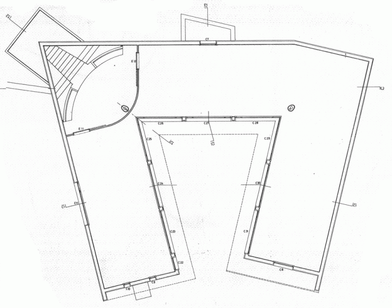
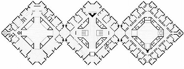
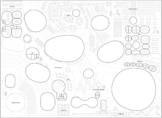
After the horrors of the image above it is good to remember that the plan is a composition in its own right. Recognise and emphasise the patterns, shapes and figures in it. It doesn’t matter if these elements are abstract or figurative. Counterpoint and contrast these. Exploit these to generate further design elements, details and iterations of the plan. A plan is in fact a series of plans within a plan.

1579d8d32dd73404c5e5d7341cbe62f3

8. Inside and Outside 

Pay attention to the plans interfaces both within itself, between rooms or spaces, and where it’s edges meet the outside world or other conditions.What lies just outside of the plans walls. What is its context? How do you get to your plan? What is its realtionship to its surrounding urban context? Or it it just another one of those plans sitting in a kind of blank ether.

dezeen_Carlos-Ramos-Pavilion-by-Álvaro-Siza_07_1000

9. Draw in the detail 

Draw in structure and floor patterns and as many detailed elements as possible. As explained above that is the same as filling it in with stock library elements or banal patterns.Floor patterns well done and with the correct line weight are always good.

kahn-bryn-mawr

10. The plan is a spatial field 

Never forget this: the plan as a diagram, that describes and implies a three dimensional spatial field in which points, lanes, planes and dare I say to volumes are located.

A well drawn, represented, or crafted plan, can hide a multitude of sins if the rest of the project is a pig-dog.Of course sometimes its too late. No matter what you do the plan is still a pig-dog. Remember Raisbeck’s number 1 rule. If it looks good it is good. In other words if looks good to you it will probably look good to the critics or jurors as well.

82f21ab9b7abf079f73ed2dfcd52b961

Finally, the plan is never really finished 

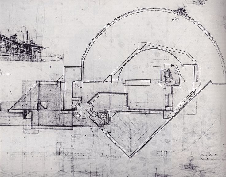
For the Italian Architect Carlo Scarpa the plan, such as his plan for Castelvecchio in Verona, was in a way never really finished. The most powerful plans, the ones that will burn a hole in your brain, are those that are iconic and compelling images in their own right. They may look finished but in fact they are not and they are usually the result of numerous iterations. It is best to remember a plan is never complete and even when the project is finally constructed it is still good to remember that the plan, even across the digital archive, has a life of its own.

Against the porn of lifestyle houses: four houses to dream about when you design a house.

The first house I designed was in second semester of second year and I didn’t really now what I was doing. How could you? Thankfully, thanks to my tutor I was slowly led through the process of how to design something as complex as a house. My tutor (who is now a colleague) wisely got me to look at numerous examples of houses, the AJ metric handbooks, and I did look a lot at all the houses that won awards for a few years in the magazine Progressive Architecture. I examined house plans. I spent a lot of time at home measuring things. How high was a bench, how wide was a door, how deep was a cupboard? What where the dimensions of a bed and how much room was needed to navigate around it. Of course in first year the time I was inspired by the work of MLTW and Sea Ranch, I liked the flow of the forms as they cascaded down the hill on the coast of California it seemed a far cry form the flat gable and hip tiled suburb I grew up in.

These days there is a lot of what I call house porn which seems to be incessantly streamed across social media. Big windows, a bit of cedar, white walls, long linear kitchens, minimal kind of Mediterranean bathrooms. These houses seem to be perfect and idealised settings for bourgeois lifestyles devoid of reflection, memory or dare I say it melancholy. Watching the reality television shows, either the cooking ones ( I am partial to MKR), or even the building and renovation ones, I get the impression that houses are simply containers for, and expressions of, lifestyle and nothing more.

Lifestyle houses are always different. They are always filled with “features” and customised to the whims of their clients. They both brand the owners identity, and help to form that identity. I am tired of seeing houses planned around an open spatiality, linear vistas leading to large windows; more and more the bourgeois house looks like a real estate marketing brochure. More and more I fear architects succumbing to this as the exemplar. In a way great houses are difficult and monstrously empty creatures. As an antidote to this I try and describe my impressions of four houses below which, for me at least, avoid the lifestyle paradigm.

Villa La Roche

The American architect John Hejduk in his book Mask of Medusa relates how he set up an exhibition in Corbusier’s Villa La Roche in Paris. The power of his prose is compelling but as he was hammering in nails to set up his 1972 exhibition to the house he remarkably found red dust coming out of the white walls. He states:

Villa La Roche is house with other qualities beyond the simple white cubed functionalism that we assign to works in the twenties. It is a house where the functional elements  suggest other uses such as some kind of dark religious ceremony or ritual. Hedjuk was convinced that the house was used by english spiritualists who came to the continent for ceremonies in the 1920s. He argued that the houses main sitting room was configured like a church. It suggests that houses must always refer to something like this, that functional elements have double readings, and that every house must have its own kind of  alchemy.

Ottolenghi House

This is another house that has always fascinated me, and whilst I have visited quite of few of scraps works in Venice and the great theatrical Castelvecchio in Verona an like many people who have visited Scarpa’s work in Venice I have yet to get the opportunity to visit this house.

Scarpa was quoted as saying I am “A man of Byzantium who came to Venice by way of Greece.” Again this is a house, like Villa-La Roche, suggests places outside of itself. The rusticated columns made of discs of stone and concrete are both monumental and yet made of a series of fragments suggesting ruins. The travertine floor, and the ponds which adjoin the house, as well as evoking the Venetian lagoon, are reminiscent of Scarpa’s influence in the gardens of the East. As a result of its compositional fragmentation, the house is also like Venice in other ways, itself constructed from fragments of plunder from the Levantine world.

The house is buried and Scarpa uses this as a means to introduce light into the interior spaces of the house in an extremely controlled way. This is done via a compositional incision on one side of the house. This incision is not unlike a Venetian street or Calle. Whilst no where near the Venetian lagoon the house still evokes this city. The combined effects of fragmented plan, entrance with adjoining ponds, the steps up and changes in level, and the dividing fireplace with its intense hard-plastered blue all suggest that this is a city within a house. It is the idea that the house can itself be a city

Villa Muller

Adolf Loos designed and built many houses. But Villa Muller is probably the best of these, perhaps because it is well documented, and perhaps because Hejduk (him again) wrote such beautiful words around it. The window grills with there hint of the orient, the exquisite Delft tiles at the entrance, the stone that adorns the house. More alarmingly, their are pictures of Loos in the house with his bride in his final years racked by Syphilis. It sits in a suburb on the outskirts of Prague overlooking that city.

There is nothing automatic or unconscious about this house. Every gesture of composition is tightly planned:  this is a house that is seems to defer canonical notions of style. Is it modernist or is it a classical building. A tomb perhaps? I have been to the house but never inside. I suspect it is one of those houses that desire impels you to enter and experience. But, once inside, the desire only heightens as you realise you are in an empty tomb.

Villa Malaparte

Probably one of the great Villas of the 20th Century it is on the isle of Capri not far from Tiberius’s Villa where he ruled the empire. The villa is famous for  a number of reasons, design by Libera, who aside from Terragni, was probably the  best of the Italian fascist architects and its owner  Curzio Malaparte at first a fascist sympathiser and later a communist his most famous novel was Kaputt written in 1944. The novel is one of the few novels to authentically describe the banality of evil. It located at Capo Massullo, on the Isle of Capri. It was the central location in Jean-Luc Godard’s film, Le Mepris. The cinematic version, as compared to the house in reality,  gives evokes arcane rituals across ancient landscapes. It is a place where the limestone crags and shards of Capri meet the horizons of the Tyrrenhenian sea. Somehow in my mind Villa Malaparte seems to evoke all of these intertwined aspects of both the 20th C and antiquity.

All of the above houses evoke and suggest other places and indeed states of being. They are not overly saturated with light, reduced to nothing through minimalism, mock joined to the landscape or overly inscribed with parametric techniques. In some way each of these houses suggest that the house is still a site of poetry, a site where archetypal forms, memories and historical associations merge. These days the house is too often seen as lifestyle porn. A home for Kardashian luxury sometimes with a little bit of materiality  and craft thrown in to demonstrate authenticity.

The architectural tradition of the Australian house leaves a lot to be desired. The appeals to unifying landscape and environment, touch the earth lightly lifestyles, well meaning sustainabiltiy and the mannered stylistic traditions of the 20th C are all to noisy for my liking. As Hejduk suggests, in his foreword to the little book I have on Villa Muller it is the tone of the house which the architect must determine before anything else. The house is a setting for the theatre of life. Simultaneously, a place of where desire, loss and dreaming mingles. A house is ideally a place of silence that respects country rather than one that fills over country’s destruction with an endless stream of features. Better to speak into the void.