Surviving the Design Studio: This is the end; the last things before the design crit.

Last week I had the opportunity to see some student crits in my Archi-schools undergraduate program. I wasn’t sure how I would react to seeing projects from undergrad students and in my dotage there seems to be nothing more appealing than the prospect of prancing around a crit with the tantalising possibility of letting loose with a few well-chosen design criticism barbs. Thankfully, for all concerned including myself, the projects I saw were pretty good all things considered. It was indeed a pity because I still yearn to employ the darker arts of studio criticism and you can read about a few of them here. But it did remind me that in the last weeks of a studio—or even a design competition–there are lots of things architecture students should be doing.

1. Don’t turn back on your concept. Avoid concept-diarrhea

img_7049.jpg

Developing a concept beyond the pragmatic is an excellent idea. One of the problems many students have in studio is that by the time they do the research, understand the site, procrastinate, do a few half-hearted sketches, have a look at what Remksy, Herzog and de Neuron, MVRDV or Bjarke spark-a-larkles are doing on Insta, then do some more reading, fool around on the internet, procrastinate some more and its like 3 weeks to go and then the panic sets in. Perhaps it might have been better to do some design sketches in week one?

If at that point you don’t have a concept get one. If you do have a concept, don’t lose faith with it. Don’t replace it with another different concept. Concept replacement is usually seen as being desperate, and a reasonable jury will always sniff out projects based on the last-minute rush to finish. You have to run with it and make it connect to all the different aspects of your building that you need to design.

If you have burnt up all your time, the first thing you need to do is remember the concept and try to fashion and explain it in a way that is not merely about a knee-jerk functional reaction to the clients, the brief the studio outline or the site.

At the end of the day critics, everyone will want to see how you have used your concept or conceptual apparatus to fashion your design. Maybe, summarise your concept in one diagram or image and put this on your final print out.

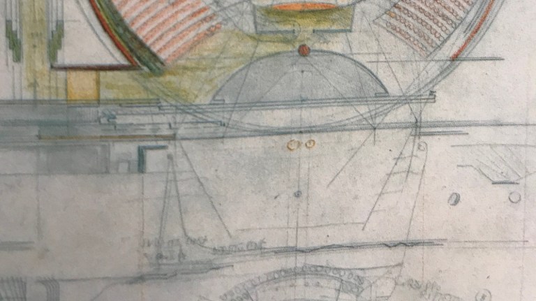
2. Work on your plan. Avoid DLD (dimension-loss-disease)

cluster-house-plans-james-stirling-low-cost-housing-floor-plan-basic-four-house.jpg

As everyone knows I hate plans, and they sued to bore me senseless when I fancied myself as an archi-school student designer. I was more interested in the developing dynamic volumes and three-dimensional architectural language.

And FFS get your scales and your spatial dimensions correct. There is nothing worse than looking at a plan that is full of empty space or the kitchen benches or door openings that are too big or too small. Another aspect of DLD is that some areas are either much bigger or much smaller than what they are supposed to be.

Print, yes actually print out your plans, and get a friend to check them. I am sorry to tell some people this, but plans are about measurement. One old trick is to actually design into your plans cool bathrooms, laundries, kitchens or storage areas. Yes, get those toilets right. If you can do that the whole plan will have more detail and look more convincing to a jury. Get some level of detail into your plan even if it is only visual.

3. Work on and present your sections. Avoid alt-right-angle-sectioning.

screen_shot_2016-02-02_at_5-31-43_pm.jpg

I cannot stress this enough. Yes, I am a section guy. I love those Siza sections which communicate so much about volumes, light, spatial sequences, and the relationship between spaces. After all, a section is in some ways a plan that has been turned on its side. Good sections are of lines that are articulated, a section is a line that has a profile: steps, nibs, thickenings and thinnings, bumps, protrusions and the whole affair is a contoured and shaped image.

There is not building on the planet that has a right-angle where the exterior walls meet the roof. Just spitting out from a digital model, plans, sections and renders without thinking what they are like in reality is not architecture.

4. How is it to walk around your building and what will you see? Avoid unreal-viewpointing.

593939bad0c4ed000400002f

Avoid the impossible angles, screwy scaled views, hot air balloon basket views that no user of your design will actually see. Avoid viewpoint unreality.

The worse thing you can do is front up to the crit and have no idea yourself what your building might be like to walk around. Looking at things in the computer is not the same thing. So, you need to walk through it in your mind and not in your computer. What will you see and what will you encounter? If you can produce and present a series of vignettes and views of what it might be like for someone, perhaps as an actual user of your building,

5. Show the context. Avoid render-plopping

23345939525_55a79e353f.jpg

Please, I beg you, I ask you with all my heart, to show the context. Nothing shows archi-school and computer ignorance more than just plopping on a sheet—and I mean plopping in a scatological sense— render as if it is completely isolated from any surrounding urban, material or physical context.

6. Show the design process. Avoid process-voidance

img_7050.jpg

Bring along all your sketches, preliminary models, have them ready to show the critics. Stick them into some kind of consistent format. I mean how long does to take to do this?

Physical models are excellent. Even if you are running out of time, it’s still good to do a small, simple scaled physical model even if it is tiny. It’s probably worth at least 5 more marks if not more.

7. Get your project timing right. Avoid timing-desperation.

Of course, all the above things might seem like they are going to slow you down or take up too much time. Better to just stay in the model and keep on doing stuff as that will be quicker. But in fact attending to the above issues either partially and or fully will, in the long run, make for a better design and a set of images at the jury end of the process; it will communicate more about your design to a jury.

If you get too desperate about timing, you will screw everything up and end up at a broken printer. Timing is everything, and you need to plan ahead as to how long things will take to do.

I suppose the above is a kind of plea for the importance of design thinking and its associated crafts. Working on a computer model and then just spitting it out into a presentation—extruded plans, oversaturated renders, no sections, Insta-people collaged into all the views, a completely missing context, isn’t really architecture. It is just crap.

Previous blogs along these lines include the following:

Surviving the Design Studio: How to start making architecture with an actual drawing.

Surviving the Design Studio: How to avoid plan reading blindness

Surviving the Design Studio: 7 things to do to hit the ground running.

Surviving the Design Studio: 6 hacks to develop your crap design quickly.

Surviving the Design Studio: Symptoms and cures of design jury anxiety.

Surviving the Design Studio: Getting through the last days before the submission deadline.


The Rise of the Box Building: Bananas in Pajamas and BIM software.

I fear that the latest digital software dictates our design decisions without architects really thinking that much about it. Instead of jumping on the new great new BIM technology bandwagon we need a different debate.  I worry that some of the readers of this blog may be a bit tired of my seemingly old school rants about the hazards of digital technologies and design. But they need to be voiced, or written about, before it is too late. Architects need to resist architectural design and design knowledge becoming a sub-system of a commodified production process. Debating the merits of the prevalent software brands is critical to developing a resistance to anything that diminishes our field of knowledge.

B1 and B2: The predominant global software brands 

Let’s call the two predominant software tools beloved by our profession B1 (Trade name of large white almost extinct animal) and B2 (Weird trade name that conjures up Cousin IT). How did our discourse become beholden to these global brands? In order to protect the guilty, I prefer not to name them by their trademarked and branded names. That would give their developers too much dignity. You can work out who I mean.

Like the Bananas in Pohjamas, also named B1 and B2, both are entities that are the result of the new digital media arena that architects work in. A landscape, dare I mention it, intertwined with the emerging digital-military complex. I wont dwell on this broader point, as today I would like to focus a bit on the hazards of B2.

Firstly, for those readers who need further prompting, B1 is a software brand with animal logo of an almost extinct mammal. In total, there are only about 20,000 of the white species of animal left. B1 allows you to design and create plastic and fluid curves and shapes. Arguably, and supposedly, B1 allows you to generate a design. The emphasis here being on the word generation.

The B2 database

In contrast B2 is different to B1 it is not a modelling tool. It is essentially a database. Yes, an actual database that allows you to do some 3D drawing. You can even do 4D in B2. Wow. Googly Moogly Batman: you can slowly watch the Banana being peeled in order to meet supply chain logistics and OH&S logics. All the information created by the B2 can then be used as the B2 created banana withers and dies. All very sustainable. Or so it is claimed.

B2 does have some add-ons which augment it. But in the rush for technical skills, and post graduation jobs, many students and indeed studios are being hampered by the lack of generative capability. Disturbingly, I am starting to see more and more design studios employing the B2 software tool as a generative and primary tool. No conceptual drawing, no generative diagrams, no annotated sketches, no exploration of options, no physical models. Just jump in and start the model.

CAD and BIM Monkey Magic

Who needs the fluff of design when you need the BIMMY B2 skills to get a job, to become a CAD BIM monkey eating B2 bananas. Who needs that when you can quickly whip up an orthogonal framework and put stuff into it. Yes, using B2 in a design studio you can quickly develop a convincing orthogonal structural frame; and a so-called system; and  lo and behold fill your overall frames with some little boxes; or even slightly bigger boxes; Holey Moley Batman these could be rooms: you can then easily pretend you have designed and actual building. A building that is little more than an overall orthogonal frame filled in with boxes and frames and segments.

Pleasuring the reward centres 

But B2, unlike B1, does not create a NURBS wonderland and it has a limited ability to manipulate individual polygons. The pleasure and experience of using B2 is quite limited. You can easily pull stuff out of the B2 database, as that is what it is made for. Coffee tables, dining tables, office tables, chairs, sofas and trees. Not to mention all sorts of windows and doors. It’s not about generative design: It’s about scrolling, clicking and selecting and then placing. Not so different to Ebay. Each time an architect undertakes this process in building a digital model, a reward pulse goes from your eyes once the database object is placed, to the reward centres of your brain. You then feel good using a database even though you have populated your building model with slop. You feel like you have achieved something. You feel as if the model you are working on is real.

Architectural Design requires thought and effort to conceive, generate, manipulate and then recast. It is an iterative process. Sometimes, two steps forward and one step back. The upshot is that with software tools like B2, limit this process, and encourage the least course of resistance to be followed in the design process. Architectural studios and graduate schools are quickly becoming populated with the results of an over use of B2. Our discipline is getting getting swamped with B2 boxes.

A guide to recognising the B2 designed Box

These projects are B2-like boxes, they are easily recognised, and the following guide should help you to spot them as well.

1. They are boxes: Usually with a few additions and subtractions. Addition, subtraction, orthogonal segmentation and division are about the limits of compositional nuance. Of course, you might find a few abberrant curves, But these will be outliers.

2. They are boxes: The box finishes at the lines of its border. Everything is contained within and there is no effort to either extend or consider how the design might extend into or be a part of a surrounding context. No need to think of architecture’s broader urban responsibilities. The bunny is definitely in the box.

3. They are boxes: and utilise a segmentation that is commensurate with the most advanced, but simplistic, prefabricated building techniques. It’s always a melange of concrete and aluminium panels. No need to think about constructional craft or detailing. Its flat packed world of timber and chipboard.

4. They are boxes: and whilst a section may have been cut through the model for display, it is at worst a section that shows an undifferentiated layer cake of walls and ceilings, at best a few gaps have been dropped out or erased to make some interior spaces. There is no crafting, shaping and contouring of sections.

5. They are boxes: The only light that illuminates these creations is the final oh-so-awful V-Ray renders. B2 software does not allow the architect to think about how light might enter or be manipulated in these toxic creations. I mean who cares. You can’t dial up or select actual light from the database.

6. They are boxes: They are dumb and inchoate boxes that have abandoned architectural theory and history except in the most superficial way. There are no cultural tones or thoughts in these creations. No authentic design research and experiment. They are lacking in irony and there is never any subversive hint or self-awareness in their own making. I hate it when these types of projects win prizes.

Architects decried the modernist box of the 1950s international style. But these new boxes are more insidious. Who needs a critical theory of architecture when you can appease your pleasure centres by using a cool database. Who needs theory when you can be part of the B2 Banana cult future.

A future that is a retrograde technological utopia devoid of architecture.


How Drawing Got a Bad Name: The sketch performance as ritual.

The Alpha male star architects gave drawing a bad name. This is because these Mofos see drawing in all its forms as foremostly a performance. It is never about design. No wonder architects have flocked to the illusory certainties of the computer and and have fled the sketch and the drawing. 

What I contest, is not drawing and sketching itself, but the uneccessary perfomances that sometimes go with it. These perfomances have nothing to do with creating design knowledge and everything to do with the actor. With a few flourishes the actors, or architects, who see drawing as performance end up belittling and demeaning the worth of design drawing and sketching. 

There is nothing worse for any architect or architecture student to have to sit down and watch someone draw in front of you. Usually this performance arises as an effort to tweak, meddle and fiddle. To know best. It is rarely the result of any methodical thought in relation to a design process. Whatever drawing, or image maybe on your screen, the drawing performance involves an intervention that involves a number of ritualised steps. These drawing performers will hover and attempt to solve design problems that don’t exist. In a design studio, they will take your printouts and then intervene with their own pen or pencil. The important thing for these so-called architects is the performance and the pomposity of this performance never ceases to amaze me.

The ritual

Firstly, there is the earnest discussion and then the actor performer steps in. Secondly, they reach for the holy instruments and sacraments of drawing. These are often at hand, the fine liner pen, the pencil of various grades, sometimes coloured pencils, a scale ruler, the tracing paper and of course the holy yellow trace. The drawn gestures are often crude but imbued with meaning and there is normally an associated commentary that has always struck me as being slightly creepy. A constant refrain in this ritual is ” let me try this” or “it needs to be bigger” or “we need more of a shape here” and of course there is the  “yes, thats almost it, hmmm, yes a bit more, yes, thats good.”

The gathered throng of observers, architects, students, sometimes clients are forced to watch this onanistic ritual as they watch each gesture, each line each tweaking of the elevations or plans, each seemingly mind blowing solving of a particular design problem. The more sycophantic of the onlookers will um and ahh. The less intelligent will unquestionably subscribe to the solutions which, despite the trivial nature of these gestures, are after a few minutes set in stone.

The horror of poetic ambiguity

Some architects will do a few conceptual drawings and gestures and then just hand them over to the adults and grown-ups in the studio to implement. I know one architect who has created an entire career out of a few flexible sketches produced in the early to mid 90s. These sketches are now enshrined in an archive that shall remain nameless. In tectonic terms these sketches are barely legible, expressionistic scribbles which may have taken perhaps 30 seconds to a minute to have produced. They are of course poetic with a capital fucking-P (apologies to my more genteel readers). This is poetic ambiguity at its maximum. A creative impulse directly translated from the deeper consciousness of the architect’s brain to the appendage of the hand grasping the holy pencil that squirts its line of graphite or ink onto the yellow trace. Remind you of anything? It is uncomfortable to watch. Give me the safe refuge of the computer screen any day.

The digital outline

frederick-kiesler-endless-house

But sadly, the computer screen has itself also succumbed to the crude gestures of performance. Of course, what is really disturbing is that these often careless and trivial gestures seem to be linked to and transformed into the norms and forms of parametric culture. The parametric computer generated diagram has now supplanted the hand drawn sketch. But the performance around the screen is little different. It’s like in front of these screens everything is new again and the sketches and biomorphic forms of Frederik Kiesler, Pascal Hausermann, Chanaec and Archigram never existed.

images

 The sketch has been supplanted by the printout of a generic and outlined parametric diagram usually with a honeycombed or diatomic, geometry. All you have to do is use the computer to fill in the detail between the lines. Its called form-finding optimisation. What would happen, if Scarpa-like, you started designing from the parametric details up rather than from an overall all outline down?

9950cbcadfd86622f0a53d3049588baa

Working in an office or studio and having to watch this performance is excruciating. It really is. I think drawing is both an analytical, investigative and generative tool. The best design architects know this. They know when to employ a hand sketch or drawing, employing different modes. They are interested in the design and not the flourish and the poetic mystery of the performance. They work to produce a design once the sketch is done. The initial sketch generates further sketches. The original sketch is not enshrined as art representative of male genius. Less infantile architects use drawings to observe as well as solve problems and develop a design. Simply put, design drawing and sketching is work. 

Yellowtrace fiddling

Once built you can tell the buildings that have been designed via this type of yellow traced performance. You can see the little tweaks and fiddles that have been added to the Revit or Microstation model. The adjustment and shifts in facades and window elevations. The added bits of architectural figuration. The big ideas, first conceived as sketches, that remain as vestiges in the built form, around which an underling has desperately tacked on the rest of the spaces. The shaping and skewing of plans that are knee jerk reactions to the immediate urban or heritage context. The problem is you have to walk through this slop.

Maybe that’s why I like Rossi’s drawings because they are the same elements and forms repeated and re-presented over and over again. Rossi’s drawings are in obvious contrast to those architects who create poetic art each time the squirt the graphite onto the yellow. Maybe thats why Rossi writes about the process of “forgetting architetcure.” John Hedjuk’s drawings represent a different and more subtle kind of poetry than the crude performances described above. There is a humility in the best architectural drawings and design sketches where it is less about the gesture and the performance in place of an almost animistic presence in the drawing itself. Hedjuk’s sketches contain an Archipelago of ideas not content or seduced by their own gestures of making. I think that there is a kind of frenetic desperation in Hedjuk’s, or even perhaps Alvaro Siza’s, sketches. At least Siza looks like he is trying to work some things out. But, the performers and actors in architecture always make it look oh so easy and individuated to their own personality.

alvaro_siza_sketch_5

I am not sure if this is true but, I always had the idea that the great, and syphilitic, architect Adolf Loos burnt all his papers and drawings. I think that to forget architecture is probably best and most courageous thing any architect can do. All architects have to do that at some point.