Always a bit crap: The Repair exhibit in the Australian Pavilion at the 2018 Venice Biennale.

There is so much at stake in this year’s Australian Pavilion at the 2018 Architecture Biennale that it is really hard to know where to start. What is at stake here is the question of how Australian architecture represents itself to the world. Maybe I am overthinking it, and perhaps the glittering spectacle that is the Architecture Biennale shouldn’t mean so much. And I don’t mean to sound overtly nationalistic — which seems to be a profoundly unfashionable position to some — even as the project of globalism in architecture, is fading and facing a period of uncertainty. But to ask this question, of how a nation-state like Australia with all its layers of race, gender, class and professional apparatus represents its architecture in a global forum is I think necessary.

The concept for the Australian Pavilion is Repair. You can read a bit about it here.

Indeed, the manifesto of Freespace ably curated by Farrell and McNamara in this 2018 Biennale certainly points to the cracks in considering architecture as a global system of centres, peripheries, pedigrees and stars. A great thing about Freespace as a theme and the manifesto that goes with it its focus on the regional and local architectural practices. It is by and large a celebration of the enmeshing of architects with both modernity but also local communities, cultures and the traces of the morphologies of settlements. Such sentiments are aptly conveyed in the Japanese, French and Spanish exhibits.

This all very nice, and this will sound like a kind of spoiler alert: in this age of blandish boosterism and uncritical praise anything even slightly critical risks danger and the silence of the bland boosters and Instagram influencers of contemporary architecture.

The primary criticism of past Australian architecture Biennale’s has been that the official curated theme of the Biennale is always set after the curators for the Australian pavilion have been selected. This time appears to be different, and the curators seem to have connected to the Biennale’s Freespace theme

img_5506.jpg

Always a bit crap  

Nevertheless, as a friend said, the Australian architectural exhibits are always a bit crap. And after visiting this year’s Biennale, my first reaction was yep that’s right.

The Australian Pavilions are always a bit crap, and we could blame the committee structure that seems to exist to promote mediocrity, the Australia Council, the AIA, and of course the usual coterie of pedigreed and “representative” curators. There have been some spectacular failures in this selection process in the past. Why Justine Clarke and Rory Hyde never got their gig a few tears back points to the mediocrity and perhaps small minded political treachery of the selection process. Look, I don’t really know but this is what I suspect. Mostly, the efforts have been mediocre and there have been few stinkers. For some people, like my anonymous friend, this year will seem no different to previous years.

Sometimes it’s easy to see how and why a car crashes. In this particular car crash, it’s hard to know at what point the entire exhibition started to drift off. The sentiments underlining it a fine. The central conceptual idea of Repair, in theory at least is well-meaning, but then it seems to go all wrong. It’s like none of the bits of this exhibition connects or come together as a whole. This is not to say that I want my exhibitions to be big and larger than life themes (for example the British exhibit with its theme of Island). Nor do I expect there is anything wrong with presenting fragments. But in this instance, each fragment seems isolated, and it’s difficult to make the interpretive connection between the different parts of the exhibit.
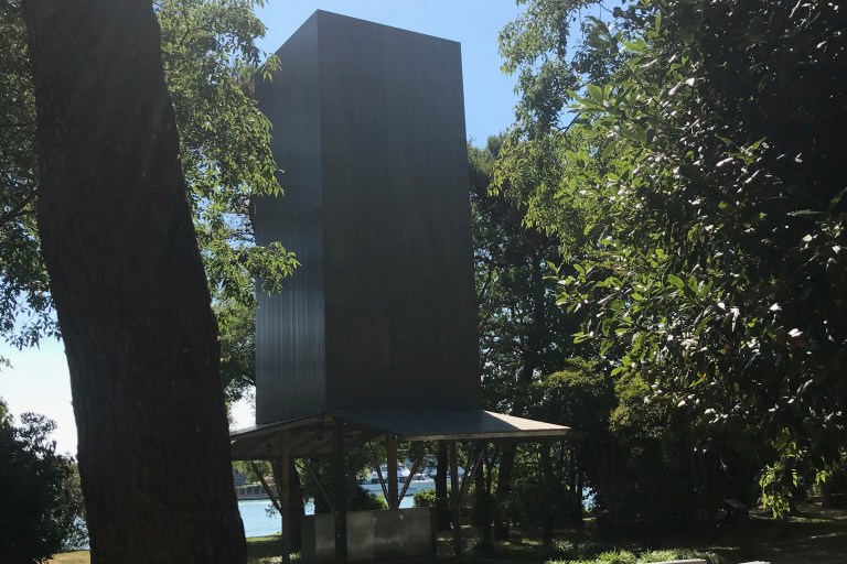
The Pavilion

The new Australian pavilion seems to be better this time I visited it. It is certainly a building that is not kicking us in the head with some kind of spat out chewing gum masticated and parametric forms. Sure, it’s a little conservative and neat, but it is undoubtedly a vast improvement on the previous pavilion with its monomaniacal focus on all things shed. I think we can all be glad that our collective shame has been erased with its demolition.
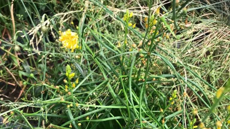
The grass is dying  

img_5510.jpg

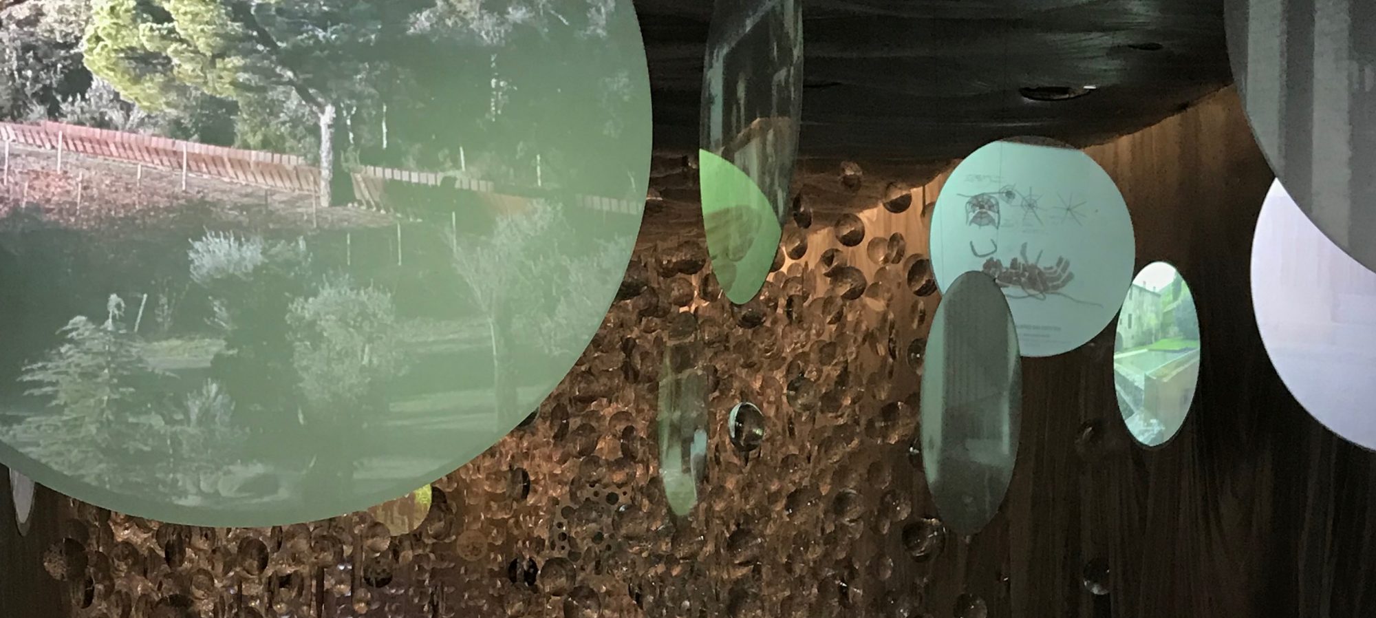
Yes, the western grassland plants in the exhibit are dying, and no one really knows what this means. Were they intended to die or not? Nonetheless, this is the great sorrow of this exhibit.

Yet, what saves this pavilion are the grasslands themselves. That was a brilliant idea. Their materiality is palpable and as one person said to me it was great to see the spiders crawling over these plants. I don’t know the back story, but I fear that the ambitions of the curators may have been foiled by committee structure and then difficulties of procurement in Italy. A country not known for the efficiency and rationality of its logistical supply chains. To be more generous this was a dangerous experiment which like all such endeavours needed to be perfected and refined. Dealing with anything living is bound to be a problem.

The associated projects

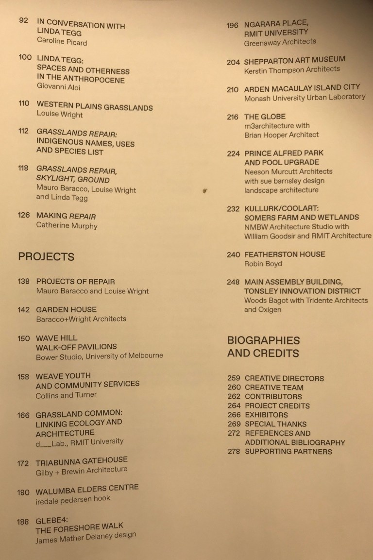
Aside from the grasslands, there are fifteen or sixteen (is it eleven?) architectural projects are featured in this mélange. There eleven projects represented in the entire show are ok. But you wouldn’t think they were even a part of what is exhibited in the pavilion. I stumbled across them in the broadsheet catalogue and apparently each one has its own video. But in the pavilion, annoyingly, you have to wait a long time to see them. It would have been better if the projects were presented in different media. Anything else would have been better. As it is not clear that they are a part of the exhibit at all.

img_5512.jpg

The one movie I saw projected in the space was execrable. An unfortunate combination of interpretative dance, cult yoga pants in a building that looked like an Australian brown brick version of a Jodorowsky set. It was actually the Featherston House (I feel we have now reached peak Boyd) and it all looked a bit too much like people doing River Dance. I presume the other films were better.

img_5525.jpg

By and large, these ancillary projects — and I am not sure if they are meant to be only incidental — do appear to pursue the notion of Repair. Most seem to proclaim their heart on the sleeve greenness and naïve ecological goodness. Of the 15 in the broadsheet, I think three do not deserve to be there. They seem gratuitous and connect nothing, and even detract from, the concept of Repair.

IMG_5510

Curatorial Approach

The curators try and bring all of this home by arguing for a transdisciplinary approach regarding architectural practice one that encompasses a broader range of practice the curators argue that:

We don’t have any definitive solutions, but believe there is a role for architecture to actively engage with the repair of the places it is part of, the soil, hydrology, habitat, connections, overland water flow, microorganisms, vegetation and so on, and that this type of repair is critical to enacting other wider types of social, economic and cultural repair.

Consequently, the broader team supporting the curators is impressive: includes architect Paul Memmott, landscape architect Chris Sawyer, landscape architect and urban designer Tim O’Loan, ecologist David Freudenberger, curatorial advisor Catherine Murphy, architect Lance van Maanen and a graduate of architecture Jonathan Ware.

Yes, transdisciplinary knowledge and its practices are mainly lacking in Australian architectural research, strategy organisational practice and design. Landscape architects and urbanists would claim that the ideas presented in this exhibit, are not new, and already form the theoretical background of landscape architecture in Australia and elsewhere. Of course architects, research academics (including myself) love to pay lip service to and generate spin around transdisciplinary ideals. But these days it is not the transdisciplinary architects, or architectural researchers, who are getting the commissions or research funds or all of the research metrics. Design research that most transdisciplinary of practices is still a second-class citizen in many forums.

So, from this perspective the aspirations of the curators are admirable. But paradoxically, the misplaced outcomes of this exhibit suggest how much further architects need to go in pursuing transdisciplinarity as real practice.

The next one

As for me well I am already thinking about the next one. This time I am going to put a pitch in for the gig. I have an idea for a team of architectural misfits. I even have a concept in mind. The space needs to be filled again with the craziness that is the best of Australian architecture. Tight-lipped and po-faced conceptual pieces need to be banished forever (as well as the bad curator portraits that go with them). No more bad conceptual abstractions that can only be used with difficulty.  Plus, the interpretive material really needs to be of a better standard. It’s just rude to make visitors guess, WTF or what on earth, is going on.

img_5524.jpg

I really love the grasslands

I love them because they speak to a lost landscape and country, they make of the other 71 curated exhibitors by the Farrell and McNamara look like earnest, well-meaning self-congratulatory bores. But these grasslands are really different to the self-congratulatory patter of Farrell and McNamara’s presentation of the regional practices of Europe. These wilting and dying grasslands with their ridiculous felt containers point to the need for architects to theorise a new relationship between natural history, ecology and immanent notions of cultural landscapes. Whilst, the idea of Repair, does have much in common with the Freespace manifesto the grasslands themselves point to the triviality of thinking Architecture is all about the cultures and histories of the European City.

img_5530.jpg

Species death

The idea of using the grasslands could have been great. But I think it was hampered by the conceptual regime of Repair combined with the worst techniques and artifices of an abstract curatorial method. I shudder to think of the “Repair” ideas workshop: “hey, what do we mean by Repair” and “let’s try and really understand it deeply” etc etc.  Unfortunately, and too often abstraction and conceptual artifice are somehow seen as being cool. In this case, I feel this worked against the material and the animistic and cultural presence of the grasslands. In response, all these species could do was die.

img_5539.jpg

Seeing the grasslands dying in the pavilion in Venice reminded me of this story of horror. There is a monument in Reading cemetery for a Wotjobaluk boy, who came from the beautifully crafted and managed lands of the Wimmera. He lost his mother and drifted to the muddy metropolis of Melbourne, where he was adopted by an Anglican cleric from Reading and ended up in England where he died in 1852.

img_5534.jpg

The grasslands in this pavilion reminded me of that story, and I think the great moment in the exhibition are the missing indigenous names for these plants. Its subtle and the curators don’t hit you in the face with it. But who knows if they meant to do that or not? After all, what can you do after a genocide, after a crime of crimes, and crimes of extinction? Yes, the curators seem to be saying: we seek to Repair what we will, and we will never mention the horror. Let’s wash it all clean with some new green. For me, and others may disagree, this position is so lacking in rage that it points to an underlying and empty politics.

img_5540.jpg

Yes, the grasslands are the real stars of this exhibit. Their seeds have been dislocated and nurtured, but now they are dying. Spiders are crawling over the grass in a far country. The grasslands, for those who wish to listen to them deeply, are a different kind of city which cannot be ignored. But that lost city has nothing to do with the notion of Repair.

Writing the Unspeakable: Sean Godsell’s Chapel at the Holy See in Venice

In keeping with the theme of #Freespace, the Holy See has commissioned a number of small chapels on the island of San Giorgio Maggiore for the Architecture Biennale. There are 10 chapels in all. The commissioner was His Eminence Cardinal Gianfranco Ravasi. For whatever it is worth Cardinal Ravasi is the president of the Pontifical Council for Culture. Isola di San Giorgio Maggiore is the site of the chapels and the place where the Benedictines first inhabited Venice in the 10th century.

img_5745.jpg

The curators were Francesco Dal Co and Micol Forti. The curators asked the invited architects to consider the chapel as a place of:

“orientation, encounter; meditation, inside a vast forest seen as the physical suggestion of the labyrinthine progress of life and the wandering of humankind in the world.”

Magnani and Traudy Pelzel were the architects of the introductory pavilion, where the exhibition starts with a kind of small chapel dedicated to Asplund’s Woodland Chapel of 1920 located in the cemetery of Stockholm. A suitable introduction to the architectural explorations of the 10 chapels.

img_5747.jpg

The invited architects were Andrew Berman, Francesco Cellini, Javier Corvalàn, Eva Prats and Ricardo Flores, Norman Foster, Teronobu Fujimori, Carla Juacaba, Smiljan Radic, Eduardo Souto de Moura, and the Australian architect Sean Godsell.

img_5668.jpg

I never thought I would say it, but Sean Godsell’s chapel is an exceptional contribution to this endeavour. Let me repeat that. Indeed, I never thought I would write these word’s, but the small chapel designed by Sean Godsell is tremendous and certainly better in many respects than the chapels by the other architects.

img_5677.jpg

Catholic liturgy

The Godsell chapel does not seem to just recreate what one might expect of some of the auteur architects represented here. What’s more, it seems to speak to an understanding of the Catholic liturgy that is not merely superficial, thematic or the usual riffs about sunlight, the sky and the meditative life.

IMG_5700

The Godsell project’s strength is that it is a discernible celebration of the Catholic liturgy itself. A celebration of its gestures, and a celebration that intimates that once its panels are closed, they could then be re-opened. The laity seating is distant from the altar, and the altar itself is all hot-blooded galvanised steel; above which is a gold metallic light shaft, even the hydraulic canisters, which support the verandah like panels, seem to suggest that this is not a static place but a working and operating chapel. The hex screws look like they have been drilled in so hard they are stigmata. The small primitive half-log benches for the laity are outside of the main area but these face the altar. The message is clear: the priest-architect is at the centre of this chapel.

img_5708.jpg

The galvanised steel work reinforces a sense of temporality in the way that appears to imply the chapel can be opened and closed. It would be interesting to see how the light on this chapel changes with the season of the Venetian lagoon. One could certainly imagine rituals, Catholic or otherwise, taking place here. It is orientated to both the sky and the lagoon, as well as a focus that directs worship towards the central liturgy of Catholicism.

IMG_5709IMG_5711

The BBQ and the Design Hub 

I have heard a few of the other blokes sniggering to say that altar looks like a BBQ, in the summer heat of Venice its natural to think you could easily fry a few strips of kanga on it. I am not sure how our collective critical faculties came to such blithe readings. Its always easy to scoff at the architect-priest driven by intuition, who readily conforms to the trope of the holy monster or outsider architect. But hey whats wrong with the barbie. Isn’t that what the Catholic liturgy is all about in a way: red meat, eggs and poking forks into flesh. Every Ozzie, Ozzie, Ozzie, Oi, Oi, Oi, BBQ is a kind of transubstantiation in its own way.

IMG_5706

Now I am being blithe, but more seriously, this project in Venice suggests that a reading of Godsell’s largest project to date, the Design Hub, could be seen differently; a jewel box or casket, a kind of crematoria and chapel situated in a profane world. Arguably, the pragmatic controversies surrounding the Design Hub have distorted a critical reading of it and the architect’s intentions. No matter how much that intention might be the result of an intuitive and primal sensibility adrift from theory.

img_5728.jpg

Christ Almighty 

Can we just write off such architectural contributions as ecclesiastical outliers for the faithful? Or can we scoff at them in with all the instruments of secular rhetoric? Does religiosity, whatever form it might take, really matter and is its representation in architecture anything we need consider? Interestingly, the Melbourne School of architecture (let’s call it that for the sake of simplicity) has been driven by a big swathe of Christological narratives. By focusing and drawing attention to the actions of the ritual itself Sean Godsell’s approach is different to the embedded symbolic narratives of Howard Raggat’s designs for our city and probably more straightforward than Peter Corrigan’s work and the complexities of his theatrical catholicism. What is interesting is a big swathe of our city, and the tribal life of its architects, has its origins and legacies in the work of these very Christian architects.

Catalan Pavilion

img_5974.jpg

A useful comparison to the Holy See’s contribution at Venice is the Catalan Pavilion. This pavilion is suitably distant from the main centres of biennale action. Of course, given the politics of Catalonia, it appears telling that the Catalan architects RCR, recent winners of the Pritzker prize, would be on the margins of the Venetian lagoon. Approaching the Catalonian exhibition you find a tin shed; another temporary fragment built on all the other fragments and accretions that have made Venice. But unlike many of the other National Pavilions of this year’s Biennale, including the Australian pavilion, this exhibit presents a dream sequence of images rather than some polemical rhetoric about architectural nationhood. As the architects themselves say:

img_5984.jpg

“Architecture shouldn’t be about doing difficult projects and iconic buildings but about creating spaces in which people can have their own experiences and develop their own creativity,”

The Catalan pavilion “Dream and Nature,” evokes the landscapes of Catalonia and the relationship of the architects to this place.

img_5979.jpg

Filled with glittering plastic lenses, grainy media projections and whimsical images of nature the Catalan pavilion presents a series of unstable images that seem to exist between waking and dreaming. If one of the primary tasks of modern architecture is estrangement, to make us perceive things differently, then this pavilion achieves this. (Shklovsky’s literary notion of defamiliarisation and estrangement and its relation to the forms of a tradition have always seemed fitting theory in this regard).

img_5988.jpg

RCR’s Catalan pavilion, called “Dream and Nature,” takes the visitor far away from Venice’s canals by evoking the woodlands, fields and volcanic hills of Catalonia. The pavilion presents images of 120 hectares of land in Catalonia that the three architects bought and have started to turn into what Mr Aranda called “our legacy” — a farming property that they aim to make a place of study and reflection about architecture and how it interacts with nature and with other disciplines.

img_5990.jpg

There was a moment in the Catalan pavilion, projected onto one of the lenses, where the architects are walking through a forest. It is like they had abandoned architecture and had become children at play, positioning architecture between nature, folklore and the spirit creatures of their own land. That’s the kind of kool-aid I want to drink.

img_5991.jpg

The Burbs 

As for the spirit creatures in our suburbs. They have all been killed. Killed by the big roofed Christian churches, Ronchamp look-a-likes and basic brick sheds next to the suburban freeways. Yet, both Corbusier’s Ronchamp and Asplund’s chapel advance an architectural language based on a ancient animism celebrating a primitivist and folkloric nature. A natural and organic world separated from the strictures of organised religion. For modernists and those who succeed them religious buildings have perhaps always presented a dilemma. What are the appropriate modes of representation and architectural language for such buildings? How do Architects build programs that represent different faith communities? The efforts in Australia to build mosques that counter Muslim racism indicate other examples of this genre. Moreover, how do we build on country?

img_5994-e1532668657936.jpg

Nowadays every city has its own little-bejewelled icons. Little nuggets and follies designed to travel through our social media feeds with dreamless iconicity. Image canoes determined not to dissolve or get swamped or sunk or lost on Insta or Twitter. Canoes attached to confected outrage or bland boosterism.

What is the point of follies, or exhibitions if they do not estrange our minds, or take us to past rituals and lost dreams. So what can we say about sacred liturgies, pagan rituals, dreams and wanderings at a time where every city has its follies and pavilions. Have we become slaves to a political economy of iconicity that is really not making our settlements any more living or sustainable or resilient or smart?

Weasel word hashtags for Architects and Urbanists

Architects always seem to get quite a bit of criticism for adopting strange, eccentric and or opaque language. Recently a friend told me that he heard a Project Manager say that “everything architects write is shit,” I am not entirely sure but maybe that PM had been reading this blog. Especially this extremely popular blog post.

Weasel words defined

This prompted me to think about this and the pressures on architects to employ weasel words to get work. A few years back Paul Keating’s speechwriter Don Watson identified and wrote a book about same weasel words amongst corporates types and the political class. In his introduction he wrote:

Weasel words are the words of the powerful, the treacherous and the unfaithful, spies, assassins and thieves. Bureaucrats and ideologues love them. Tyrants cannot do without them.

To speak the words the powerful speak is to obey them, or at least to give up all outward signs of freedom. Stalin was not the first tyrant to be so feared that those around him preferred to imitate even his malapropisms than give him any reason to think they were not in awe of his authority.

The same mimicry can be expected wherever the official language is a kind of code that we must at least appear to understand, or be excluded. It happens in democracies, and in businesses and government departments. Today it is found everywhere the language of the information age is (compulsorily) spoken; everywhere the management revolution has been; everywhere marketing goes. This is language without possibility. It cannot convey humour, fancy, feelings, nuance or the varieties of experience. It is cut off and cuts us off from provenance – it has no past.

The public language of architects 

Certainly, the same kind of miasma exists in the public life of architecture. Its true for construction and the related disciplines and I am breathing this stuff in all the time in marketised academia. Who is the worst I wonder? The development industry, the real estate industry or the contractors. Architects should know better to avoid the butchering of language, and overuse of signifiers cut adrift from any real architectural theory. For architects weasel words often accompany weasel images.

My point is not that architects do not need a dose of “plain English” speaking.  They already do that. For example, a quick scour of a few architects websites revealed words like client focus, inspiration, evolving, inclusive, distinctive, responsive, quality and of course context. Architects are all these things. But I  hope that in and across all the architectural websites and hashtags there might be a little more clarity, nuance and resistance.

How you talk about projects, like urban design or architecture is just as important as how you might represent them. In recent years with the rise and rise of social media, it seems like every second, Facebook post, Twitter byte, Insta Story or Linked-In post is pushing a new positive and inspiring line about the urban and architectural world. Written in a way that attempts to grab you distract and then grab your mind for a few seconds in the attention economy. Consequently. It seems with the rise of social media we have seen a corresponding surge of weasel words and slogans. With the demise of theory and history and any subject that might help architecture students analyse these words.
Are architects flying into a vortex of dumb and dumber? So here is my own list of Weasel words specific to architects and urbanists. So what is an urbanist anyway? When you hear someone say one of these words or phrases its best that the alarms go off in your head and you drill down into the detail.
The following is a warning and an alert as to what these words might really mean. So here is my list of weasel hashtags. For each #weaselword I added the word architecture or city to and did a Google image search to see what would happen.

#Low-Carbon

Usually followed by words like Architecture, Urbanism, City, City Transition Holy fuck you can add low-carbon as a descriptor to just about anything. Maybe it doesn’t really matter if haven’t actually done a Carbon Audit or you emissions are through the roof.

download-7

The low clouds are not carbon emissions

#Sustainable

This one has really been overused. We should stop using this word and think of something better. This one is also like Low Carbon. But whereas Low Carbon sounds a bit more techy and quantitative, this one just sounds like mush. But hey sustainable architecture is this in image search.

download-8

Naturally 6 stars for this one

#Smart Cities  

What this really means is the opposite. It means dumb cities. Dumb cities with awful curtain walls, mixed-use retail and glassy-eyed towers in the portfolios of middle manager real estate types. The Google image search threw up this.

1200px-Smart_City

Just oozing smarts

#Parametric

Ok, I know regular readers of the blog will be accustomed to my hatred of the cult of parametricism. But I could resist. It’s like a label you can use to pretend you have done architecture. Googling Parametric studio gets you 9,960,000 results. When I Google image searched Parametric architecture I got this:

download-10

Not so far down the parametric image food chain you start getting timber stuff like this. 

images-1

Wow !!

#Liveable

#Liveable = Melbourne. Yes, equals full stop. Melbourne is the world’s most liveable city.   What else could it possibly mean? When I Google image searched Liveable I just got Melbourne:

1.09.A-v02r01-PhotoLarge.jpg

It’s a great place to sleep out if you are homeless.

#Visionary

This one means usually means we are going to build a massive tower on top of a tiny little historic building. When I Google image searched Visionary architecture I got this:

Screen Shot 2013-10-21 at 12.1924603.png.1924605

Those crazy architects !

#Resilient

It should mean when the climate change catastrophe comes how will our community recover. Or it might mean how we can recover from any kind of volatility. But when I Google image searched resilient architecture I got this:

kpf-red-hook-houses-1

How could that design not be resilient? 

#Innovative

Usually means “we are going to try and do something different that our middle-brow time and cost outcome clients will not like.” Can also be used to explain, to the uninitiated, why the scheme is a completely under designed ad-hoc dog’s breakfast disaster. When I Google image searched innovative architecture I got this:

download-11

Innovative and blurry. 

Finally

So let’s hear it for those architects and urbanists who bother to think about the words and images they make and send out into the media streams. Let’s applaud those architects who refuse to adopt the official languages of information tyranny and capital. Architectural practice of worth will always pursue architecture as a minor literature in the hope that it can still be a gathering point of critical resistance.

Venice Architecture Biennale 2018: In search of Australian Architecture’s global brand.

Today is almost the day that the call for the creative director of the Australian Architecture pavilion at the 2018 Venice Biennale closes.  At least we now have a relatively decent exhibition gallery in the Giardini to exhibit in. The old pavilion, as we all know, was designed  by Philip Cox (kind of channelling Glen Murcutt) and it looked like a little bit of that old timey Darling Harbour style. The pavilion contained a series of long spaces, over two levels, with vaulted metal deck roofing. The new affair by the Melbourne architects DCM is much better as an exhibition space and I visited it in 2015 and saw how it worked for Fiona Hall’s exhibition for the Art Biennale. Of course it is pity that this commission was not a public competition. This was the source of some controversy at the time. But, that is not to deny the fact that DCM have done well; It would have been a nightmare project to have managed, constructed and delivered.

The architecture Biennale at Venice is the  shining and glittering highlight in the calendar of the global system that is architecture these days. From my antipodean perspective, it probably ranks almost as highly as the AA Projects Review exhibition or the opening of the Serpentine Pavilion. It’s as if a  Klingon ship, has picked up quaint little earth in a tractor beam, given it a shake and all the world’s architectural models has fallen of their storage shelves and lodged in Venice. Venice that city of cities where all the other cities of the world and their histories, can be glimpsed  in Venice’s own layers and edges around the lagoon. Venice has always been a place of politics, intrigue and controversy: Just like the Architecture Biennale itself in terms of who is being selected ect.  It  has always been a place where the flows of territorial ambition and power collided and then just as quickly departed. Of course these days, Venice is more like Disneyland in some ways where every tow years the architectural glitterati drink Aperol’s on the Grand Canal and in eat Fiaschetteria Toscana.

All of this exoticism and history and the fact that the worlds biggest architectural trade show is in Venice every two years might be why over time Australian architects have generally gone nuts over the Venice Biennale. There is nothing like swanning around the Vernissage (the opening week of the Biennale) and going to the parties. When I went it was like being in Prahran. Of course, as I discovered you have to know the right sort of people to get invited to the parties with Rem, Sejima or Patrik (Patrick?) or Zaha (god rest her soul). The only party I ever managed to stumble into was one held by the Armenians, in a stripped out Palazzo hulk somewhere behind Campo Santa Margherita, who despite their long association with the Venetian lagoon had run out of beer and Aperol’s by the time I stumbled into the party. At least the Armenians knew how to dance. So going to Venice as an invited exhibitor, and more so as a so-called creative director, is a prestigious gig;  if you don’t get invited to exhibit in the gardens or the Arsenale you can always set something up in one of the numerous Palazzo’s around the town and make it look or seem half decent. All you need is a couple of plasma screens and a bit of money to print a catalogue.

Just the name Venice or Architecture Biennale is enough to make most architects swoon. Which is literally what happened to me as my friends will know at the 2010 Biennale. I drank so much Aperol that I leached all the Potassium out of my system and ended up in the Venice Ospedale (sadly, as all architects know, not the one that Corb wanted to build). My room overlooked the lagoon towards San Michele the cemetery island. For a day I was able to reflect and think about one the great architectural projects of the last century. Aldo Rossi’s Floating Theatre constructed for the 1979-80 Venice Biennale. As I thought I was going to die from a Aperol Spritz induced coma Rossi. I thought about what Rossi had said about his theatre in Venice.

“and what better place for a beacon, a house of light, literally a lighthouse, than by the sea, in a border zone between sea and land, amid beach, rock, sky and clouds?”

Any way I lived to tell the tale about being in the Ospedale. I certainly saved a few bucks because Venice is no place for the small practitioner on a limited travel budget.

I have been to quite a few of Biennale’s and the Australian representation at them is to some degree problematic. I can’t remember if I have said this in a previous blog or not: But, what exactly is Australia’s brand in the global system of architecture? As I touched on last week with the hair thing in this world of Google analytics and SEO’s its amazing that a Google search of Australian architecture reveals mostly Murcutt, Utzon (not really Australian) and maybe a bit of Harry Seidler. I fear there is a lot of Opera House and Murcutt action when people think of Australian Architecture. Even the Wikipedia entry is execrable. Whoever wrote the second sentence of that entry should at the very least be transported back in time to be reeducated in a Maoist collective.

The problematic nature, or lack of a brand or even an identity, around Australia’s global Architectural brand can be seen to some degree in the various curated Biennale that have occurred over the past dozen years or so. My quick take, and Raisbeck ratings  on each one is below.

2006: Micro Macro City Creative Directors Shane Murray and Nigel Bertram.

I thought this was characteristically dry and lacking in any kind of ironic reflection. But in hindsight I think it did depict a kind of realist picture of Australian cities and suburbs. The Models in the exhibition were great. (Raisbeck Rating 8/10)

2008. ABUNDANT Creative Directors Neil Durbach, Vince Frost, Wendy Lewin, Kerstin Thompson and Gary Warner.

After the tight and well planned 2006 gig this was the complete opposite. It’s almost as if the creative directors had to purge the building of the tone of the Micro Macro City exhibition. This as a real free for all it was like every boy and is dog (except of course Raisbeck) got a gig in it.  Annoyingly, the catalogue, if it existed at all, was non-existent by the time I got there. It contained hundreds (140 to be exact) of models all vying to be different. Some of these were really good and some were really bad. The spin around it was that it was a way of establishing the scope and range of Australian Architectural experiment. Sadly, I think it lacked a firm theoretical  basis and just made us look like a nation of idiosyncratic and isolated savants. Having said that it was indeed an exuberant and “abundant” celebration of the pluralism of Australian Architecture and I liked the way the Cox Pavilion was painted green.  (Raisbeck Rating 6.5-7/10)

2010: NOW and WHEN Creative Directors John Gollings and Ivan Rijavec.

This was the one I was involved with a collaborative collective that we called ourselves colony collective. Basically, two crappy laptops and a lot of help from Flood Slicer who set up the multimedia works in the exhibition. This was a take on Australia cities in 2050. Our entry Mould City was intended to be  a kind of  Superstudio or Archizoom take on Australia’s future cities.

Mould-City_Colony-Collective-when.jpg

Mould City Colony Collective 2010 

Disappointingly, in the other architectural ruminations, there were a lot of flooded cities. And I mean a lot of flooded cities. Plus, a few overhead floating type cities. Readers of this blog will probably you know the sequence: One, climate change is real. Two, the icecaps will melt. Three, the cities will flood. Four, lets build floating cities etc etc. Theory and l discourse around Utopian architecture is really lacking in Australia. Nonetheless, Golling’s images of the mines were great and ALL the technology worked. (Raisbeck Rating 7.5-8/10)

2012: Formations Creative Directors Anthony Burke, Gerard Reinmuth, with TOKO concept design

This was the worst one I ever saw it was disjointed and paltry. A total waste of money and resources.The Creative Directors selected six architectural teams working in non-traditional ways and domains from around the nation for the exhibition. The intention was to highlight different modes of practice. In part it did this, but not convincingly. When I got there I couldn’t quite figure out what it was about. It looked scrappy, and as if the creative directors were more interested in being creative directors than actually working to put together a credible exhibition representing, the 6 teams, Australian Architecture. Google it and all you get is pictures of the creative directors in linen jackets and black t-shirts or shirts. I did not really get the football tables outside of the exhibition.  (Raisbeck 4/10)

2014: Augmented Australia: 1914 – 2014 Creative Directors felix._Giles_Anderson+Goad

This one was on when the new pavilion was being constructed. I didn’t really get to visit this one so there is not a lot I can say. There was a call for unbuilt and then augmented projects and I submitted a few but of course; but not being a so-called star architect and given our practice is consigned to the graveyard of small practice oblivion its understandable that any one would want to remodel or Augment on of our old projects. There was  a whole lot of kiosky-appy-cloudy Ipad action;  I am told the technology didn’t quite work on the day (but perhaps I am wrong). I thought it was probably a good idea. (Raisbeck rating 7/10). The project below is the one of ours (Raisbeck and Klempfner circa 1995) that they decided not to “augment.” It certainly could have done with that.

21498cf8-c8da-4da3-afc6-72220bf15c96

Hanoi Office Building Raisbeck and Klempfner 1995

2016: The Pool Creative Directors Amelia Holliday, Isabelle Toland (Aileen Sage) and Michelle Tabet

This was the first one in the new building. I wasn’t sure about this one. I thought maybe it was more of a social history rather than an architectural history. I was also worried that the curators may have forgotten the fact that the public swimming pool has been a colonising instrument space for subjugating Australia along racial and gender lines. I think they perhaps managed to avoid that trap. But I am not sure that the social history of the pool says that much about our architectural culture. (Raisbeck rating 7/10)

Given the above, and my ratings aside. I would argue that a strongly theorised and polemical exhibit is better than some of the above efforts. I know of  few friends who have tried to do this.Only to be knocked back by an overly conservative AIA selection committee. I suspect that is a better than trying to appease everyone or going for concepts that are so saccharine that they really do not add to Australia’s global architectural brand; I mean what si that brand anyway; we really need to shift the brand away from the Utzon-Murcutt-quaint-Boyd and Seidler brand attributes and make our own the contribution to debates and experiments now emerging in the global system that is architecture. I have not really discussed that much about the overall curation of the Biennale. I will leave that for a later blog.

Maybe for the AIA it’s all about getting the sponsorship dollars. That is fair enough to some extent. Janet Holmes a Court has done a great job in that regard. Some countries have the gumption to only exhibit the work of one architect or architectural firm. Other’s tackle ideas that are in themselves controversial. Presenting a seamless and saccharine image, or an overly pluralist one, of what Australian architecture is like doesn’t really cut it for me.   With any luck we might even start to dismantle the innately conservative nexus of Star Architecture, parametricism and Ivy League privilege that bedevils global architecture. On paper at least this year’s curators for the entire Biennale look like they might be able to do that.