Paradoxical Design Thinking: How architects can avoid the BIG IDEA is crap trap.

In this week’s blog I resuscitate from my vault an old conference paper which discusses design processes. This came after a conversation with friend about how and why his firm of architects is suffering because they have not won a lot of new work recently. I think this blog might help those architects and other creative orientated firms, stuck in a rut, and seeking to reflect on their creative processes. 

The BIG IDEA syndrome

Trump is full of big ideas like build a wall, lock up HRC and even all those franchising ideas Trump steak, Trump uni, Trump perfume and Trump Vodka. Sadly for some there is a view that creativity and genius is something innate. A secret sauce or recipe that is embedded in our DNA. This sensibility leads to people looking for the one big idea. The BIG IDEA. Dare I say it: the big fucking idea. The secret to the universe or the solution to the particular problem. (Of course as noted in another blog when the problem is “wicked” there may not even be a single solution). Unfortunately, in the many professional cultures, for example architecture, urban design, landscape urbanism and maybe even advertising, the single idea or big idea view reigns supreme. Once you have that idea you, or the team, runs with it. But as Andy Warhol said of Trump he is kind of cheap and I think the same about the Big Idea in architecture. It’s always kind of cheap.

So, what if the one BIG Trumpian idea is crap? How do you avoid the Bad BIG IDEA syndrome (it’s a bit like saying how can America avoid Trump)? If the idea is bad you might lose the competition, the job, the client or the pitch. You might even lose the confidence of your team working on it. You might end up with a design or an end strategy that is so bad that all you can do is polish it a bit (there is a saying for this but I think I can only sustain one profanity per blog post).

Paradoxical Design can save you 

One way to get around this conundrum is to abandon the focus on the one big idea syndrome and always build a portfolio of ideas into your design practice. This is done by deliberately fostering the generation of paradoxical or counter ideas in a project. Ideas that are in opposition to the prevailing project idea. In opposition to the one BIG IDEA. In other words, its great have a few paradoxical, counter or oppositional ideas being pursued at once. Yes, it makes for chaos with contradictory ideas are competing at some point in the project but this is manageable and ensures that you are not locked into a dog of an idea. The counter ideas can help you to test and compare the prevailing idea. Not only that but you can use the paradoxical ideas in other projects in the future.

Design thinking is about constantly generating creative ideas and every project should run with and explore a few ideas in parallel. This is one aspect of design thinking that most, but not all architects, understand and are taught in architecture schools (well some of the time anyway).

Running with a few paradoxical ideas might actually save time and effort (and of course money) in the long run. The problem is that for architects or other creative design professionals changes are often seen as being unwelcome and at odds with sequential project development milestones. Changes are often seen as negative in a productivity sense; or changes contribute to rework during the construction or production process and this adds costs to project risks. Also, there is the perennial problem of how you explain changes to the client.

But, on the other hand creative and generative design is seen to foster innovation and this is at the heart of the design paradox. One way is to ignore this constant paradox but the other way is to embrace Paradoxical Design.

Paradoxical Design and innovation 

In innovation theory a number of notable theorists also suggest that embracing Paradoxical Design means recognising, but also fighting against linear and binary descriptions of the design process. As Winch theorised (sorry to get all academic here) designing can either be characterized as either a conjectural model or a linear model (Winch, 1998). He argues that the linear model is a problem solving approach which involves analysis, synthesis and evaluation. Which is all very well and dandy. But he goes onto argue that the conjectural model, a model which is arguably linked to ker-razzy assed architectural design, is more discontinuous or disruptive. For those of you reading this interested in innovation theories and systems, in Clayton Christensen’s parlance, (the elder-king of innovation academics) conjectural design is what might be termed as exploratory innovation.

In Paradoxical Design, an initial hunch or conjecture is formulated and following this the process then proceeds through a number of iterations. It is through these paradoxical iterations that design knowledge is created; in each iteration conjectures are proposed and then abandoned. The iterations, or the creative idea embodied in each one, are paradoxical because they might be quite different to one another. They may even contradict each other.

A rapid survey of architects

In a rapid survey I did a few years back of architectural firms practices in Australia in a desperate effort to churn out a quick conference paper. I aimed to find out to what degree architects pursue Radical Design vs Incremental Design solutions as design projects progressed. You can find the paper here. Its full of diagrams describing the process I am describing.

To cut a long story short, in the survey I defined Radical Design solutions as: solutions “leading to fundamental rethinking of elements of the project”, “affect the form or conceptual origin”, “change the design concept” or “a change that affects the fundamental design – so great that the concept must be re-assessed or thrown out.

In the survey which had about 70 respondents the term Incremental Design was seen as being “stepwise improvements” or “incremental refinements of an existing idea.” Incremental Design represents linear, logical, and rational design gestures and solutions.

Survey results

28% of the Architects surveyed responded by saying that “Pursuing radical design changes is a part of the practice’s normal design process.” 29% claimed that “In our practice any project the principal designer, designer teams and design architects have the time to pursue new design solutions throughout the project.” More importantly. 42% stated that “continuing to generate both Incremental and Radical design solutions throughout the process helps to identify and highlight new design issues and problems as the design progresses.”

In terms of cost benefits, 21% responded that “Continuing to generate both Radical and Incremental design solutions throughout the process outweighs impacts on project delivery time or cost.” But despite this 72% acknowledged that sometimes it is necessary to discard a design solution or sketch design and start the design process again in order to achieve a better project outcome. And 65% agreed that “Creating and then culling both Radical and Incremental successive design solutions in a given project helps to achieve high quality and innovative design.

Design architects are often accused of changing their minds once decisions have been made during the project development and delivery process. Some see this as architects just being all about ker-razzy assed architects. For other professions, even creative ones, paradoxical design is not possible. This is because an investment in design itself is seen as all too costly and wasteful. Let alone running with the wolves of Paradoxical Design. But, on my town we all remember the brouhaha over Federation Square; which turned out great despite the village naysayers decrying its cost and design.Of course it is always cheaper to run with one idea. But, a badly and cheaply designed building or project has many longer term societal costs.

But if you really want to find the creative idea that is so compelling that clients, users and the punters can’t resist it then you are not going to find it just latching onto the first big idea that comes along. Thats part of the paradox I guess. You may only get there by thinking about a set of pradoxical ideas rather than one BIG IDEA.  In any case, thinking about and managing Paradoxical Design processes is a great way to build design knowledge and a portfolio of design ideas in your firm. Paradoxical Design thinking is essential to winning those clients, the big commissions and the awards.

My students in the colliding spaces studio have pretty much finished the semester. thankfully no one imploded. A few even seemed to enjoy it ! But then again as we all know archi-students will say a lot of nice things about their tutors to get a good mark. I am hoping to put their projects up on this site in the next few weeks. 


Surviving the Design Studio: Why Architecture students should read books instead of sticking their heads up Snapchat.  

I took some old books to studio the other day. The students just looked at me like WTF. I also felt a bit ashamed because I felt like I was some kinda old-timey-Appalachian-mountain-fogey bringing out his old architectty books. With all of the current enthusiasms for craft beer, artisanal coffee, cardboard  furniture that  goes soggy when its wet (just like a book), pop up vegetable gardens (real books are made from real vegetables), old timey Ned Kelly bushranger lumber jack beards,  and Aravena communitarianism you think the humble bound book would have have made a bit of a comeback.

My architecture school has a library. Yes, thats right a real live actual library and guess what?  It is actually full of books and it is opposite the workshop. But, as far as I can tell the workshop is more popular and in the library the students just appear to sit there and look into their lap tops. So in this digital age of Pinterest why would you ever read a book about architecture? The following points suggest why the physical book may not be dead after all and that maybe reading is not such a bad thing. My overall argument is that architecture isn’t simply about spinning the Rhino or computer model around and around and around and crafting that so called final render.

The Archive

Books and print media was actually where it was at before the dawn of the computer. In the 60s, 70s and well into the 1980s the main means by which architectural ideas were transmitted was via print media. The architectural magazine and the book reigned supreme. Magazines like Architectural Design, Architectural Review, Progressive Architecture, Japan Architect and also Domus were the places where ideas where debated about architecture. In the 1970s Oppositions, and a bit later in Australia, Transition were central to the architectural debates.

Any one interested in the architecture of the 20th Century, or particular projects in this enormous archive, probably needs to look at magazines and books to try and figure out what kind of project was being proposed and understand the general context at that moment in time.

Not looking at the books or print media means you are limited to what you can know about architecture and its history. As students have got more desperate about learning technical software skills historical knowledge of architecture has unfortunately tended to be seen as being redundant. I would disagree and argue that knowledge of architectures historical traditions and its canon of projects is essential to critical thinking and architectural education. Anything less reduces architecture to a technical discipline rather than

Reading Plans

Books enable you to read plans rather than just consuming architectural images as a series of pressed like buttons. How often do you see a plan on the main social media feeds? Not that often I suspect and it would be interesting to get some data analytics on that.

By reading a plan I mean actively looking at a plan, and its associated sections in order to ascertain how the building or project is spatially configured. What can the plan tell you about the three dimensional form of the building or the project. I think it is easier to read a plan in a book than on the web. The problem with the web is that web plans, and associated drawings, of buildings are often too fragmented. You never see the whole plan or a series of plans in relation to the sections and other orthographic instruments. A neccessary skill of all architects is to  figure out how the plan relates to all of the other spatial and material components that make up the building or project. By learning how to read plans we can begin to imagine in our heads what different places are like even though we may have not visited them. Just looking at images on Pinterest or Google image search doesn’t really cut it with me.

Literature and Cities. 

Architectural books should be regarded as much a part of literature as anything else. Of course not all architects can write well. But there are a few. Some of my favorite books written by architects that would also fit into this class. Aldo Rossi’s Scientific Autobiography springs to mind. Some of the writings of the American architect John Hedjuk arguably also appear to fall into the category of literature if not poetry. Colin Rowe and Fred Koetter’s Collage City is beautifully written. Delirious New York by Rem Koolhaas is also another work where the writing is good.

But you don’t have to read architecture books alone to learn about architecture. Works of fiction which evoke cities and places are also a great thing to read. At first glance these may not neccessarily be books about architecture. Italo Calvino’s Invisible Cities is a book that appears to span history literature and architecture. A book that helped me to see the history of cities, in particular Venice, in a new light. Lawrence Durrell’s Alexandra Quartet is a fabulous evocation of a particular historical city. Reading about cities in the work of those who evoke them is a great way to think about architecture and urban design and its connection to lives and memory.

Employable skills

In this age of high student debt and the investment of time and energy to get through architecture school it is understandable that students would desperately want to get technical and computing skills at the expense of the book or the architectural archive. But reading books is a powerful way to help us to apprehend plans, sections and to understand orthographics and not to mention construction detailing; this all enhances the process of the spatial imagination. Theory and practice are often intertwined in books.  This might be bad news for those architecture students who stay away from the book. Those desperados determined to be CAD monkeys, fabrication technicians, coders in order to “advance” their career or get a job.

But, of course the most valuable people in the future architects office will not be the people with just the technical digital skills. Nor will it be the social media mavens with their heads stuck up Snapchat. Both stances are limited. The most valuable architects in the future will be those architects who can go digital and go the old-timey physical books as well.

Those are the architects who will be called on to do the thinking.


The Horror of Barangaroo: Lousy bastard architecture as industrial design.

Having time away from home often helps one to see things in a new light. The grind of normal routine falls away and more reflective demeanour takes its place. For the academic such reflection helps to fuel ideas and suggest further things that can be written about in venues such as this. Hence, I am a bit later in doing this weekly post.

In my city the media in certain instances has all too easily attacked large infrastructure projects and urban design projects. Federation Square in Melbourne and also Southern Cross Station have both been the victim of campaigns that have sought to know better than the architects who have designed these projects. Federation square is now one of the most successful urban and public spaces in Australia. Southern Cross Station works pretty well. However at the time of their design and construction they were excoriated in the tabloid media.

As I tell the practice students it’s always easy to blame the bloody architect.

Maybe this is why sentiments against architectural expertise, opinion and knowledge are easy to drum up in the tabloid media. Sometimes these sentiments are used to promote inappropriate development as much as they are used to attack fine architecture. A case in point is the design of the Crown Resorts Barangaroo tower development in Sydney which in many ways exemplifies the relationship of architecture to the mainstream media.  Arguably, this tower, and I am loathe to condemn something until it is actually built, represents the whole catastrophe and horror of the current state of public procurement in Australian cities.

The whole saga of Barangaroo started in 2003 and in 2005 an international urban design competition was won by Hills Thalis with a winning concept plan that divide the site up in a way that would, in theory at least, encourage diversity of development. As set out in this  article by my colleague at MSD Dr. Jillian Walliss the concept of the original competition entry for the headland park has been butchered. The Lend Lease development along and behind this headland park has, as documented by numerous critics, been a site of controversy and debate since at least 2010 as exemplified in this article by Elizabeth Farrelly.

354937-barangaroo

The current design for the Barangaroo tower has been supported by an adhoc alliance of the media, developer, gambling interests and no less a personage than the former prime minster Paul Keating. In the past Keating has been a friend of architecture supporting projects such as Federation Square and providing AusAid money to help plan and maintain the heritage of values as old Hanoi. Noble stuff. How an acolyte of the hard old men of the Labour Party such as Jack Lang and Rex Conner became an aesthete I have no idea. But, I do know that politicians, no matter how esteemed, should be wary of employing their dark arts in a fluid and as a contestable territory as architecture.

There is not a lot that can be said about the “pinnacle tower” in the quay  designed by the English firm Wilkinson Eyre (a firm with 9 male directors). Maybe this is why the tower is the worst kind of big dick sculptural architecture you can imagine. Reportedly, the new tower was described by Keating as Constantin Brancusi’s sculpture Bird in Space (L’Oiseau dans l’espace) created in 1923.

The tower is also described like this:

The concept takes its inspiration from nature, composed of an elegant, curved geometry. The tower’s form emanates from three petals that twist and rise together, and its sculptural shape maximises the opportunity for accommodation to make the most of the views of Sydney’s famous bridge and harbour.

A sketch of the the curtain wall facade of the tower adorns the cover of a book of Chris Wilkinson’s recently published sketchbooks. In the sketchbooks the conceptual and annotated sketches for the tower suggest a concept around the idea of petals. It’s the whole catastrophe of making architecture seemingly natural and organic: “sculptural forms”, “leaves and petals”, “spiral geometry” which is all meant to contrast with the towers oh so boring and ugly “rectangular surroundings.” I am not sure if Sydney and its waterfront edge was ever that rectangular.

Stab me in the eye with a biro mate; the crude simplicity and the final form of this concept is astounding. This is nothing like the complex initial sketches of Utzon’s Opera house with it’s shifting and ambiguous shells and its podium related to Chinese temple architecture. Utzon’s original sketches are more frenetic, chaotic and ambiguous. This is part of their power and this is perhaps why Utzon got into trouble with the parochial naysayers and bean counters of the time as he developed them into architecture.

A sketch is something you work from towards a constructed and designed reality. Modernist superstars such as Le Corbusier, Kahn and Mies Van der Rohe all understood this. The Portuguese architect Alvaro Siza understands this. Frank Gehry understands this. A sketch is not something that should be oh-so-easily translated to the digital and parametric realm as the case with the Barangaroo tower. Sadly, many of Wilkinson’s public sketches are like this. There is no sense of searching for any emergent ideas in these sketches. They are overdetermined and over annotated attempts to depict and translate an idea to a final reality rather than exploring that reality. You end up asking if these sketches represent architecture or are they more about industrial design? They seem to be all about control of the final product. Product being the operative word in this equation.

Whilst on holiday, as the revelations about the torture of indigenous children in the NT came out, I was reading Xavier Herbert’s Poor Fellow My Country. It won the Miles Franklin award in 1975 and was reprinted in a new edition in to celebrate the 40th anniversary of its publication. In part the novel inspired Baz Luhrman’s unfortunate film Australia. Intensely anti-colonial and anti-British the novel depicts Australia as a community of kowtowers, thieves, drunks, and lousy bastards. I suppose a lack of generosity has always been a theme in Australian public life and in the design of our cities. At Barangaroo the transfer of public land to private interests and the tower development seems to exemplify these underlying cultural torrents. We deserve more than billion dollar developments built on a couple of quick sketches. I think the original Cammeraygal inhabitants of these harbour headlands certainly deserve more as well.


Surviving the Design Studio: 7 things to do to hit the ground running.

The first few weeks of any project or new graduate studio are critical to the success and delivery time of the project. Too often I have seen both architects and students waste valuable time by not quickly setting up the research, design research and design production process. Whilst, I am all for mulling ideas around in ones head this is not all one should focus on early in the project. Too often procrastination or a laissez faire approach in the early stages of a project can ensure problems with the design further down the track. Timing is critical and what follows are a few ideas about getting started in order to hit the ground running.

1.Curiosity

One of the key things any student or architect needs to do at the start of the project is to ask questions. These may be tacit questions one may ask oneself or questions you might ask a studio tutor or team leader. Critical questions about the site, the program, the brief, design approach or timing can all be asked at the project or studio’s outset. The purpose of these questions is to begin to set out the parameters and limits of the project. What can be done? What needs to be designed and what is possible? Are there special site conditions? What kind of density of building does the project parameters suggest? What are the critical things that need to be designed? What is ambiguous about the project; what new information needs to be ascertained prior to designing? What still needs to be researched?

Of course some architects or students never ask questions. There are often different motivations for this. But in my experience the student who has asked the most questions in the studio over the semester usually get’s the best design result. In design studio no one is going to tell you the answers. Unless you ask.

2.Traditional Research

I hate it when I hear about studios or teams that have spent weeks or months researching and not leaving enough room for design. Inevitably no time is left for actually designing and the results are usually mediocre. It’s great to be methodical. But, a good studio leader or team leader will recognise this and get the balance right between conducting traditional research activities, urban or precedent analysis and actually designing. I think it is a myth to not feel that you can’t design something until all of the parameters and research information (site topography, history, regulations, precedents, urban context and briefing notes) have been fully researched and documented. Given the internet this kind of research should not take that long. Of course it needs to be done. But it needs to be done quickly and efficiently and in tandem with early diagramming and conceptual design.

3.Design Research Parameters

A lot of architects these days talk about design research. As some of you may have guessed, it is not the same as traditional research although the two are linked. Good textural or theoretical research will underpin your design concerns. I worry that the activity of designing is too often conflated with this more recent notion of design research. Simply designing or thinking that because what you are doing is design doesn’t neccessarily make it design research. Design research is what it is you are trying to find out through the activity of designing. Are you trying to find out more, or ask something about, about a particular site, or brief or typology or cultural context? Is there a design research question underlying your design efforts? You also need to ask how your design process can contribute to knowledge. For example, in our recent proposal for the Pilbara we asked if Australia remote regions were a viable place for new settlements. We explored this via the design and strategic design of a autonomous settlement around an iron ore mine. Our contribution to knowledge was to establish how important notions of country are to new regional settlements. Moreover, the Planetary Urbanism brief was a good design research summary of the issues, the questions and the ground to be covered.

It may sound simplistic but design research should be structured around these questions and conclusions. The why, what, how and so what questions are important in generating design research solutions. To reiterate, design research parameters need to be clearly set out. What is the critical contribution to design knowledge that is being saught? What is unique about the project? What will be explored and how is this different to other similar or related projects.

4.Design

All I will say is why wait. Design is best explored by designing. It is not simply a matter of being creative or spinning that digital model around and around and around. In the early stages it is about exploring the parameters of the site, the brief, and any other things. In more conceptual projects it is about finding the right abstract structure or process that best represents and solves (in a sense) your design question. Procrastination only delays your ability to reiterate and explore different design options at a later point in time.

5.Avoid the delusions of technology

There is a lot I can write about in regards to design and design processes. Mostly, it is about the evils of computers and the need to respect traditional orthographics. I won’t bore you here as I am sure many of you know architects, or have tutors, who know more than I do about architectural computing and software. Needless to say, a computer model can easily lead you to believe you are designing when you are not. Just being technically adept at producing a digital model is not the same as designing.

6.Design production

The end result is important. It’s a good idea to think about it at the beginning of the process. What kinds of outputs in terms of drawings or models does the project suggest. It’s not good just making it up as you go along and lurching from graphic communication crisis to crisis. Having a vision of how you want to represent or draw your project at the end is actually really important. Considering this at the beginning will help you to design the most important parts of your project and help you to structure your time. Time is so important in the design process. Mismanage it and this will show up in the design. The last minute design effort, or the quickly found new concept a week before the hand in is usually obvious to every one. Client’s and jury critics can usually tell when they are looking at shit presentation.

7.Make space to design as much as you can

There are those who still think that design is all about being creative. Some innate force of ego or the will and innate talent is born into us at birth and the world is occupied by those who design and those who cannot. It is a view about stereotypes. It has helped to perpetuate the culture of star architects, gender and class stereotypes in the profession. It is a view that should not have any place in studios or graduate schools. This is one of the most damaging myths to prevail in architectural culture and discourse. Not unlike public speaking or politics or formula one or airline pilot’s designers are made and not simply born. Which is why we need to design as much as we can in our studios and graduate schools. Avoid being your own worse critic to the point where you can’t do anything. Everyone can design but like most things it requires a space to practice in. If you want to design, either in an office or at architecture school, then the above suggestions should help you to make that space.


A New Fortress for Art: Herzog and de Meuron’s Switch House at the Tate Modern

The new Switch House extension at the Tate Modern museum attests to Herzog and de Meuron’s ability to propose a public architecture that need not be a mish mash of white walls and fully glazed open vistas. As the Observer art critic Laura Cumming noted the Switch House seems to go against the “dominant piety of modern public buildings that democracy = transparency = glass.” This dominant and simplistic piety seems to have infected much of contemporary architecture. As I have written elsewhere the house seems to have suffered the most from this kind of architectural pornography. In the public realm this dominant piety is certainly the public and civic architectural language most beloved by the neoliberal state. Everything is Richard Meier like these days. In some ways it is the final triumph of the architecture of the New York Five.

The new Switch House as an addition to the Tate Modern adds more gallery spaces, education and events facilities, staff facilities, a restaurant, members rooms and best of all a viewing deck across London. All of this sounds like a lot of extra space and prior to visiting the building I naively expected to see it organised around clever vertical circulation with large open and flexible floor plans. I naively expected a similar regime to that evident in the existing Tate Modern previously refurbished by the Swiss pair. The new extension is more intricate than this and its public spaces, and circulation routes exhibit a finer grain of detail that is not common in contemporary architecture. The internal circulation and public spaces are generously scaled and inflected by strange warp and weft of the concrete frame that supports the exterior brickwork.

IMG_0359
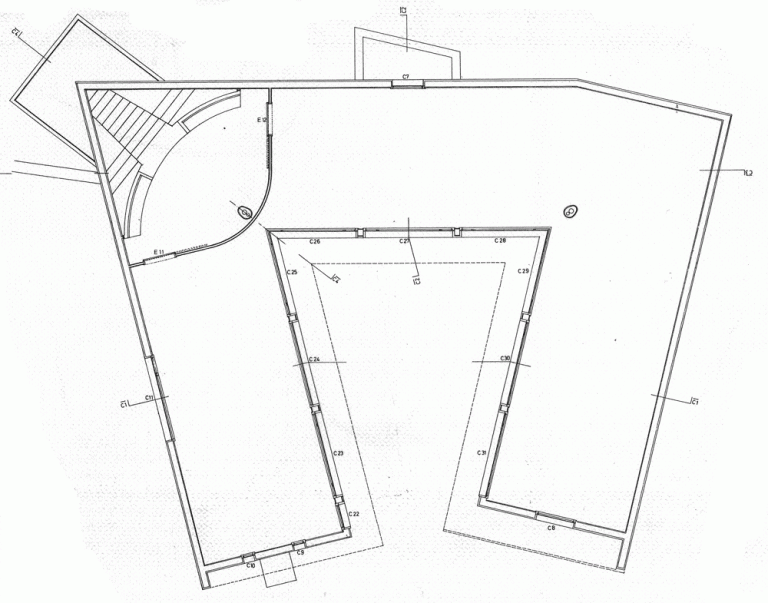
Stairs are always a place of apprehension and darkness; often the back stairs are where the budget ran out or where the fire services are fully revealed or where you may never encounter others. In the Switch House stair system this a generosity of space, attention to material detail, views to the exterior, as well as view lines along and across the vertical circulation spaces to other adjoining spaces. There are a series of different promenades within the building, through the undercrofted old tank spaces, the heroic helical stair, vertical stairs, and outside the lifts and along the perimeter walls with glimpses of the outside world. This is a hollowed out pyramid with a palimpsest of interior spaces. In this theatre of spaces the silhouettes of both individuals and small groups seem momentarily freeze framed before they move on.

IMG_0196In some ways the antithesis of the Tate Modern’s turbine hall and galleries. In these one is subsumed by the monumental spaces of a now archaic industrial technology of Giles Gilbert Scott’s power station desperately designed not to overshadow Wren’s dome at St Paul’s. Where the 2000 Tate Modern is vast and cavernous and the surreal glimpses and dissonances of conceptual art can be taken at distance. Walking up and down this building one becomes enveloped in its spaces as a flaneur both of the architecture but also of the other people one can see and may encounter within the building. In other words Herzog and De Meuron have created a city within a city. The complexity of the circulation spaces seem like a version of Loos’s raumplan; the building is certainly more raumplan than free plan. The Switch House circulation reminds me of the vertical stair circulation at the back of the Muller House. The grain of the concrete in the Switch House also seems strangely like the interior cladding stone of Muller.

IMG_0194The Switch House is certainly more claustrophobic than the spaces of the turbine hall and there is a dissonance in the architecture with its odd juxtaposition of concrete columns, brick lattice grill work, and seemingly adhoc spaces which come into much closer confines with ones body. This is not a public palace that one can walk through easily as a god-like citizen of Rome or Athens, ala Richard Meier at the LA Getty, with the ease of knowing that the space itself is open and rich and luxurious and supported by a network of philanthropy. Herzog and de Meuron have created a series of spaces that are variegated in their lighting effects, a bit dingy in some ways, and perhaps more like being in the underworld of the enslaved Nibelung dwarves in Wagner’s Das Rheingold than being on the mountaintop. The Switch House is an fortress that has, through its sparse material treatments, had a kind of melancholy folded into it.

IMG_0198 
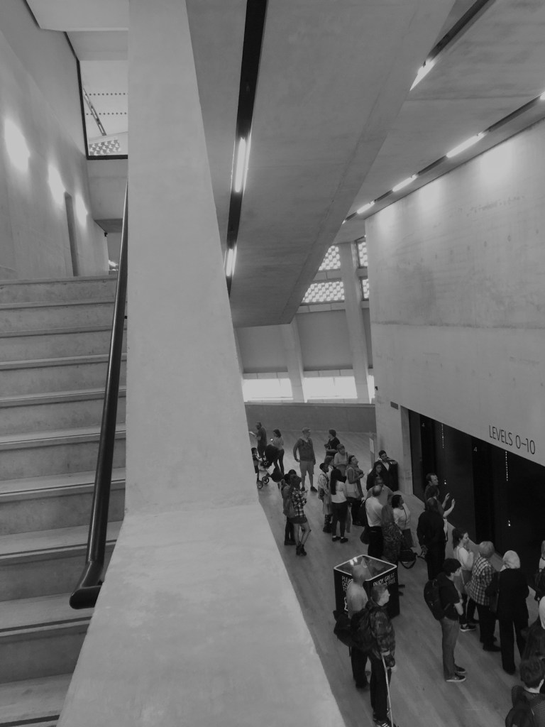
My own biases makes me think that the extension points to the architecture of Loos, the paintings of De Chirico or the subtle yet weird surrealism of Corbusier’s houses of the 1920s. Perhaps Herzog and De Meuron’s work is related to the Swiss artist Urs Fischer. In any case, this is an architecture that evokes notions of estrangement and the grotesque in minimalist forms. The geometric kink in the exterior of the building is both gargoyle and pyramid. After all, and despite its Renaissance pretensions, London is essentially a Gothic city.

IMG_0193There is a real treat on the viewing deck. The viewing deck is great because you get a 360 degree view of the City. The sense that you are in a public building is further emphasised by the fact that you can see directly into the neighbours houses in the unfortunate Neo Bankside development. It’s actually funny as these are the neighbours that happen to be part of Richistan, the nation where money is made, accumulated and distributed to the Caymans. It is this contrast that highlights the fact that the Switch House is to some degree a fortress of public space in a city where public and civic space, the space of encounter and possibility and freedom, has been largely destroyed by the bankers and more recently the celebrity politicians of the City.

IMG_0189

But by some miracle of circumstance and patronage Herzog and de Meuron have created a public building that is both fitting to the radical art that it might house and suggestive of a civic spatiality that is not the result of  a simplistic formula of the neoliberal palaces. There are no sunfilled spaces, open planned white minimalism with a bit of glazing desperately trying to frame or invent a serene view. Of course, the bankers and the celebrity politicians have no need for the poetics of the grotesque and estrangement which underpins so much radical art. The new extension is great because it suggests that for some at least, the techniques related to the grotesque and estrangement, and indeed architecture itself still matters.


Bjarke Ingels vs. Pokemon GO: the summer pavillion at the Serpentine gallery.

A regular pilgrimage for many architects in the Northern summer is to the Serpentine Gallery in Kensington gardens to see the summer pavilion. This year’s pavillion is Bjarke Ingels of BIG architecture fame. It goes without saying that the summer pavilion or Serpentine folly in the park is now a regular feature on the international architectural calendar.It is just another part of the global architecture road show. Of course we have our own version in my city. 

I have seen a few other pavillions, although not all, at the Serpentine over the last few years. In 2007 I saw Olafur Eliasson with Kjetil of Snohetta strange and totemic spiral volume, in 2009 it was SANAA’s smeared reflective mirrors and last time I was here in 2011 I saw the Peter Zumthor’s enclosed contemplative garden. Last year it was selgascano which looked colorful but probably crap to be inside; because, there is nothing like the smell of  being inside a plastic tent structure when its skin heats up. This year there are also four small summer houses nearby designed by Nigerian architect Kunlé Adeyemi, Barkow Leibinger, Paris-based architect Yona Friedman and British architect Asif Khan.

One of my friends is an architect in London who has seen more pavillions than me and suggested this years is the best yet. Being cynical by nature I wasn’t sure that this could have been at all correct. Living on the periphery far from the great architectural centre’s of the world one likes nothing more than tearing down a star god architect. Especially, one that has that look that is kind of the epitome of the hero architect image. As most of us know Bjarke himself is one of the gods in the current panoply of star brand architects. One of those big name architects full of self confidence and regard. One of Denmark’s more successful exports in the global competition for architectural services. These days his firm BIG or Bjarke Ingels Group is reported to be a huge going concern of 200 or so staff with 10 or so partners. The group is currently working on the new Google HQ in California.

20160710_162724

BIG’s pavillion is constructed from a series of rectangular boxes. The boxes are made from a kind of carbon or composite fibreglass. They are connected together with neat well detailed aluminium angles. Each box, or tube, is about 150 by 150 mm in cross-section and depending on there placement in the construction thyme vary in length. This year’s pavillion is cleverly sited, which is more than I can say about the other pavillions I have seen here. Mostly they have just been plonked in the garden with no regard to context. This one frames the lantern of the Serpentine gallery and it is has a deft relationship from the roadside entrance to the gardens.

Parametric design has been employed to good effect in this project. From one side it looks like a high wall and then from another view it appears to be a fallen down jumble of the fibreglass boxes. It appears to be both a monument or a folly in the park, as well as an object that has been deliberately and chaotically dismantled. In the interpretation notes Bjarke argues that the concept of this structure was that of a unzipped wall constructed from the bricks. As noted elsewhere it has been likened to a construction one might find in Minecraft.

20160710_162631

Inside the pavillion one is easily engaged, if not entertained by the different and variable permutations of the fibreglass boxes. There are numerous views from the boxes to the immediate confines of the outside garden.The height of the pavilion gives the impression that one is inside a kind of mini cathedral. Somewhat dubiously Ingel’s makes a connection to the work of Utzon (star-brand appropriating hero-brand) by saying that the pavilion was in fact inspired by work of Utzon:

“had this idea that you could create any imaginable form with carefully designed, mass-produced elements, almost like creating difference out of repetition, and it’s essentially that spirit we’ve tried to bring here” 

In any case, the pavillion seem’s to confirm to me how BIG’s architecture always seems to work with a kind of constructed tectonics often working with serial elements alongside direct and uncomplicated disparities and juxtapositions of scale and form. At the pavillion the elements of its making are not hidden and are evident both at the scale of the detail as well as at the scale of the pavillion itself. There is no deliberate fuzziness, or ambiguity, between its interior and exterior planning. What you see is what you get. Any ambiguity in the work is highly controlled, logical and the result of a generative parametric system. Whilst it fits in with the existing gallery this is not an architecture of memory and place.

20160710_162749

As with most things on the periphery there are the second order imitators. If any Australian firm comes close to the work of BIG it is probably Jackson Clement Burrows who have deservedly won a raft of awards of late. BIG’s work and the pavillion in general sits between the two dominant streams evident in Australian architecture. BIG’s (why do I keep thinking of this BIG persona?) facade of repetitive elements with their different permutations reminded me of the Design Hub at RMIT but unlike the design hub the Serpentine pavillion does more with its repeated elements. Who knows perhaps the discs on RMIT’s design hub will be replaced and live up to there initial and early promise. In general BIG’s work, and perhaps this is why Jackson Clement Burrows have been so successful, is positioned between the all singing all dancing kerraziness of ARM and Lyons and the assertive and odd agricultural minimalism (think moleskin pants and horse stables) of Sean Godsell with its overtones and nostalgia for the mannered modernism of the 1950s.

The pavillion is certainly a change from the dreary CNC plywood framing, reused milk cartons, laminated struts, and timber or laser cut timber held together with bolts and connecting fittings bought from the local hardware store. The BIG pavillion appears to establish that the tectonics of order as compared to creative disorder must count for something. This is minimalism with a tale to tell and the pavillion goes some way to drawing us back to architecture, to reminding us that tectonics, construction, siting, view lines and materiality still matter. It was as if the architect(s?) of the pavillion wanted us to be reminded of all the sane and logical things architecture can still do.

The last pavillion I went to we all sat around and contemplated the garden and the sky. In this pavillion there is nothing like that. On the afternoon I visited it was full of people looking at the boxes but mostly they were looking on their own little boxes. Their smartphones. They were taking pictures and doing whatever social media things the network would allow.

I think most of them were playing Pokemon GO in the pavillion and I wondered if BIG’s efforts to drag us back from our digital distractions were working. Somehow I doubt it until seriality and parametrics is able to engage with the memory of cities. At the moment Pokemon GO is winning against architecture.


Cutting to the Bone: How fee cutting is destroying architectural practice

The architecture awards in my city is normally a time for celebration. As it should be. Many architects in my town live for it. This is not unlike my friends in advertising, who are also obsessed with awards but the difference is if you are in advertising you get to go to Cannes for the ceremony. In advertising you get an actual Lion. Architects in Australia get to go to their local state chapter awards or maybe if they are lucky to the nationals in Canberra. If you win you get a framed certificate.

I now no longer go to the AIA awards I think I was banned after my last visit there.  Of course the ban was self imposed after I knocked the the tiny but sticky dessert wine glasses off a waiters tray to see them spin in the air in slow motion and land on the toupee of a distinguished middle aged contract admin architect. Another year in the early 90s I remember booing at some of the award winners and one year, as chair of a jury, I was told if my jury didn’t give a particular building the award I might as well pack my bags and leave town. Another year I passed out at the after party and woke up in the president’s kitchen with my hands clutching someone else’s framed award. That’s probably about as close as I will ever get to an award. All of the architect awards functions I have been to in my city have now blurred in my memory into one large ceremony of alcohol, glittering prizes (always badly framed) and bad cut-price function centre food.

Social media was on fire after the recent  Victorian chapter awards because the President of the institute reportedly admonished every one for fee cutting and not arguing for the value of design. If that is what she said then she is right. Ranked just below the scourge of gender inequality in the industry the other great scourge of our profession is fee cutting. it doesn’t matter if you are in Australia or elsewhere iI think it is a global phenomena.

Fee cutting is the scourge of architects no matter where they practice as it devalues design as a service in every respect. This year in my practice class we asked students to develop fee proposals using the Association of Consulting Architects Australia Time Cost Calculation Guide. The software helps people understand the relationship between office overheads and variable rates in relation to the hours needed to be spent on each phase of a particular project.

With another colleague I am currently researching the degree to which architects choose to specialise in practice. Linked to this is how much architects charge for their knowledge and expertise. Our early results indicate that for design services most architects will charge a either a fixed fee (30% of respondents) or a fixed fee with added charge out rates if circumstances change (38% of respondents).  As most architects will know good design takes large amounts of time. Particularly in the early stages of a project.

This above statistics beg the following question: if design is the central skill that architects offer then why is it predominantly charged for with fixed fees? A fixed fee might get you the job and give your client some kind of “certainty” as to what you will charge. But if the fee is low you will always inevitably end up spending more hours than you allowed for if you care about the design. If that is the case you might as well pay your client to get them to let you do the job for them. This may be why 41% of our respondents felt that partial services were unsustainable. They were more optimistic about the profitability of specialist services. But if you are stuck in the low fee vortex you will never develop those new services.

If a firm is in the spiral of fee competition, fee cutting and fixed fees you will never get the resources to undertake good design. It’s no good just cutting the fees, or offering a fixed fee, just to get the job. Of course most developers don’t really know what good design is and will exploit price competition in the market for architectural services to get the design cheaply. The talk around my city is you can get a fully designed high rise apartment building with planning permits for around 120k. Not bad for developer constructing a building with 200 apartments with a sale value of 60M.

Many  small firms dream of going upstream in the knowledge stakes and adopting a management consulting style model. They dream of clients paying a premium for their architectural knowledge and expertise is indeed a dream unless firms charge more for design. With the rise of digital practice and workflows, the disintermediation of architectural services, (try explaining what design development is to a client), the loss of contract admin to project managers and the outsourcing of documentation all architects have left is design. The problem is low fees undervalue design and ensure crap outcomes all round. It also means firms are stuck in a vortex of reacting from crisis to crisis; from low fee job to low fee job and never getting above water. If fees are low firms will never have the time or be able to invest in the R&D and the innovation they need to undertake to go upstream. Eventually these firms, and perhaps architectural services as we know it, will disappear.

So what is the solution to this downward spiral? How do small firms, which are most of the profession, get out of the vortex?

Firstly, a change in the professions  broad culture is needed. The old stereotypes really need to fall away. The myth surrounding the dichotomy between innate “designers” and “business” types in the profession is sickening. It annoys me that because I teach practice at MSD and have and MBA I am typecast as a kind of business “man” architect rather than being seen as having a stake in design or architectural theory. You can just see me in the chinois and the boating shoes playing golf with my gentleman stockbroker mates. I think these old stereotypes are perpetuated by the appalling gender constructs within the profession. As architects we all need to know about the mechanics of business strategy and competition.

As one eminent colleague said to me when I started teaching practice, “Just stand in front of them at the first lecture and tell them it’s all bout the fucking money.” In some ways it is all about the money. But, the troglodytes would argue that such a sentiment cheapens design. That is not the case as it is really about about valuing design services and arguing the case for their worth.

The best architects I have worked for have been good designers and highly skilled negotiators. A winning combination. We need to mentor our young architects so they gain negotiation skills. Yet negotiation and financial skills are not really a big part of the national architectural competency standards last time I looked. Its all about doing the traditional things and there is nothing about management, finance or negotiation. The competency standards are a sop to those who think architects need to be technical experts rather than a profession focused on generating design knowledge. The balance is all wrong.

Small firms, indeed all firms, also need to conduct formal R&D. R&D into simply doing a bit of design and calling it research. It should not be an adhoc activity. Nor is it about having a chat, and throwing around a few ideas, with a few friends down at the pub. Firm’s need to invest in formal R&D programs if they really want to develop their design skills and go upstream. R&D and innovation is the way for architects to compete with their competitors. There needs to be more institutional infrastructures from the AIA and other bodies to enable this. Architects need support to understand IP and commercialisation pathways. Unitised Building is a great model of how formal R&D can lead to a successful commercialisation pathway for an architect.

Firms need to charge more for design services. Fixed fees or even fixed fees with hourly rates for variations should be abandoned for the design phase or for partial design services. If all firms charged a percentage fee for design or an hourly rate for design the profession would be better off. Firms need to argue to clients that design is labour intensive and until it is undertaken it is hard to know how long it will take. Firms need to argue for its importance in the early stages of the project. If clients go elsewhere so be it. But they will eventually figure it out: You get what you pay for. I inform my students that they are better off going down to their local single origin, filtered coffee, wified, barista heaven with there sketch book than take on a project for low fees. Why do a job for such a low fee that you end up doing it at a loss. Effectively paying the client to do it. You are better off just buying the coffee.

As a profession we need to out the fee cutters and the informal price-cutting cartels. The culture of the profession needs to avoid the schizoid tendency when it comes to design fees. On the one hand architects exalt design and glorify the designers. On the other hand firms are viciously cutting their fees behind the scenes to get that elusive job next job. This schizophrenia will eventually destroy the profession as we know it. Fee cutting and price competition has already destroyed the middle sized firms and the small firms will be next unless all architects change this. This is architecture’s last stand.

This is the last blog for the month. Thank you to all those who read it and have sent me comments (good and bad). I am leaving the periphery and off to the northern hemisphere sunshine in my gentleman architect chinois, panama and boating shoes. So in July watch out for a few Kerouac road trip style blogs from the so called centres of architectural excellence and culture.  

Surviving the Design Studio: Why architects and archi-students should go non-digital cold turkey.

In between moving house and writing the conference paper I was able to attend attend a few end of semester pinups at my architecture school. Afterwards of course the tutors and critics sat around in the local pub and get about the current state of play. We mused about one very prominent and recently built facade in the city and how it may, or may not have been, developed via the computer. Inevitably the discussion turned to the insidious grip that the computer and digital design has on architecture students and even architects.

We were however, or at least it seemed to me, to be in agreement that the computer’s influence on modern day architecture students was often, although not always, potentially negative. An understanding of orthographic design, iterative process, and the ability to research design issues via different media are all essential skills for the architecture student.

Too often architecture students rush into digital design and then never return. Too often as a design teacher I am faced with students who are lost to me. Lost in the computer, they seem to have no interest in learning about architecture and its relationship to the real world. They are certain that the computer itself will solve all problems.  I think the computer software vendors have a lot to answer for.

Architectural education is a continuous process. Architects learn from one project to the next and the then the next. Each time lessons are learnt and the knowledge gleaned from the encounter with one project or situation is then banked in the mind for later use. But this continuity also extends into our lives as architects. Perhaps it sounds trite, but architecture is a spatial medium, and as architects we encounter this medium in our everyday lives.

The journeys we fleetingly conduct, the places we inhabit and bodies that we encounter are all a part of our continuous education as architects. Too often the allure of the computer limits our understanding of these other encounters.

So I would suggest the best thing any architecture student or architect is to have a few free digital days, weeks or even a life between projects. Yes, I think it is a great idea to go non-digital cold turkey. At the end of it the next time you do a new project, which will inevitably mean using the computer, you will feel be more capable and have a different insight into the design process.

So next time you are between projects go non-digital cold turkey and try and see what happens. The following exercises and rituals should help. The are designed to help you get over the fever of going cold turkey.

Observation

Yes its not a bad idea to look at things. Yes, actual things in the world. This is what going non-digital is all about. Architects are constantly observing and assessing the everyday environment that  surrounds them. In a way there is really no need to go and visit the latest building or luxury product produced by your local version of the star architect. Houses, streets, details roads, objects and urban patterns. Record what you see and interests you in a note book or a sketch book. Study on particular thing: street lighting, doors, kerbs, drainage grates, or windows. You could also observe different materials like concrete, brick, steel or paint and render. Of course, you can cheat a bit and take photos with your phone and start a new Instagram account based around a particular element or issue.

If you get really desperate you can always go to a gallery and sit in front of some art. Sit in front of a Rothko; or maybe even a building buildings or a landscape.

Measure

Size is everything. Measure you house. How big is a chair or a table. How much room is need to clear a path of circulation through a space. How high are your kitchen benches? Its all too easy to pull things out of a digital library and plaster them all over your drawings. But do you really know what it is those things represent.

Going non-digital means observing things to consider how high or how big they are. Its always good to carry a tape measure in your bag to help.

Imagine how big something is. a place or a building or a door, and tray and quantify this. Then go and measure it in reality and see if you are right. This exercise or ritual will help you explain to your clients the size of things when they don’t quite understand how big thing will be.

Different scales

Going non-digital means measuring things or considering the relative size of things in the real world. This way of seeing inevitably leads to a consideration of scale. Consider juxtapositions in scale. In some senses the architectural world that we inhabit is comprised of elements thrown together at different scales. Architects, if they choose, are able to nest and embed different scales within the one project. Arguably every project is a series of nested scales.

The tiniest renovation or detail fragment can evoke the monumental.

Viewpoints 

Vist a view buildings and consider how the are viewed and how viewpoints are either controlled by the architect or taken advantage of in their urban setting.

View points and scenography have always been big in architecture. For some post Tschumi architects viewing architecture via the viewpoint, based on the architect as an individual observer, might suggest a dated and static approach to signification. Contrary to those design methods reliant on conceptual abstraction, field theory and overdetermined diagrams, I think the viewpoint is still a valid compositional consideration. Ask Brunelleschi (except he is dead). Even Zaha Hadid’s (also dead) riffs on Suprematism rely on the view and the viewpoint.

Going non-digital means asking yourself does this building reveal more as I engage with it from different viewpoints? The facade of the building (that shall remain nameless), I was talking to my fellow jurors about, looked terrible to me from its Southern perspective. Coming up in the tram, it looked like a ham fisted commercial office building with coloured glazing : yet from another more oblique viewpoint, travelling in my car, from the Easter approach it looked great. I could almost imagine that this was the viewpoint from which the architects actually designed the building.

I guess what I am suggesting is that, as architects we should practice a kind of architectural mindfulness; its great to live in the digital world but maybe its also better to understand how the real world is. Going non-digital means taking back architecture before it becomes just another gap filler amongst the virtual banner ads.


Planning Anarchy: Why architects hate urban planners in my city.

Architects are a contradictory profession. Prone to political activism and yet also deeply conservative. Seemingly agile, radical and innovative yet unable to move quickly in the face of gender inequality in the profession. Forward thinking and future driven yet bound by the traditions of the canon.

But if there is one thing I think many architects in my small global city of 4 million people can agree on it is this: Statutory Urban Planners are the lowest form of life.

I am not the only one in Australia to actually think this. A recent article by Elizabeth Farrelly in the SMH also points to the crisis in the planning profession in Sydney. However, I think many of Farrelly’s observations may also apply to Melbourne. The only problem is the planners themselves are not aware of the crisis. Architects, to their credit, on the other hand always seem conflicted by professional guilt and riven by internal debates of one kind or another.

Don’t get me wrong. I am a big fan of urban planning and its associated discourse. I was in partnership with a planner who also did architecture. But, many small architectural practitioners I know are angry. They are angry about the idiocy of a planning system that permits the wholesale destruction of our cities fabric and memory and yet binds up small projects in the most torturous regulations and processes.

From the perspective of many architects in Melbourne planning governance is broken and this impedes the governance and development of the city. It is an anarchic system.

Lesson 1: The built environment would be better if planners actually learnt about architectural and urban design

In 2011 we organised a protest against the unsanctimonious and ill considered renovation of a so-called brutalist building. One of the most important examples of this movement from the 70s.   You can read about it here. As a result of our protest, the council undertook to renovate an important element of that building. It is still yet to be refurbished. Despite a heritage assessment report and its significance the planners at the council in question said and did nothing.

Clearly in this instance the planners had no sense of responsibility to or appreciation of Australian modernist architecture.

Perhaps the study of Australian architectural history should be mandatory for statutory planners. The curriculum of most planning courses have a kind of pseudo legal aspect to them. This is matched with a altruistic, if not condescending, interest in community participation. Chuck a bit of sustainability into the syllabus and what more could you want? How about planners study architectural history, visual arts or urban design as a core component of their tertiary courses. How about planners learn about design, design research rather than exclusively focusing on social science research?

Lesson 2:  Planners will tie you up in processes that are disproportionate to the size of the project at hand

In the process of doing an internal renovation of a commercially zoned building in a middle ring suburb the building surveyor insisted an external facing shutter be removed and replaced with a gate in order to facilitate emergency egress. Makes sense doesn’t it ? Sure, it makes sense but not to the planners. They insisted that the new gate be subject to a planning permit including advertising. Maybe 3 months, maybe 6 months maybe a year to get through this process if you are lucky. Providing no one objects during the advertising period. But, maybe someone will object and you will go to VCAT. Of course if any one objects the planners will agree with them.

The architect friend of mine responsible for this project bemoans the fact that, a junior planner is employed at the council on the project and is just following the rules; that way they don’t have to think. She says, perhaps with the benefit of prior experience,  if you complain the planners put you at the bottom of the list and go slow.

Planners are not independent, mostly they are employees of councils, who will simply follow the dictates of their line managers in their organisation.

I am keen to document examples of situations where architects have been bogged down in planning red tape on small inner city projects. Send them to me and I will de-identify these cases and then discuss them in a later blog ! Email me if you are interested. 

Lesson 3: Planners have no control or interest in questioning large scale developments

One of of the last remaining buildings associated with the coach industry. Who cares ??? Not the planners. This facade is about to be completely demolished for a, perhaps tawdry, laneway and curtain wall. Maybe the laneway will have a barista outpost in it.

The upshot is almost nothing is actually governed by the planners. Small projects get locked up in red tape and as Elizabeth Farrelly points out the interests of big developers remain paramount.

Lesson 4: Planners love to meddle in architectural design 

So what’s worse than the planners not planning or not governing the planning system? It is when the planners actually start to see things in the urban environment; or think they actually know about design. Planners love to add design value. But they often get this wrong. Why is that? Urban Planners are not trained in visual or spatial thinking. Sure they can argue and talk about the politics of community participation and the rights to the city. But they by and large have no idea about urban aesthetics, architectural value, or design processes. Their understanding of the issues is extremely simplistic.  Consequently,  since the demise of high modernism and the birth of the building conservation and renovation movement in the 1970s our city is littered with the most simplistic and naive examples of facadism. Rohan Story has all done us a favour by documenting many of these as a part of Melbourne Heritage Action group (thanks to MHA for the images in this blog).

You can always tell when the stat planners have a had a go at a building in the planning process. They love to tweak a corner or add a bit of value to a streetscape. They are excellent mimics especially when it comes to imitating, the facades of Victorian and Edwardian housing stock. Their favourite delight is slapping on the heritage colours out of the paint bucket. Fragmented and “broken down” facades, setbacks on setbacks, screening in myriad materials, different materials and colours; beige, pink, rust and that beloved of all colours for the planner wanting to evoke Melbourne’s historic past: terracotta. Oh, and I forgot to mention that the planners love a balcony.

Future Melbourne Committee meeting 17 May 2016, Agenda item 6.2:

These pathetic efforts are usually touted as a win-win and as a result our city is full of the results of this kind of urban streetscape slop.

In reply to Farrelly’s article the PIA the Planning Institute of Australia responded by stating:

Planning policy provides the checks and balances to put the densities where they best fit and ensure infrastructure is appropriate. There will always be differing public, professional and political opinions and reactions to any rapidly changing city. 

Planning is inherently focused on facilitation and balance where both the public and many differing private interests are accommodated. This should occur without compromising good design, creation of place, amenity and liveability – this is known as the public interest.

As far as I can tell urban planners in Melbourne are powerless and do none of the above. The planners are always good at writing stuff to make it sound nice.  After all that is what they are trained to do. But they need to be visually and spatially literate.

Yes, some of my best friends are planners, many of my more admirably and politically orientated colleagues are planners, but I am sorry we really need to have this debate.

What rankles is how easily the punters find it in themselves to hate architects. In actual fact it is the urban planners the punters should be hating. Yes, architects are kinda guilty as well. Both professions are involved in and witness to the current and ongoing contemporary destruction of Melbourne.

But at least the architects as a profession will argue about it and lose sleep over it. Which is more than I can say for the urban planners.

24461081874_403e840d41_o


Surviving the Design Studio: 10 ways to fix the plans before the final deadline. 

Ok so it’s the end of semester or the project and you have spent your life deep in the Rhino, or the other R model, and it’s time to do your layout. But hey you forget about the plan. The what? Oh yeah, the PLAN !!!

The problem is the plan is the first thing any critic or competition judge will look at. Sure they might glance at the crappy 3D render you have done; so hastily crafted the night before. But it’s the plan they will use as the co-ordinating point of reference for the rest of the drawings. Its probably the thing they will look the most at. In fact an excellent plan will mean that the design jurors or critic (or perhaps even a client) will more easily forgive how bad the rest of the project might be.

The demise of the plan

In this digital word it is easy to forget about the plan. You may have sketched something early on; quickly outlined it in the computer and then constructed a model from that plan. By the end of the project you have actually forgotten about the plan.

We no longer read plans because we are too busy watching the future stuff. This is because everything nowadays is three dimensional or even four dimensional. It’s all about AI, CNC fabrication, robotics, autonomous agents and swarmies (I think I mean swarms). Patterns, processes and parametrics reign supreme. Plans are pretty dull compared to the latest YouTube clip or article on Architizer or Dezeen.

In the age of big data, global analytics, digital diagramming and planetary urbanisation the plan has lost its power to seduce our eyes. The network diagram and digital clip is king (and queen too). Born in the computer the global diagrams of networks, animations of swarms and simulations of a flooding cities are more compelling to watch than those old planny plan things. There are some excellent exponents of these new must-be-watched diagrams: Michael Batty at UCL, Neil Brenner’s mix of geography and global flows at the Urban Theory Lab, Eyal Weizman’s forensic architecture. In the work of these contemporary image proponents its like the ideograms and diagrams of the Smithsons’ have been sped and given life through the joys of accelerated computerisation.

In the past, like today’s digital clips, the plan was a seductive artifice in its own right. It could simultaneously be read as a conceptual diagram, a spatial condition and the history of  place. Plans are stratigraphic in their ability to embody layers of meaning and different narratives; no matter how abstract those narratives might be. But, in the current real world, I fear that plans don’t mean that much anymore. For the merchants of neoliberal architecture slapping up the apartment towers its all about the skin bae. These days the plan no longer seems like it means anything at all.

Ok, so much for the ranting and raving about the lost world of plans.

More importantly, when the critics come in, all jackboot like, and start criticising the plans you know they have it in for you. A good critic can demolish your entire scheme just by looking at, and asking questions, about the plan. Here are some tips to get that plan in shape ready for the submission and the critical onslaught.

1.The plan demonstrates the size of things 

The plan and measuring the size of things is extremely critical in housing schemes. A few years back I ran a studio in to we tried to teach the students all the things they didn’t know about plans and unit planning. Basic stuff like how big is a bathroom, or a bedroom and what’s the best way to design a kitchen. How big is a bed or a table?  How do you do a carpark what do you need for turning circles?  You know when a critic is really out to get you is when they start asking you questions like these. So be prepared this is the sort of stuff you need to know. The plan is the best way to control and convince others that you have handle on the dimensions. If you don’t already you need to get one of these books.  

1325821016-lower-floor-plan-1000x587

2. Conventions 

Don’t forget the drawing conventions. Scale and North points; North up the page. This goes without saying.  The same goes for other things like windows, doors and stairs. Draw them correctly. If you don’t put these on your plans, or get them right, you end up looking moronic. Get the measurements right.

3. Spelling

Spell the room names properly. This goes for just about everything on your drawings. Use a dictionary if you have to. Choose a lettering font that isn’t going to be confused for your actual building or prevent it form being understood. Try and avoid using the standard fonts straight out of the software program.

dezeen_Carlos-Ramos-Pavilion-by-Álvaro-Siza_10_1000

4. Draw it like a section 

Draw it like a section. Yes, for those of you who don’t know, a plan is really a section. But it is a section where you are looking down about a meter above the ground plane. Hence it is good to draw it as if it sis a section. Line weights, whilst seemingly subtle are critical in conveying planimetric depth.

Soleri

5.Show the levels 

Use the plan to design your levels and level changes. Stairs and steps should be drawn in a way that is well crafted and shows that you know that a plan is not simply a flat plane.

LeCorbusier_Olivetti2a

6. Don’t fill your plans with crap 

Don’t fill it full of standard library furniture. It always looks like shit and makes you look like an indolent and lazy idiot.

CAFEplan

7. Plan composition 

After the horrors of the image above it is good to remember that the plan is a composition in its own right. Recognise and emphasise the patterns, shapes and figures in it. It doesn’t matter if these elements are abstract or figurative. Counterpoint and contrast these. Exploit these to generate further design elements, details and iterations of the plan. A plan is in fact a series of plans within a plan.

1579d8d32dd73404c5e5d7341cbe62f3

8. Inside and Outside 

Pay attention to the plans interfaces both within itself, between rooms or spaces, and where it’s edges meet the outside world or other conditions.What lies just outside of the plans walls. What is its context? How do you get to your plan? What is its realtionship to its surrounding urban context? Or it it just another one of those plans sitting in a kind of blank ether.

dezeen_Carlos-Ramos-Pavilion-by-Álvaro-Siza_07_1000

9. Draw in the detail 

Draw in structure and floor patterns and as many detailed elements as possible. As explained above that is the same as filling it in with stock library elements or banal patterns.Floor patterns well done and with the correct line weight are always good.

kahn-bryn-mawr

10. The plan is a spatial field 

Never forget this: the plan as a diagram, that describes and implies a three dimensional spatial field in which points, lanes, planes and dare I say to volumes are located.

A well drawn, represented, or crafted plan, can hide a multitude of sins if the rest of the project is a pig-dog.Of course sometimes its too late. No matter what you do the plan is still a pig-dog. Remember Raisbeck’s number 1 rule. If it looks good it is good. In other words if looks good to you it will probably look good to the critics or jurors as well.

82f21ab9b7abf079f73ed2dfcd52b961

Finally, the plan is never really finished 

For the Italian Architect Carlo Scarpa the plan, such as his plan for Castelvecchio in Verona, was in a way never really finished. The most powerful plans, the ones that will burn a hole in your brain, are those that are iconic and compelling images in their own right. They may look finished but in fact they are not and they are usually the result of numerous iterations. It is best to remember a plan is never complete and even when the project is finally constructed it is still good to remember that the plan, even across the digital archive, has a life of its own.