Surviving the Design Studio: Getting through the last days before the submission deadline.

Architecture is a desperate enterprise. This is because in many ways designing is a race against time. As a designer you are always time poor. Deadlines are imposed externally. The more time you send on the design the more you burn up your fees. Fees that sometimes have already been cut to the bone. Whats worse is that it takes time to design properly. It is a labour intensive exercise that involves the consideration of different options and the exploration of different design pathways.

Most architects are always designing in a blind panic and this is what you need to get good at. But: too many architects procrastinate and too many architecture students leave things to the last minute. Finally, the procrastination can inevitably give way to blind panic.  Its 5 days to go and you still need to do the layout and print ! OMG !!

As it is almost the end of semester here in my hemisphere I thought I would do a special Surviving the Design Studio blog outside of my normal weekly blogging routine. So here are a few last minute survival points to think about. Enjoy.

1.Dont Panic

Hyperventilating and multitasking and not knowing where to start can lead to conflicted priorities. Its best to sit down and to methodically  plan you way out of things. Make a list. Write down all the things you need to do. Prioritise the list. Decide what you can’t do. Yes everything is interlinked but you can only do one thing at a time.  Put the prioritised list next to you computer and every time you start to panic look at it and stay calm.

Avoid anxiety and your own inner critical negative voice. Be mindful as much as you can.

2. Work back from the end

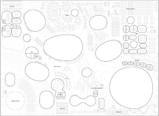
Know what your layout is (and I don’t mean the layout of your plans). Know what drawings you are going to pin up or publish at the end and how these drawings contribute and support your argument. If you know what you are going to present at the end then you will know more accurately what you have to do. Do an actual mock up and stick it on a wall and see how it looks.  Read this previous blog of mine on layout and this one on verbal presentation.

Timing is critical and working back form the end helps. Too often architects forget to allow for the print queue. There is nothing worse than having a great design but missing the deadline set by the project manager or the studio submission.

3. Plan and resolve your way through problems

The quicker you can resolve issues around your design the better. At the end of the project it usually the medium and little things that need to be resolved.  What is the profile of the roof or volume, where should openings or windows go, what happens at the entry conditions, is the circulation pattern easily communicated. Resolve as much as you can and as quickly as you can.These are design development decisions.  If you think you are getting into a bind about anyone decision. Just make a choice. Its your design.

Know when to design and then when to just produce the images.

4. Figure out what you can and cant do

You cant do everything. Use a prioritised list and a final layout plan to figure out what you need to do.D hat way you won t get sucked into the computer finessing things that you don’t need to worry about and making design development decisions. Concentrate, and complete, the hardest and most time consuming elements of the design and presentation first. Leaving the hard and time consuming things to last is just another form of procrastination.

Your mantra at this stage should be. Resolve, Resolve and Resolve; one issue at a time.

5. Look after yourself

Staying up all night to 5 in the morning hyped up on mother or red bull or coke or amphetamines is really really bad. After 1 am your productivity will drop. It doesn’t matter if you are in your twenties. Take breaks, eat properly and know when it is time to sleep. Get some exercise.

If you are really strapped for time the best you can do is work form 9 am to around 1 am with an hour for lunch and hour for dinner. Then make sure you get 6, maybe 7 to 8 hours sleep. It will help you to make better decisions.

Know when it is not worth it. At the end of the day it is not worth sacrificing your mental health for a better than average pass or wining the selected competition. There will be other design studios and other projects. Stop and get help if you feel your mental health is suffering.

6. Get help

Get your friends in. Get them to do stuff. Get them to lend you another eye when you are not sure about things. Ask your tutor, or a team member, about design and design development decisions. A good tutor or team member will relish the questions and help you to resolve issues more quickly rather than you agonise over something for hours.

Discussing your project s concept and design process with others even at this late stage will help you to clarify and prioritise what you need to do to finish it.

7. When bad things go wrong problem solve and replan again

There will be glitches of course. Once I printed out all of my final thesis drawings and looked at them only to realise they were all wrong. The line weights combined with the particular experimental printing process I employed led to unreadable drawings. It was a total disaster. The best thing to do was to have a sleep and not to panic.

After the sleep I could think straight and look at my drawings with a more evaluative eye. I then replanned my production technique and after a few days had reprinted my drawings. I lost time, but on the second print run my drawings were much better (see 2 above).

8. Don’t sit on the computer for the sake of it

If you are sitting there looking at the screen and not getting much done it’s time to move. Efficiency is good and sometimes that means taking breaks every so often. Don’t deceive yourself by thinking that all because you are sitting in front of the computer you are getting things done. Move on to another task.

9. If it looks good it is good

The above statement is my cardinal rule for deciding when to move onto the next task or micro task. If you are running out of time you need to suspend your own inner critic and inner perfectionist. If it looks good then use that and move onto the next task. There is no point having a great and perfect render if the rest of your drawings and images are awful.

Getting the balance right between different images and representation of your design at the end of semester or project is what will count. You are producing an integrated and wholistic design vision. Making one thing superbly refined at the expense of everything else is always remarked upon by the jury critics. But you will never win the competition if you do this. Jury critics usually want to see that how well your design proposal relates to everything.

Of course it may be too late for you to get the balance right. between the design of different elements on your final images. You may have just run out of time or read this blog too late in the day. If that’s then case you may need to make sure a couple of things are so good that you cant fail. This is what I would call a salvage operation.

10. Take notes

Take notes as you work and different justifications, rationale or aspects of your project spring to mind. Use these notes to frame and articulate your own arguments if and when you have to stand in front of your project and discuss it. You can also use the notes to help you include any explanatory or annotative text that may need to go onto the drawings. These notes will also help you to take lessons and insights onto your next project.

Don’t try and constantly second guess your tutor or the critics. Consider what they might want and then craft your response to it. Use the working notes to do this.

Finally 

All of the above should help if you are in desperation mode and you have kissed your significant others goodbye. You may think you will never see them again  as you go into the vortex of the final days of a design project.  But it will soon be over and then of course there is always the next project and it is actually the next project that all architects yearn for.

Planning Anarchy: Why architects hate urban planners in my city.

Architects are a contradictory profession. Prone to political activism and yet also deeply conservative. Seemingly agile, radical and innovative yet unable to move quickly in the face of gender inequality in the profession. Forward thinking and future driven yet bound by the traditions of the canon.

But if there is one thing I think many architects in my small global city of 4 million people can agree on it is this: Statutory Urban Planners are the lowest form of life.

I am not the only one in Australia to actually think this. A recent article by Elizabeth Farrelly in the SMH also points to the crisis in the planning profession in Sydney. However, I think many of Farrelly’s observations may also apply to Melbourne. The only problem is the planners themselves are not aware of the crisis. Architects, to their credit, on the other hand always seem conflicted by professional guilt and riven by internal debates of one kind or another.

Don’t get me wrong. I am a big fan of urban planning and its associated discourse. I was in partnership with a planner who also did architecture. But, many small architectural practitioners I know are angry. They are angry about the idiocy of a planning system that permits the wholesale destruction of our cities fabric and memory and yet binds up small projects in the most torturous regulations and processes.

From the perspective of many architects in Melbourne planning governance is broken and this impedes the governance and development of the city. It is an anarchic system.

Lesson 1: The built environment would be better if planners actually learnt about architectural and urban design

In 2011 we organised a protest against the unsanctimonious and ill considered renovation of a so-called brutalist building. One of the most important examples of this movement from the 70s.   You can read about it here. As a result of our protest, the council undertook to renovate an important element of that building. It is still yet to be refurbished. Despite a heritage assessment report and its significance the planners at the council in question said and did nothing.

Clearly in this instance the planners had no sense of responsibility to or appreciation of Australian modernist architecture.

Perhaps the study of Australian architectural history should be mandatory for statutory planners. The curriculum of most planning courses have a kind of pseudo legal aspect to them. This is matched with a altruistic, if not condescending, interest in community participation. Chuck a bit of sustainability into the syllabus and what more could you want? How about planners study architectural history, visual arts or urban design as a core component of their tertiary courses. How about planners learn about design, design research rather than exclusively focusing on social science research?

Lesson 2:  Planners will tie you up in processes that are disproportionate to the size of the project at hand

In the process of doing an internal renovation of a commercially zoned building in a middle ring suburb the building surveyor insisted an external facing shutter be removed and replaced with a gate in order to facilitate emergency egress. Makes sense doesn’t it ? Sure, it makes sense but not to the planners. They insisted that the new gate be subject to a planning permit including advertising. Maybe 3 months, maybe 6 months maybe a year to get through this process if you are lucky. Providing no one objects during the advertising period. But, maybe someone will object and you will go to VCAT. Of course if any one objects the planners will agree with them.

The architect friend of mine responsible for this project bemoans the fact that, a junior planner is employed at the council on the project and is just following the rules; that way they don’t have to think. She says, perhaps with the benefit of prior experience,  if you complain the planners put you at the bottom of the list and go slow.

Planners are not independent, mostly they are employees of councils, who will simply follow the dictates of their line managers in their organisation.

I am keen to document examples of situations where architects have been bogged down in planning red tape on small inner city projects. Send them to me and I will de-identify these cases and then discuss them in a later blog ! Email me if you are interested. 

Lesson 3: Planners have no control or interest in questioning large scale developments

One of of the last remaining buildings associated with the coach industry. Who cares ??? Not the planners. This facade is about to be completely demolished for a, perhaps tawdry, laneway and curtain wall. Maybe the laneway will have a barista outpost in it.

The upshot is almost nothing is actually governed by the planners. Small projects get locked up in red tape and as Elizabeth Farrelly points out the interests of big developers remain paramount.

Lesson 4: Planners love to meddle in architectural design 

So what’s worse than the planners not planning or not governing the planning system? It is when the planners actually start to see things in the urban environment; or think they actually know about design. Planners love to add design value. But they often get this wrong. Why is that? Urban Planners are not trained in visual or spatial thinking. Sure they can argue and talk about the politics of community participation and the rights to the city. But they by and large have no idea about urban aesthetics, architectural value, or design processes. Their understanding of the issues is extremely simplistic.  Consequently,  since the demise of high modernism and the birth of the building conservation and renovation movement in the 1970s our city is littered with the most simplistic and naive examples of facadism. Rohan Story has all done us a favour by documenting many of these as a part of Melbourne Heritage Action group (thanks to MHA for the images in this blog).

You can always tell when the stat planners have a had a go at a building in the planning process. They love to tweak a corner or add a bit of value to a streetscape. They are excellent mimics especially when it comes to imitating, the facades of Victorian and Edwardian housing stock. Their favourite delight is slapping on the heritage colours out of the paint bucket. Fragmented and “broken down” facades, setbacks on setbacks, screening in myriad materials, different materials and colours; beige, pink, rust and that beloved of all colours for the planner wanting to evoke Melbourne’s historic past: terracotta. Oh, and I forgot to mention that the planners love a balcony.

Future Melbourne Committee meeting 17 May 2016, Agenda item 6.2:

These pathetic efforts are usually touted as a win-win and as a result our city is full of the results of this kind of urban streetscape slop.

In reply to Farrelly’s article the PIA the Planning Institute of Australia responded by stating:

Planning policy provides the checks and balances to put the densities where they best fit and ensure infrastructure is appropriate. There will always be differing public, professional and political opinions and reactions to any rapidly changing city. 

Planning is inherently focused on facilitation and balance where both the public and many differing private interests are accommodated. This should occur without compromising good design, creation of place, amenity and liveability – this is known as the public interest.

As far as I can tell urban planners in Melbourne are powerless and do none of the above. The planners are always good at writing stuff to make it sound nice.  After all that is what they are trained to do. But they need to be visually and spatially literate.

Yes, some of my best friends are planners, many of my more admirably and politically orientated colleagues are planners, but I am sorry we really need to have this debate.

What rankles is how easily the punters find it in themselves to hate architects. In actual fact it is the urban planners the punters should be hating. Yes, architects are kinda guilty as well. Both professions are involved in and witness to the current and ongoing contemporary destruction of Melbourne.

But at least the architects as a profession will argue about it and lose sleep over it. Which is more than I can say for the urban planners.

24461081874_403e840d41_o


Surviving the Design Studio: 10 ways to fix the plans before the final deadline. 

Ok so it’s the end of semester or the project and you have spent your life deep in the Rhino, or the other R model, and it’s time to do your layout. But hey you forget about the plan. The what? Oh yeah, the PLAN !!!

The problem is the plan is the first thing any critic or competition judge will look at. Sure they might glance at the crappy 3D render you have done; so hastily crafted the night before. But it’s the plan they will use as the co-ordinating point of reference for the rest of the drawings. Its probably the thing they will look the most at. In fact an excellent plan will mean that the design jurors or critic (or perhaps even a client) will more easily forgive how bad the rest of the project might be.

The demise of the plan

In this digital word it is easy to forget about the plan. You may have sketched something early on; quickly outlined it in the computer and then constructed a model from that plan. By the end of the project you have actually forgotten about the plan.

We no longer read plans because we are too busy watching the future stuff. This is because everything nowadays is three dimensional or even four dimensional. It’s all about AI, CNC fabrication, robotics, autonomous agents and swarmies (I think I mean swarms). Patterns, processes and parametrics reign supreme. Plans are pretty dull compared to the latest YouTube clip or article on Architizer or Dezeen.

In the age of big data, global analytics, digital diagramming and planetary urbanisation the plan has lost its power to seduce our eyes. The network diagram and digital clip is king (and queen too). Born in the computer the global diagrams of networks, animations of swarms and simulations of a flooding cities are more compelling to watch than those old planny plan things. There are some excellent exponents of these new must-be-watched diagrams: Michael Batty at UCL, Neil Brenner’s mix of geography and global flows at the Urban Theory Lab, Eyal Weizman’s forensic architecture. In the work of these contemporary image proponents its like the ideograms and diagrams of the Smithsons’ have been sped and given life through the joys of accelerated computerisation.

In the past, like today’s digital clips, the plan was a seductive artifice in its own right. It could simultaneously be read as a conceptual diagram, a spatial condition and the history of  place. Plans are stratigraphic in their ability to embody layers of meaning and different narratives; no matter how abstract those narratives might be. But, in the current real world, I fear that plans don’t mean that much anymore. For the merchants of neoliberal architecture slapping up the apartment towers its all about the skin bae. These days the plan no longer seems like it means anything at all.

Ok, so much for the ranting and raving about the lost world of plans.

More importantly, when the critics come in, all jackboot like, and start criticising the plans you know they have it in for you. A good critic can demolish your entire scheme just by looking at, and asking questions, about the plan. Here are some tips to get that plan in shape ready for the submission and the critical onslaught.

1.The plan demonstrates the size of things 

The plan and measuring the size of things is extremely critical in housing schemes. A few years back I ran a studio in to we tried to teach the students all the things they didn’t know about plans and unit planning. Basic stuff like how big is a bathroom, or a bedroom and what’s the best way to design a kitchen. How big is a bed or a table?  How do you do a carpark what do you need for turning circles?  You know when a critic is really out to get you is when they start asking you questions like these. So be prepared this is the sort of stuff you need to know. The plan is the best way to control and convince others that you have handle on the dimensions. If you don’t already you need to get one of these books.  

1325821016-lower-floor-plan-1000x587

2. Conventions 

Don’t forget the drawing conventions. Scale and North points; North up the page. This goes without saying.  The same goes for other things like windows, doors and stairs. Draw them correctly. If you don’t put these on your plans, or get them right, you end up looking moronic. Get the measurements right.

3. Spelling

Spell the room names properly. This goes for just about everything on your drawings. Use a dictionary if you have to. Choose a lettering font that isn’t going to be confused for your actual building or prevent it form being understood. Try and avoid using the standard fonts straight out of the software program.

dezeen_Carlos-Ramos-Pavilion-by-Álvaro-Siza_10_1000

4. Draw it like a section 

Draw it like a section. Yes, for those of you who don’t know, a plan is really a section. But it is a section where you are looking down about a meter above the ground plane. Hence it is good to draw it as if it sis a section. Line weights, whilst seemingly subtle are critical in conveying planimetric depth.

Soleri

5.Show the levels 

Use the plan to design your levels and level changes. Stairs and steps should be drawn in a way that is well crafted and shows that you know that a plan is not simply a flat plane.

LeCorbusier_Olivetti2a

6. Don’t fill your plans with crap 

Don’t fill it full of standard library furniture. It always looks like shit and makes you look like an indolent and lazy idiot.

CAFEplan

7. Plan composition 

After the horrors of the image above it is good to remember that the plan is a composition in its own right. Recognise and emphasise the patterns, shapes and figures in it. It doesn’t matter if these elements are abstract or figurative. Counterpoint and contrast these. Exploit these to generate further design elements, details and iterations of the plan. A plan is in fact a series of plans within a plan.

1579d8d32dd73404c5e5d7341cbe62f3

8. Inside and Outside 

Pay attention to the plans interfaces both within itself, between rooms or spaces, and where it’s edges meet the outside world or other conditions.What lies just outside of the plans walls. What is its context? How do you get to your plan? What is its realtionship to its surrounding urban context? Or it it just another one of those plans sitting in a kind of blank ether.

dezeen_Carlos-Ramos-Pavilion-by-Álvaro-Siza_07_1000

9. Draw in the detail 

Draw in structure and floor patterns and as many detailed elements as possible. As explained above that is the same as filling it in with stock library elements or banal patterns.Floor patterns well done and with the correct line weight are always good.

kahn-bryn-mawr

10. The plan is a spatial field 

Never forget this: the plan as a diagram, that describes and implies a three dimensional spatial field in which points, lanes, planes and dare I say to volumes are located.

A well drawn, represented, or crafted plan, can hide a multitude of sins if the rest of the project is a pig-dog.Of course sometimes its too late. No matter what you do the plan is still a pig-dog. Remember Raisbeck’s number 1 rule. If it looks good it is good. In other words if looks good to you it will probably look good to the critics or jurors as well.

82f21ab9b7abf079f73ed2dfcd52b961

Finally, the plan is never really finished 

For the Italian Architect Carlo Scarpa the plan, such as his plan for Castelvecchio in Verona, was in a way never really finished. The most powerful plans, the ones that will burn a hole in your brain, are those that are iconic and compelling images in their own right. They may look finished but in fact they are not and they are usually the result of numerous iterations. It is best to remember a plan is never complete and even when the project is finally constructed it is still good to remember that the plan, even across the digital archive, has a life of its own.

Surviving the Design Studio: 10 things to do when your design tutor is always critical negative. 

Here at “Surviving the Design Studio” I wanted to title this blog “What to do when your design tutor is a bit Psycho”. But, I thought better of it. Then I softened it a bit and thought I would title it “What to do when your Design tutor is kinda crazy.” But maybe those titles don’t really do anyone justice. Especially, those people with genuine mental illnesses or personality disorders.

Anyone who has graduated from an architecture school would  like to think they have had Psycho or crazy design tutors or leaders. You would be surprised to know some students think I am pretty crazy. But seriously we of the old Archi-school studio world all have our stories about the jumped on model, the swearing, the tantrums and all of this followed by all the students crying. Not to mention the cronyism and the sexcapades: Architecture school is not what it used to be. But the real problem is not so much the mental health of our design tutors or team leaders. The real problem is when the design tutor or project team leader is actually not that good at teaching design or mentoring our design skills.

Bad design tutors or teachers abound. They don’t neccesarily have to be an architect. Nor do they have to be working in academia. Yes, they could be running your design studio at Archi-school, or embedded in your practice studio. But, they could also be the project architect leading your team. They could be in any of the design fields, architecture, graphic design, interior design or even advertising.  Worse still they could even be a client. In other words a  client who thinks they no something about design.

Bad design tutors normally share a few common characteristics. The key site of contention is how they give, receive and foster criticism in the design studio.  Contrary opinions from week to week is a primary attribute of this type. Always critical negative about your work. So much so you wonder if they were actually your parents in a past life. Hence, you can never be right or never know if what you are designing is right.

Mismanaging your time during studio is another. The tutor has no respect about other people’s time and will mismanage your time if you let them. The night before the hand-in, tender or the pitch they will berate you for getting the smallest detail wrong and thus getting everything wrong. They will change their mind just before everything is due.  In studio’s they will humiliate you in front of the others (especially in the crits).  When this happens you will unfortunately perceive how their lackeys and acolytes will stand by and applaud.

Before you quit your studio or job or wallow in misery by reading DSM-5. Here are few ideas to help you cope with the design tutor, project leader or creative who cant actually teach design or effectively mentor you. The person who never has a good thing to say about your work.

1. Zero Tolerance Issues

Firstly, dont put up with bullies, racism or discrimination. Check your organisation or companie’s policy on these issues. Understand who the right person in your organisation is to talk to if you think this is happening to you. Don’t keep things to yourself. If there is a pattern of behaivour take notes and record these. If necessary seek legal advice. You have to protect yourself in the first instance.

Make sure you are not being set up to fail. 

2. Personality matters.

But more often than not things are more subtle than what is suggested above. If you are having differences with your design tutor. It could be about personality differences or maybe different learning styles. I think all students of architecture should be self aware enough to do a Myers-Briggs test and figure out where they are positioned. It is always helpful to know if you, or your team mates, are a INTJ or an ENTJ or whatever. It is a good ida to be self aware of other peoples personality types. Especially your design tutors, leaders and mentors. 

3. Culture

Your differences with your tutor may well be as a result of cultural differences. In the globalised education market and contemporary workforce this is more of a factor. You need to think about negotiation style in different cultures. What culture is your tutor or project leader from and how is this different from your own culture or sub-culture. Mannerisms, vocalisation, gestures, status, and even dress codes are all communicated differently, and mean different things, in different cultures.

Once you understand some of the differences between you and your tutor it will make it easier to work with them. 

4. Keep producing. 

You might hate your design team leader or tutor and hate the project and wonder why you picked that studio or job. But that is no reason to just close down. The first thing you need to do is to focus on your design and not procrastinate. Keep producing what you think the right solutions or possible options are for your design. Keep talking with your tutor no matter what you might think of them. If you hide a way or become to fearful to produce you will not get anywhere.

5. Do the work 

Then really important thing you need to listen to is if it seems like your tutor is continually nagging you to do more work, week after week after week. I would take that as a warning sign. As a design tutor I hate nagging postgrad architecture students to do more work. My tactic is to say it a few times and if it then doesn’t happen not to keep saying it (until the end of semester of course). By then it is too late. More often than not students fail design because they have not done enough work.

The best thing to  do that is to design, avoid procrastination, and design and redesign. Design confidence is built up via practice. Even if you think your work is awful there is nothing like learning how to polishing up a pig-dog (as we used to call bad designs at Archi school).

6. Listen 

Listen to what your tutor is saying about your design and your design processes. Is it reasonable? What is that they are suggesting? Do they have insights into the project or your own design processes that are valuable or helpful. Part of learning how to design is quickly, and I mean quickly, being able to take on board criticism, evaluate it and feed it into your design processes. If you can do this you will be ok. In fact if you can do this you don’t really need the bad design tutor or project team leader. Which leads to the next point.

7. Criticism

Good design tutors and project leaders create an atmosphere within the studio or the team where it is safe to criticise without fear or favour.  It’s probable, if you tutor is really bad, that whatever you do will be criticised. But if your experience is limited it is sometimes hard to figure out what to do. If you feel that your work is being unfairly criticised seek other opinions form your peers and friends. Create your own design crit circles and networks. Chat about it at lunchtime with your co-workers. Sharing the pain of unfair criticism gets you thinking about what is good and not good in relation to your design process.

8. Get help 

Who needs a design tutor when you have friends and all your friends are other architecture students or architects. Use your friends to try and sort out the good from the bad aspects of your design. Use them to help you judge what your tutor may or may not be saying to you.

9.Do the alternative design 

Do the alternative design either by stealth or in your head. Think about the things that will drive that overly controlling modernist parametric purist you are working for into a design rage. Build those elements into your design and then sit back and watch the fun when you turn up for the crit.

Producing the the alternative design is always a good way to test and explore your own design processes.

10. Remember it maybe not be you that is the problem 

Don’t let a bad tutor destroy your confidence. Protect and nurture your own sense of design, design skills, always try and improve your own design processes.

You should not rely on the good or bad opinion of a tutor or your star-architect employer to bolster your confidence. Work through the issues if tutor feedback is bad. The purpose of architecture school, or any school for that manner, is for your to develop confidence in your own abilities independently. Being overly reliant on tutors to give that to you is fine up to a point but at the end of the day you need to stand alone.

The best way to gain your own design confidence is to be responsible for your own design education. This is a life long process and no architecture school, or the star architect you are working for is going to give you that confidence.


The Apartment Apocalypse: “Peak Apartment” and the trashing of brand Melbourne.

In my city of Melbourne the apartments are coming. This has also is happened in other cities around the world but at the moment Melbourne is just about to reach “peak apartment.” It is an unprecedented development onslaught that will change the face and the character of the central city and the broader city of 4 million people. But will this onslaught of lowest common denominator design destroy Melbourne’s image as a great place to experience, do business and learn in? Will the apartment apocalypse destroy the image of the student friendly city?

IMG_9727

Data Sources

The first problem that exists in approaching this question the lack of comprehensive, easily accessible and independent data. No one government institution or organisation independently collects and communicates aggregate data on these developments. Hence, the data describing the real situation needs to pieced together, compared and substantiated from a range different sources (A task obviously too much for this blogger).

Currently the sources about the apartment boom might include research and data available from: The ABS, the  Property Council , Melbourne City Council and of course the media including newspapers such as  The Age .

One reasonably reliable data source that appears to provide a good information is the the Urban Melbourne Project Database. This data gives a good overview of what is being currently being planned for and built. As of the date of this post Urban Melbourne states that within the Central City of Melbourne there are currently.

  • 18 projects under construction
  • 11 Projects with sales campaigns under way
  • 39 projects that are being assessed by the minister or already approved.

Urban Melbourne predicts that if only half of the projects in this pipeline are delivered this will in itself add 15,000 to 17,000 new CBD residents. The potential boost of all these projects is an extra 42,000 to 43,500 residents.

In contrast the Melbourne City Council states that there are 20,038 residents in Melbourne CBD represented which represents 21 per cent of the municipality’s overall population. Remember that the figures I am citing here are only for the central grid. They do not include the population or dwelling numbers for other zones or small areas in Melbourne City such as Southbank or Docklands. According to the MCC there were:

16,320 dwellings in Melbourne CBD representing around 28 per cent of the municipality, with residential apartments comprising 69% of all housing types in the small area Melbourne CBD’s population is forecast to reach around 52,000 by 2036; an increase of more than twice today’s population, living in around 27,500 households.

There are some disturbing trends in the demographics of the MCC statistics. Around two thirds of residents are in the 20 to 24 age group with a median personal weekly income of around $560. Median income is relatively low, median rents for individual properties are above these and the age demographic is under 30. Many of the residents are stduents and Mandarin speakers dominate. As this 2013 snapshot states “The most common workplace location for employed Melbourne CBD residents was within the Melbourne CBD small area (45%).” 

Given these statistics it is not hard to imagine a city comprising an  underclass of service workers, or worse still “guest workers”, pursuing education opportunities in the city and funding this through part-time work. It is like the entire central city is becoming one big  7-11 which is adjunct to and servicing a very large office that employs workers from the dormitory suburbs.

There is more that could be written about the economics of the situation. But I will save that for a later blog.

IMG_9726

Design Shockers  

As this process of densification takes place there are some notable design shockers both under construction and in the sales or planning pipeline.  But, there are some real shockers about to be built.Off the shelf curtain wall systems combined with a bit of branding are the worst offenders. A lack of consideration for wind effects and a disregard for urban scale and amenity at street level.I would be keen to see the fluid dynamics (wind) models for some of these new proposals.

All of this shabby development is obscured by the expert opinions, future technology, urban lifestyle, smart infrastructure chatfests and Ted talkie Linked-in Types (I should talk) types who grace out city. We are beset by gurus and a  week doesn’t go when there is a new guru trucked in proclaiming a bright new densified future for our city.  I think the first of the trucked-in-to-Melbourne Gurus Jan Gehl has a lot to answer for. Gehl’s slogans have been a mask to a city that is increasingly privatised and where civic and public space has been lost and is increasingly regulated and surveilled. Even Federation Square, with its compositional parti based on open field spatiality, in theory enabling a range of civic activities and “possibilities”, has easily facilitated, the capital flows through Melbourne’s machinic grid. The position of developers is evident in the debate over Fed Square East .

All of this suggest that we are witnessing a new phase of development and a property market driven largely by the Property Council advocates and developers. The housing market in the central city has been distorted at a number of levels. The debates over Negative gearing and the nature of capital inflows from elsewhere into the property market exemplify this. Inadequate planning governance in Victoria is another factor. It is appears easier to get a planning permit for a high rise building than a small internal renovation in the inner suburbs. Thirdly, a kind of “no policy” regime exists that always privileges the developer. You would think after the Docklands (and Fishermans bend) debacle that politicians and policy makers would exercise a greater rigour and toughness towards development.

Infrastructure also remains a real problem. At least the state government is building a new metro. But, where are the social services for the increase in central city population? Indeed, what services are needed ?

Being able to so easily characterise this current boom and its associated phenomena suggests that it is large scale property speculation and branding that is driving the boom in apartments in the central city. Where is the real vision for inner urban communities and affordable housing in all of this? Affordable housing that is social and sustainable and not 53 square meters on the 40th floor with an empty gym above a low ceiling carpark, some small biz retail, a coffee roasting  barista heaven; with a bit of wireless some bain-marie action and a sandwich toaster. The developers would say, what more could you want for in a city?

The “densification of the city”argument by sustainability academics has only led to unsustainable (replete with green star rated curtain walls)  and aesthetically horrific developments. In Australia, property markets are distorted and social housing reform is stuck. This is pretty much what happens when capitalist property development runs amok. As we all know after every boom there is a bust; Melbourne is now in that strange state just before the flow of capital seeks other markets.

We are entering a new, strange, surreal and distorted phase of city development in Melbourne. Despite the appearance of densification we are approaching, and driving, densification’s opposite condition: emptiness.  An emptiness epitomised by a city scrubbed clean with capital flows and the corresponding erasure of its history as a once great 19thC city.

IMG_9724

Face to Face vs. Online Teaching: The destruction of culture in architectural schools.

Why architecture students and even university managers should go to design studio. 

I went to my Archi school reunion recently. It had a kind of 80s theme. It was great. The pitch for it went like this:

If you remember the days of set squares, Rotring pens, dyeline machines, compulsory Charles Jencks text, cardboard models and scratching out your mistakes with a razor blade….

Today it is all different of course. No more adjustable set squares covered in masking tape, no more broken 0.18mm Rotring nibs, no more inky hands (with ink smudges all over the house), no more sleeping under the dyeline machine at the back of the Master’s office, no more sniffing the dyeline ammonia to get high, no more scratching, scratching and scratching on thin tracing paper. Worst of all  Charles Jencks and the Language of Post Modern Architecture is now a weird curiosity piece.

Digital and mobile computing has changed everything. Of course, we all love our mobile apps. The speak directly to us.  They deliver content and information specifically tailored to our needs and personal pathways in life. Weather, traffic, entertainment, personal fitness and even relationships (tell me about it). I even did a online Coursera MOOC last year delivered on my mobile phone. Although, I did not finish it. But it all seems a good reason to skip class and opt for the online lecture. Its easier, you can raid the fridge and hang out in your pajamas and watch the course online.

Nowhere is technology  and so called disruption innovation more seemingly apparent than in tertiary education.  For those of us who work in tertiary education the spectre of so called disruptive technologies in the sector is real. There is even a book about it. All the executive managers and Dean types have read the Innovative University by Clayton Christensen which discusses the issues around innovation in the sector.

The narrative is a little predictable and hence easily taken up. As it states in the book:

The downfall of many successful and seemingly invincible companies has been precipitated by a disruptive innovation—that is, an innovation that makes a complicated and expensive product simpler and cheaper and therefore attracts a new set of customers. 

Of course its all about “customers”:

In higher education, online courses now typically offer lower-end and more convenient access to courses that can improve students’ credentials or help them switch careers, which is often precisely what the students customers want to accomplish by enrolling.

All of this is about doing things cheaper and the book claims to establish:

How universities can find innovative, less costly ways of performing their uniquely valuable functions and ensure their ongoing economic vitality, thereby saving themselves from decline and possible disruption.  

Thats enough to scare the pants of any university corporate manager or strategic executive in the ivory tower.

So what does all this imply for architecture? Should architecture students go to class? Or should they work at their low paying retail and hospitality jobs and catch up online on lectures when they can? Why even go to class when you can earn a part-time income and get a qualification from a premium branded institution?  How will architectural education fare given the rise of these so called online disrupters and lower cost educational innovators. Should universities migrate architectural studio teaching, or any of the architectural syllabus, to online platforms and delivery? Will this diminish curricula?

I think architects and architectural educators need to resist and question simplistic calls for whole-of-subject shifts to online teaching. Design studio teaching and design thinking is best taught face to face. I think future architects get more out of face to face teaching for the following reasons.

 Design studio teaching is unique 

For a start, studio design teaching is a mode of teaching that is unique and particular to architecture. It is one of the central elements of architectural discourse and its associated canon. Face to face studio teaching is the strong intermediate link between local and increasingly global architectural practice. The design studio is the crucible of design research. It is also itself a place of disruption where desires, expectations, and ideas are generated, regenerated, critically considered and creatively destroyed. The architectural studio thrives on creative destruction.

With all the talk of customisation via marketing channels and delivery portals its good to remember that face to face studio teaching is already customised to the individual. Nowhere else can individual gestures, vocalisation, tone and temperment be part of learning and the teaching equation. The teaching and learning of design processes is very much an individual, and even emotional, exchange between teacher and learner.

 Face to face collaboration teaches leadership

It is essential that we teach our future architects about face to face collaboration. After all that is mostly what architects do in the real world outside of the academies.  At the moment there are a variety of Project Management and web tools which enable collaboration in the virtual realm. But, in advanced procurement research there has also been a return to physical co-location and face to face relationships. For example, an increasingly popular tool for scheduling collaboration in the new Integrated Project Delivery (IPD) projects are physical maps which allow project teams to discuss schedule sequencing as an integrated team in  large ‘Big Room’ environments as they are denoted. These maps appears to be closely related to the lean construction philosophy where construction processes are conceptualised as “flows.” In the IPD model “value stream mapping” appears to have been borrowed and adapted  from Toyota’s lean manufacturing process. It all hinges on in person collaboration.

NASA’s Team X at the Jet Propulsion Lab is another example of advanced design processes and face to face design innovation. JPL created the first concurrent engineering team in the aerospace industry. Team X as it was called started in 1995 and since then it has carried out over 800 studies, dramatically reducing the time and cost involved, and has been the model for other concurrent engineering teams both within NASA and throughout the larger aerospace community. Team X relys on the physical co-location of different engineering disciplines; alongside, an advanced  networked spreadsheet intensive system with real time parameter updating ( See here and Warfield & Hinh 2009). Architects are not rocket engineers or scientists but again problems are very often solved face to face on building sites and on manufacturing floors directly with craftspeople and tradespersons.

Whether it be done using technology or systems such as those borrowed from Toyota, JPL, or a Building Information Model and rapid prototyping, these tools shift the decision making to integrated teams. These teams, at some point, rely on face to face collaboration. Educators and managers who wholly opt for the virtual dream are doing just that: dreaming. I fear that the current fashion for online teaching and so called university innovation is just another version of corporate managerialism gone wrong.

Mostly, these days my students like to watch the lectures online at a time of their choosing after it is recorded. In this nice new neoliberal age of tertiary education they are too busy to come to class.  That’s because they are probably also working hard to pay their fees. This has destroyed and is destroying the culture of architecture schools.

If as a student you want real value for money then its best to come to class and engage with face to face. You will end up being a better architect.

The same goes for university managers. Most of the university managers I know, with a few exceptional exceptions, have never been to a design studio crit session. Yet they are intimately involved in architectural education. My experience is that often they don’t appreciate, and frankly whilst it sounds harsh, I wonder if they even care about the value of building a culture around a discipline or a cohort. It’s too hard to build a culture, in a discipline you are not trained in, when its is so much easier to cut costs, outsource staff, manage up and apply rules and policy regimes.

For strategic and executive managers further up the food chain in universities it’s easier to opt for the new cheaper lecture delivery technologies and spout off mantras about “innovation” and “disruption” and the “future.” If anything Christensen’s earlier work would show that simply adopting the latest technology does not necessarily ensure success.

Interestingly, enough, Frey and Osborne’s seminal paper on AI and which future professions will be “least (probability 0) or most computerisable (probablity 1) ” ranks Teachers at 48 (.0095) something that is not easily computerisable. Architects are ranked at 82 0ut of 702 (.018) employment categories (Telemarketers are last of the 702 occupations modelled in this study).

In more practical research a recent paper in the Journal of Applied Research in Higher Education asks if  “the use of online video mini-lectures, intended to complement in-class teaching by allowing students to review the more technical aspects of the course (in this case a Washington USA micro-econ0mics course). It is concluded that:

“online lectures improving student achievement, but that this improvement is mostly achieved by the lower achieving students, and exhibits significant diminishing returns to the number of times the videos are watched. As such, the videos are shown to help students who were struggling with the material, but that there is little value to exclusively watching the videos multiple times.”

A cynic like me, would again say, that the students are probably struggling with the material because they are too busy working part-time to pay for their degrees.

As Frey and Osborne argue creative intelligence and the processes of creativity are difficult to specify. Indeed, the ability to formulate architectural ideas, concepts, schema, systems, forms, compositions, theories and ways of knowing in practice is best taught through a vibrant educational culture. A culture which understands and puts face to face teaching first is central in this endeavour. In our universities and architecture schools architects will need to fight to preserve the integrity of their education systems and their canon against the onslaught of mindless managerialism disguised as “innovation.”

Authentic innovation as most architects will know is about destroying any idea just before it threatens to become a commodified and generic product.

The Zaha Grandparent Test: Turning your design into a great visual presentation.

A colleague told me her final year Masters design students asked her what the format requirements were for the final submission. What is the template they asked? She told them, as they were all doing individual projects, there were no right answers. There was no template. They were horrified and disturbed.

She suggested  that they each needed to design their own layout and graphics for their project. Of course, as all experienced architects know, by the end of architecture school students should know that there are no rights answers. Full stop.

Of course, such stories make me wonder about the power of computers to seduce young minds. Yes, I know this sounds cynical. But the computer is a highly controlled software environment ruled by algorithms producing another set of rules, graphical user interfaces and templates that are stable and static. Unfortunately, outside of this pleasant world of the rule regulated shimmering screen there are no rules. So here are a few ideas about making that design shine on the printed page or on some other digital platform. At the end of the day, or studio, your work needs to pass the Zaha Grandparent Test.

Drawings are read 

In the real world people “read” drawings. What do I mean? It is not like reading a book; nor, is it like watching  a television; or like looking at the screen of a mobile device.

The key to a great visual presentation is to understand that reading drawings or digital models is about getting inside the head of the person, or people who will look at our drawings and digital images. It is like a novelist who writes words in order to evoke images, sensations and thoughts in the person reading the book. Your drawings and visual images are “read” in this sense. If you do not prepare your presentation with this in mind you will fail to communicate your project ideas.

Approach it from the viewpoint of creating memorable images for your audience. What are the images that you need to produce that your audience of critics or clients will never forget? In other words create images they will think about even when they are fiddling around on their favourite app on their mobile phone.

RACHEL JONES FINAL LAYOUT_BLACK_Page_5

Layout is crucial 

When I look at architectural drawings or images on the wall. I don’t often read the text. I want to look at the images and get a sense of what the project is like. The layout of the drawings in the pdfs. or on the posters on the wall need to tell a story; in other words a narrative needs to be created that guides a “reader’s”, in other words a critic’s, “eye” through your architectural or urban design. In two dimensions either digital or physical you will need to describe and guide this “eye” through a three dimensional project.

What the project is like as a spatial entity, object or series of spaces is important. The spatiality of the design may need to be described and explained at different scales. At a urban scale in relation to a city or neighbourhood. How it is approached is important. At the scale of the street or its immediate neighbourhood. Entry conditions should be described. How do you enter the building and what are the spaces you first encounter when you are in it? What will a person see as they move through the building? What is it like at the scale of rooms? One way to do this is to organise your layout around these different scales or even the circulation routes around and through the building.

Layout is crucial to convey all this. It should not contain too much text as people want to see what the design is like. Too much text is confusing. Give your layout a heirarchy. Consider which information is more or less important. Structure it so that supporting diagrams, text and research information is adjunct to describe the spatiality of the building.

It is no good having one big aerial fly through or overall image if you then do not show the other spatial aspects of the project.

Always test your layouts with mock-ups and then refine them. Physically print them and pin them to a wall and then stand back and see what it is like. A bad layout has usually been done in one hit.

RACHEL JONES FINAL LAYOUT_BLACK_Page_4You don’t have to show everything. 

A good layout is a sequence of well organised images that convey a story and give an overall impression of the design. You do not have to draw everything. Tutors or critics who insist that you draw everything or you need to consider every detail are pedants. In the dark days of the 1970s I visited the architecture school up the road from my architecture school. I remember coming to the final year pinup and seeing sheets and sheets of plans, elevations, roof plans and sections. Every internal elevation, every external elevation and numerous sections. Line after line after black and white line of two dimensional drawings. There were even a few details. By the time the students had done all of these there was then no time to do any 3 dimensional drawings. The whole enterprise was as boring as batshit.

Drawing everything is a waste of time. Draw and translate into other media your digital models the  aspects and qualities about your design that are the most important. Architectural design communication is not about naive realism or trying to representing reality. You are not a failure if you haven’t drawn every elevation. In fact you can convey more about a design by just producing sections. After all plans are really sections anyway.

Only draw and present those images that convey the spatial, emotional or material narrative of your proposal.

RACHEL JONES FINAL LAYOUT_BLACK_Page_2

Design with the end image in mind 

Smart architects, at some point in the design process, plan their images, drawings and layouts ahead of time. They then put more design effort into those aspects of the building that will be presented and end up as images for others to view. In other words they start to design with the end visual product or presentation in mind.

Once you have a design up and running its always important to think that this will be presented and then work backwards from that. The worst presentations are those that desperately pop out at the end of the digital design process and get slapped around in Photoshop and slopped into InDesign.

RACHEL JONES FINAL LAYOUT_BLACK_Page_1
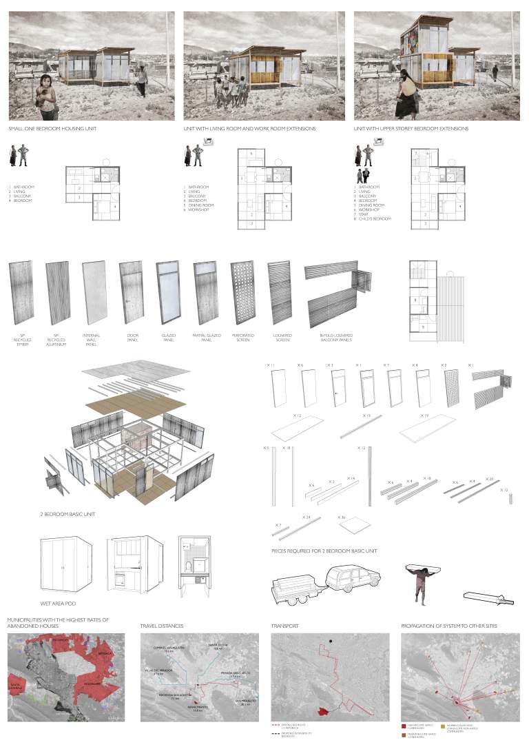
Avoid excessive realism.

It’s not about copying reality. If your were going to represent your design as reality then you would build it at one to one scale. But, creating architectural images, particularly in the early stage of a project (sketch design),  and representing your design is not about making it real. It is not about filling in the dots with material likenesses, textures or colours of the real thing.

Yes, the sky is blue and bricks are red and concrete is a kind of grey. But that doesn’t mean we have to make everything look like its kind of real. Usually it just leads to really bad visual images that are oversaturated with colour and that reek of naivety. Drawings are not real, (look at Zaha Hadid’s early work for example), digital images are not real, 3d printed physical modes are not the real thing. So why try and pretend they are real? The best and most powerful architectural images are those that recognise this fact. Your images are representations and translations of your design. They are not the real thing and as such your images should represent the essential ideas of your design in the very manner in which it is presented.

Understand your media

We don’t all have Oculus VR set ups. So in the meantime we have to be able to translate our models from the computer to other formats. Sometimes these formats are actually physical. In the past we had a limited range of formats to translate or describe our projects in. Mostly just pens and pencils a and ink and limited range of reprographic techniques. I was an expert on reprographic techniques and using pantone for colour on drawings.

Today the techniques are different. Today with the proliferation of different platforms, software  and mobile computing your project may end up in a powerpoint, in a .pdf file, as a poster on a wall, on a web page or in the screen of an ipad or mobile phone. Its a good idea to remember which media you are translating or representing your design in.

Finally, the Zaha Grandparent test

Your images need to pass the Zaha Grandparent Test. Put your grandparents in front of your final Zaha like outputs and see what they say. They should both be able to understand what you have done and also be blown away as well. All of the above survival tips are another way of saying that to a large extent architecture is about image making. Of course how these images become a material reality is the topic of another blog. If not a few thousand blogs. Again, there are no right answers and after all isn’t that what architecture is all about.

(The images are from Rachel Jones MSD MArch thesis from 2011.) 


Was Robin Boyd on Acid? The multimedia Space Tube at Expo 70.

Robin Boyd’s Space Tube, designed for the Australian pavilion at Expo 70, was a commission that came at a time when Boyd’s practice was struggling to make ends meet. From mid-1968 through to Boyd’s death in October 1971, his practice consisted of mainly residential houses and some more speculative projects. Amongst these projects, the Expo 70 commission was one of Boyd’s more significant commissions because of his use of multi media.

For todays architect’s multi-media technology is ubiquitous and Expos in the 21st century are mostly hyped up trade shows. Expo 70, the site of the Space Tube, in Osaka Japan, was the culmination of the 1960s neo avant-gardes dreams for architecture aligned with futuristic and universal values. Expo 70 crystallised the experiments of the 1960s neo Futurist avant-garde even more so than the previous Expo 67 in Montreal; this was perhaps because of the influence of the Metabolists who were directly involved with the planning of the many of the exhibits at Expo 70. (1)

DSC09059

Original sketch of the Space Tube from the Boyd Archive at the SLV

In general media coverage and most publicity photos, Boyd’s space tube is generally overlooked in preference to the “coathanger” structure of the Australian pavilion designed by the Government architect James McCormick. The Space Tube gained very little publicity from either the architectural press of the time or historians since. This is surprising given that it is one of Boyd’s most significant later commissions. The cost of the project, in 1970 Australian Dollars, was then estimated to be $700,000 and Boyd’s fee for the work was to be $75,000 (2 ). More importantly, it was a commission which was actually completed; of the 28 or so commissions that Boyd received from 1968 until his death, 7 were domestic commissions and 13 were speculative schemes. (3)

Slide1

As the Australian Expo 70 exhibits architect Boyd was responsible for the planning and circulation of the interior exhibition area, principally within the space tube. Boyd, in consultation with the Commonwealth Government committee overseeing the project, proposed that the exhibit would have four subject themes: “Man, Man and Nature, Man and the Man Made, Man and Man”. It was intended that these themes would divide the space tube or tunnel into four parts, which would then contain 19 exhibits (4). In notes for an early press release, Boyd makes note of these display boxes, which were to be built in Australia before being shipped to Japan, to be “simply bolted on and plugged into the power supply.”

The experience for the visitor within the tube itself was designed as a sequence of experiences controlled through movement. Boyd’s intention was that the motion should be barely noticeable. According to Boyd, “[t]he function of the moving platforms is not to excite or even to relieve the feet. Their main function is to give control.”(5). Through this use of multi-media technology, the architect was able to control the flow of visitors through the space, and hence “present a sequence of exhibits, knowing that the visitor can view them only in that sequence.” After leaving the first crush space and stepping onto the travelator, the visitor was presented with a view of the entire tube for the first time. As the opening of each display was inset from the tube surface and arranged at a right angle to the axis of movement, all that could be seen was a series of bright lights and colours shining onto the visitors ahead.

In the final scheme there were 20 displays or subject areas in all. Each display or subject area was comprised of up to four display boxes, arranged radially around the tube. The visitor was moved past the displays by means of twin moving travelators which positioned the visitor’s eye level roughly in the centre axis of the tube. The travelators were supported from below by a minimum of structure, to allow an unimpeded view in all directions from the moving platform. The tube itself was made from “Gunnite”, a form of shot concrete on mesh reinforcing which created a thin shell. Attention was paid to the finish of the tube, with construction drawings stipulating a smooth, uniform finish on the outside surface and a matt black “acoustic surface” on the inside. The tube’s status as a design object was as important for Boyd as its role in presenting a view of Australian society.

Slide1

Boyd was also responsible for the design of what was termed “technamation effects”. This was a multi-media technique achieved by projecting from two or more lights or projectors onto a polarised screen. As the viewer moved past the display, the screen would shimmer and ripple with colour and light. These effects were incorporated in a variety of ways into six of the display boxes. The best example is exhibit 17C, ‘Night City’. A model of a city block in exaggerated perspective was fitted on top of the polarised screen. Beneath the screen were six projectors mounted in opposing directions, creating the illusion of night traffic through moving red and white lights. What was otherwise a quite simple and almost dull model was in this way enlivened through animation. However, instead of a moving image or mechanical device, it was the viewer in motion which brought these displays to life. Visitors within the Space Tube were thus tangled in a complex set of visual relationships. The layout of the displays, in particular their height and angle in relation to the visitor, was one method used to control and organise these views. For example, the displays mounted horizontally (in the cardinal arrangement referred to above) made use of the level horizon line to suggest an equivalence between the visitor’s gaze and the subject matter. For instance, in exhibit 13C ‘Repco Brabham’, a cutaway model of a Formula 1 racing car is surrounded by a projection screen showing the car driving around a track. The view is arranged so that the visitor watches the track from just behind the car as Brabham makes his lap.

In contrast, the displays mounted at 45° to the horizontal present a more varied set of views. The displays below the walkway, such as 2C, 2D, 6C and 6D, present stylised views of the abyss – the mine, soil and what Boyd referred to as “the beasts in the pit”.(6) The circular frame of the display openings emphasise the detached and special view, appearing to be the viewfinder of an enormous microscope in exhibits 2C, ‘Some of the Body’s Microscopic Enemies’ and 2D, ‘Defence Cells Emerging from a Lymph Node’. The displays above the walkway more often include images of authority figures as part of their design. For instance, in exhibits 2A, ‘Immunology’ and 2B, ‘Organ Transplants’, circular screens were included which displayed projections of Gustav Nossal and Macfarlane Burnett, respectively. These images literally and figuratively look down on the visitor, countering the visitor’s gaze. These two displays include another recurring motif of Boyd’s design, the life-size transparent acrylic mannequin. A toy called “The Visible Man” and a teaching aid developed at the University of Michigan called “TAM” inspired Boyd (7). Both were human figures created with a transparent skin which revealed the organs inside. Boyd’s use of figures and bodies seems more scientific and anatomical than overtly erotic; however the experience for the visitor was doubtlessly voyeuristic (8).

Boyd was also central to the design and production of all the film, visual sequences and sound effects. He specified in detail the subject matter of each sequence, and personally chose the images used for each slide and film sequence. Though concentrated in the final displays, visual and multimedia effects were used throughout the tube as the central element of most displays. This was probably one of the largest and most extensive Australian multimedia projects of its time. In Boyd’s own words the purpose of the displays was to “capture the eye and the ear with light and colour and movement with music and sounds with 28 movie projectors and 46 synchronised slide projectors with hundreds of fluorescent tubes and 200 incandescent lamps.” (9). Circular screens were incorporated into most of the displays. Some of these screen arrangements were highly complex – for instance, exhibit 7B ‘Asian Aid’ was composed of six circular screens at the end of tubes housing a slide projector, each of which slid forward into the main space to reveal captions and subsidiary information printed on the side of each tube. Exhibit 3 ‘Tennis’ was made up of two projection screens facing one another across the tube, showing two players – Lesley Hunt and Yvonne Goolagong – playing a game above the visitor’s heads. Exhibit 17A ‘Ballet’ made use of moving screens, variable focal lengths and multiple projections to create a complex sequence of images (10). Sound effects were synchronised to visual cues for most of images, all of which were described and stipulated by Boyd. The Australian composer George Dreyfus was responsible for composing four variations of the pavilion theme, which were played at equal intervals along the tube.

The motion of the viewer through the tube constantly reinforced the logic of inevitability and progress within the subject matter of the exhibition material, and vice versa. For example, in Exhibit 20, the ‘abstract colour image’ designed in association with J.S. Ostoja-Kotkowski, was intended to literally be the “light at the end of the tunnel… visible all the time that the visitor is in the tube”(11). In effect, it was also a visual echo of the kaleidoscopic sun of first exhibit. From the very beginning, the Space Tube was thus a passage from a red/yellow stylised contemporary sun to a blue/green argon laser ray abstract future, toward “an absolutely explosive visual phantasmagoria in 3-D ” (12).

Of course this all makes me wonder if Boyd had at some stage taken LSD. Boyd’s thematic explorations certainly mark him as an architect of his time. But the design for the Space Tube does hint at the media driven technological future architects now find themselves immersed in (13). The degree to which contemporary architects have the same control over, or experiment with, new media technologies as Boyd did  is debatable. Boyd may not have actually taken acid. But it would be nice if we could direct such an accusation at contemporary Australian architects a bit more often.

This is an edited version of a conference paper co-authored with Simon Wollan.Peter Raisbeck And Simon Wollan Boyd As “Bower Bird”: Robin Boyd’s Space Tube And The Global Avant-Garde. SAHANZ 2003. 

NOTES.

1. For details of Expo 70 in architectural magazines see the entire issues of: Architectural Design June 1970 especially p 271 for comment on the Australian pavilion and Japan Architect 1970 Vol 45 N0. 5/6-164 see especially Koichi Sone, Sei Oyuki, and Yuji Morioka, “Moving Walkways and Urban Traffic” as well as p. 69 for a comment on Kikutake’s Expo tower.

2. Fee agreement for the project was signed on the 22nd of October 1968; to be paid in monthly instalments as the work proceeded. For this fee, Boyd’s brief was to design the Space Tube and its display cases in a way which would depict Australian life and industry to a primarily Japanese audience. The Commission also extended to producing and managing the construction of designs for the merchandising which was to be associated with the exhibit. Refer to Box 104, GRB Archive, State Library of Victoria.

3. His most significant civic architectural commissions during this time were Churchill House, exhibition designs for the Australian Chancery in Washington and the ”First 200 years exhibition” in the foyer of Harry Seidler’s Australia Square building.

4. In the original proposal the exhibits were numbered from 1 to 19 with the following subject titles and in the following order: origins of humanity, the battle against disease, science of the mind, enjoyment of life, Australian invention in agricultural technology, Soil and Water, Exploring and preserving resources, Exploring the Universe, utilization of Polar Regions, Transportation, Modern Living, Urbanisation, Automation, Language and Literature, Communications, Fine Arts, Lively Arts, Australia-Japan Relations, The Film. Refer to Box 104, GRB Archive, State Library of Victoria.

5. Robin Boyd, “Australia at Expo 70 for Walkabout” , undated text, Box 103 (c), GRB Archive, State Library of Victoria.

6. Letter from Boyd to Prof. G. Nossal, 11 July, 1968. Box 103 (a) GRB Archive, State Library of Victoria.

7. Letter from Boyd to J.P. Tyrer (Acrylic Industries), 7 October, 1968. Box 103 (a) GRB Archive, State Library of Victoria.

8. Further work, which is outside of the scope of this paper, is required to fully establish how Boyd fetishised these figures as objects, and the more general effects of the technological gaze within his designs.

9. Robin Boyd, “Australia at Expo 70 for Walkabout”, undated text, Box 103 (c), GRB Archive, State Library of Victoria.

10. First, a film loop showing dancer’s legs was projected onto the front screen, nearest the opening to the tube. Next, an image from a slide projector appears small and out of focus on a screen behind. As this screen moved forward the image enlarged and came into focus, before again going out of focus and diminishing in brightness. From the visitor’s point of view the slide image passes through the film image, literally deepening the visual field of the screen. Refer to Box 100/3, GRB Archive, State Library of Victoria.

11. Letter from Boyd to J.S. Ostoja-Kotkowski, 16 July, 1968. Box 103 (b) GRB Archive, State Library of Victoria.

12. Letter from Boyd to J.S. Ostoja-Kotkowski, 9 October, 1968. Box 103 (b) GRB Archive, State Library of Victoria.

13. This compression of time and consequent distortion of space also appeared in individual exhibits. For instance, exhibit 13D ‘Shipbuilding’, displayed a model of a ship growing from blueprints to steel structure to dry-dock construction to finished bow steaming steadily ahead through a technamation wave. However, instead of showing each ship in sequence, each stage occurs on a portion of a single hull, giving the sense that the ship is impatiently sailing through time into the future. That this exhibit is the only one mounted directly below the visitor, between the two travelators, ensured that this movement was aligned with that of the viewer.

Surviving a design jury presentation: The essential guide. 

Design juries can be terrifying. It doesn’t really matter if you are an architect or a student the experience can be soul destroying. Get it wrong and you can lose the job or fail. Get it right and you live in order to fight another day. Standing in front of a group of critics can determine if you get the job; or the prize; or if you are at architecture school, a pass in  design studio. It’s much harder to present if you haven’t done enough work or you don’t really believe in the project. But speaking well in public and knowing the essential lessons of presenting a design can be the difference between passing or failing.

I have sat in on numerous design and award juries. The awards or the commissions don’t normally go to the architects who talk too long, speak in jargon, or bore the jury with an explanation of the stair and or toilet details. So here are a few essentials that will help calm the nerves and get you through if you are not used to public s peaking or always find presenting to a jury harrowing.

Timing 

When you are presenting to a jury. Get the timing right. Don’t run over time or drone on. Architects are notoriously bad at timing there talks. As a student I went to the old AIA International Lecture series. All I  remember is Hans Hollein talking for around 3 hours straight. Aldo Van Eyck was the same. Will Alsop did it to us as well. Each time it happens to me it is excruciating. It doesn’t really matter how good the work was an overly long talk will kill any audience interest or curiosity. But, at least Will Alsop was kinda interesting because he was long winded as well as being drunk. But I still would have given him an E for going over time.

A picture says a thousand words

If you are smart, or English is your second language you don’t have to say a lot. The more diagrams, images or other representations you have to present the less you have to say. The less visual material you have on the wall the more you have to explain what is not there. There is nothing worse for a jury than seeing an under designed scheme that is then talked up, explained and elaborated in words.

In presenting to a jury architects need to remember to right balance between about talking and what is on the wall or on the digital files. Architects are visual and jury members like to look at images. I tend to think it is better to have more visual material than text on your drawings or images. There is nothing worse than having a few thousand words of detailed and so called explanatory text on architectural presentation pdfs. A short summary of the concect is good. Like an abstarct it should be no more than 300 words or so. The rest should be diagrams including, charts, graphs, flow charts and conceptual diagrams explaining the concept. Minimal text is good. As well as two and three dimensional views that explain the design.

In short there should be enough visual material on the wall to make your life easy explaining it. You wont always be there to explain you work. This is particularly the case for competitions and when a jury member or critic reviews the project later. So the layout and the visual argument of the design with any supporting diagrams is very important. This is why clear and communicative graphic skills are important.

Just cutting and pasting the renders out of the virtual world into photoshop and then sending them straight to the printer doesn’t really work. Slapping together a layout doesn’t really work. Keeping it in the computer up until the last minute doesn’t really work. Over-talking or over-texting the project doesn’t work.Filling your drawings with slabs of text doesn’t really work.

As a presenter of a design the aim is to lead the juror’s and critic’s eyes to the drawings. The aim of what you say is to get them to understand the visual argument and, in the minds, to inhabit the space. What you say to a jury in words must be linked to the images.

Don’t avoid talking about the concept 

Some architects find it difficult to talk in conceptual or theoretical terms. This may be in apart training and it is usually because for some architects it is easier not to talk about history, aesthetics, compositional processes, form, critical theory or the politics of urbanism. But this is exactly the sort of thing a jury wants to hear.

Bad presenters or architects, or students, who have not got a great content on the wall talk a lot about the other stuff. Like, what they had for breakfast. How their semester shaped up in terms of blow by blow and sequential description of how the design happened. Usually the easiest way to do this is to talk about everything that doesn’t matter. There is nothing worse than hearing a long winded talk about the pragmatics of  project. Siting, briefing, sustainable technologies, construction and materiality, client and user preferences can all too easily dominate any presentation. A great design is not simply a response to these factors; nor should it sound like it.

Most jury members and critics are architects who know a lot about that kind of stuff. Good architects have mostly spent there life trying to escape from the contingencies of pragmatic design. Mostly they are there because they have an interest in the strategic issues, problems and broader views not the details. Jurors and critics want to hear and talk about the big ideas. For a jury member going to an awards presentation is a bit like going to one of those TED talk thingys. As a jury member you want and expect to hear about life the universe and everything in relation in a very focused way.  Design Jurors and critics like to debate ideas in relation to the design. Give them what they want and don’t avoid talking about the conceptual apparatus and how it has shaped the building.

Of course, if you just talk about life the universe and everything and not the project design then you should be doing philosophy.

Structure 

Guide the jurors eyes to the design. The way you structure the presentation should reflect this. Avoid the “this is what I had for dinner” or the “passage through life” syndromes. Get to the point. The first thing a jury wants to here is about are ideas. This will give them the context from which their eyes will begin to apprehend and understand the design and inhabit the building in their imaginations.

Do it as an elevator pitch. In three or four sentences you should be able to say what the project is about. What is it’s over riding concern or concept? The sooner the jury is familiar with this the more they will feel comfortable with looking at the design. Don’t leave the concept to the last minute. The best way to present to a jury is as follows. The improtant thing is to guide the jury to the design and the images which describe it.

You also need to lead the jurors thought the building. You can do this by describing how they enter the building, how they circulate thought it and what qualities of light or spatial qualities it has once they are inside or moving through it. The point is that you need to guide, not unlike a tour guide, the jury members or critics through your design.

  1. Introduce your self and the concept
  2. Quickly describe 3 or 4 ways that the concept has shaped the design of the building.
  3. Lead the jurors through the design quickly discuss: Siting, main entrances, circulation and spatial qualities of different spaces.
  4. Summarise what the design contributes to design knowledge and what you would do to evolve the design further.

And then you can be ready questions. Of course you in the above scenario there are whole lot of things you have not spoken about. Like materials or what or how its constructed or where the toilets or parking are. Some jurors like to ask these questions and by not mentioning them and yet being prepared for them. You will end up sounding knowledgable and thoughtful. Nevertheless, the main aim in the question period is to get a discussion going about the design, its associated concepts and what it says about the designers attitudes towards the particular type of architectural or urban problem the design encapsulates.

Public Speaking 

Don’t speak as if you are channeling a bad power point slide. A badly formatted template with crap images and too much detail on each slide. Keeping it simple is best.

I once saw the director of an architectural firm destroy his firm’s chances of getting  a $150M project by the ineptitude of his presentation. After 10 minutes everyone in the audience felt the same. After 10 more minutes I wanted to stab myself in the eye with a biro. The problem was that the presentation went on for another hour. It was scheduled to be only 35 minutes. The firm did not get the job and the primary topic of conversation in my email inbox, by other attendees, the next day was how bad it was. I just hope someone told him.

All the rules of public speaking apply. Don’t forget to wear your bow tie or best shoes. Get a good nights sleep before hand and rehearse, rehearse and rehearse. Practice in front of your grandmother or your non-architectural friend’s. See if they get it. After all it could mean the difference between getting the architectural commission or doing the Uber thing: Who wants to be an Uber driver after seven years of study?


Is BIM as good as it looks ? What Deleuze can teach us about BIM

In the Building Information Modelling (BIM) utopia representations of time are linear and easily progresses into a future where BIM enables seamless collaboration across the full gamut of design orientated disciplines. The viewpoint presented in the various BIM representations and advertising that litter the internet is often that of an eagle, or angel, freed of all earthly constraints and propelled towards a future BIM revolution. But unlike the critical theorist Walter Benjamin’s iconic image of an angel looking back on the wreckage of progress these images of BIM do not indicate a reflexivity that recognises that not every technical innovation succeeds or that technology has a social-technical dimension.

In theory, BIM project models paired with collaboration tools offer a number of significant improvements and benefits over traditional design, delivery and supply chain processes. Proponents of the BIM utopia claim that the BIM will change and be linked to augmented reality, enhance lean construction, scheduling, safety management, trade scheduling, progress measurement, design visualization and even architectural design studios.

But as some researchers have noted the BIM dream is not all it seems to be. For example the IFC’s, which are at the heart of BIM collaboration often “fails to provide complete interoperability.” 

BIM careerists, proponents and evangelicals claim that BIM is a new mode of visualization. Someone once said to me you can tell a BIM building because of the limitations of form that seem to be built into BIM software. Nonetheless, emerging from and circulating in BIM research discourse and the public domain the above claims are supported by a plethora of BIM representations. These often include strategic and operational diagrams, screenshot images and animations available in research papers, publications, reports, various how to do BIM manuals and numerous animations across the internet.

As the BIM industry has arisen as numerous, and in some ways glamorous, case studies and screenshot images are published and promoted as examples of successful BIM operation. The colours employed are seductive and colour is the key feature in numerous BIM screenshots. For example, a shimmering green is a often contrasted with yellows for services and purple. The viewpoint is often from a point looking above or below and is positioned to emphasise the layering of different systems and suggests a layered complexity constituted by the overlapping of many different small scale construction elements. With these highly seductive images it is argued that BIM can improve workflows through clash detection and management, better two dimensional drawing extraction, automated quantity take-offs, supply chain integration and facilities management integration.

bim-4

The French Philosopher Gille Deleuze’s encounter with cinema is a useful, although to some it might seem surprising, critical framework in the BIM context. Deleuze wrote two philosophical books about cinema. Deleuze saw cinema as a “new practice of images and signs, whose theory philosophy must produce as conceptual practice.” Deleuze’s concern is not a philosophical investigation of cinema’s essential nature. Unlike the proponents of BIM Deleuze did not simply proclaim cinema as a technological revolution. Rather, he was interested in interrogating the cinema for its possibilities about what it might become. Deleuze argues that cinema establishes the problems of traditional subject orientated epistemologies. Deleuze cites Henri Bergson as a philosopher who opposed a view of the world that is predicated on a static and centred viewpoint or subject. Deleuze sees in Bergson a philosophy that accounts for the early technological advances of cinema as well as anticipating its later developments. But, Deleuze also saw the cinema as constituting a language of images. Deleuze’s conception of image is something which is neither representation, secondary copy, imitation or mimesis.

These perspectives suggest that BIM research R&D should oppose a concept of BIM that privilidges linear sequences, singular perspectives and robotic notions of construction that ignore the randomness of craft.

The above considerations suggest that new methodological approaches are needed in the area of architecture and BIM R&D. If BIM is to reach it’s full potential as a tool which saves resources and allows better architectural design outcomes. Future BIM research needs recognise the power of different representational modes, stochatsic and random events, social milieu and avoid seeing a building as a simplistic digital-technical object or diagram linked to a database.

Stochastic processes which are random and are capable of using agents and swarms to predict what will happen within BIM models may reveal more than the static and mechanical models which seem to plague BIM research today. Notions of time should be seen as being multi-layered and interdependent of sequential BIM animations and screenshots. BIM models should be seen as entities which develop over time from the beginning of the design process where there is a iterative transfer of information between designers, teams, and 3D representations of buildings built in computers.

In BIM research critical theory should be employed to ensure that the architects of the future do not relinquish their canon of knowledge regarding the craft of building to mindless databases.